Matt Bullock
Matt Bullock
on mobile you can remove the gradients to the left and right - these are only meant for desktop when the arrow buttons sit over them. Ideally the edges of...
Doesn't look ready for me to check over yet - many links aren't working yet
Top space still looks too big
Can you replace this image with the new market page 
@bconfortin still a couple of things: Still seeing white lines down left and ride sides - is the background layer not wide enough or something?  --- Wallet provider section...
@bconfortin this looks good. Couple of requests: - can you turn off background scrolling when the menu is open. If it's a big task, leave it for a later date....
Can you adjust the placement of it. Below is where it should sit in the top bar order    
Couple of small details: Can you make the dai icon in the orange circle pure white  --- When you close the switcher with the augur pro section still expanded...
@JohnDanz Still seeing this: 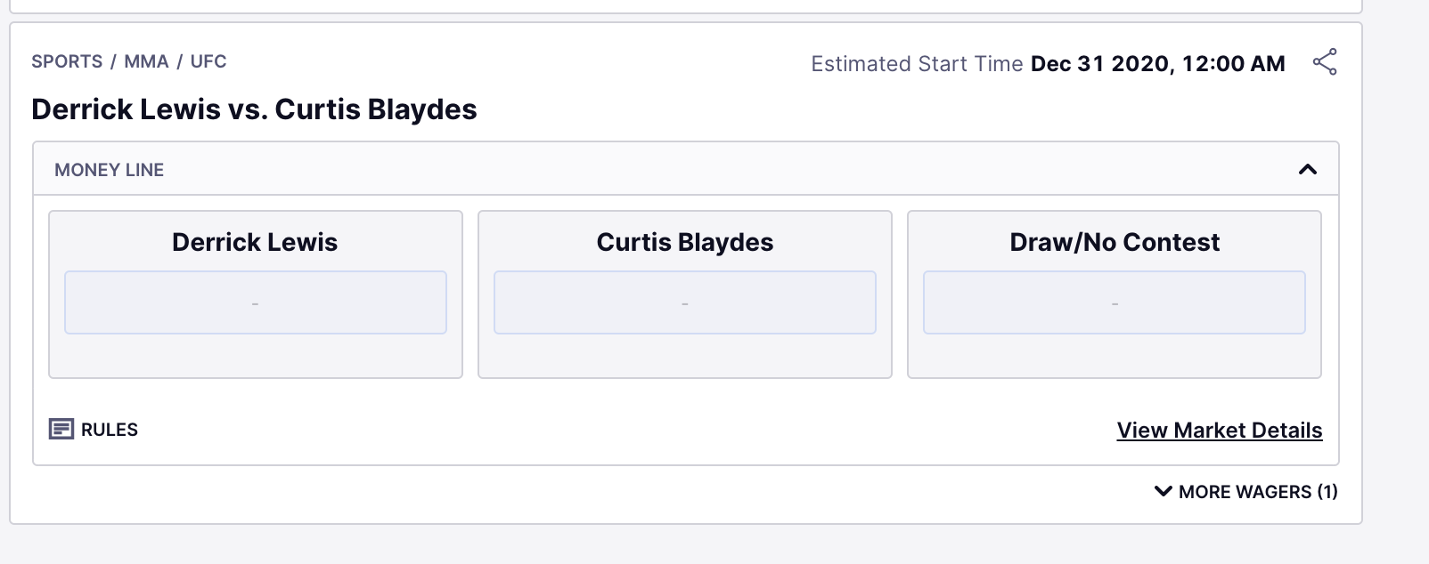
Few things I noticed: - Lines missing in the top left - Gradient overlay should sit above image, not the lines otherwise it washes out the colours of the diagonal...