augur
 augur copied to clipboard
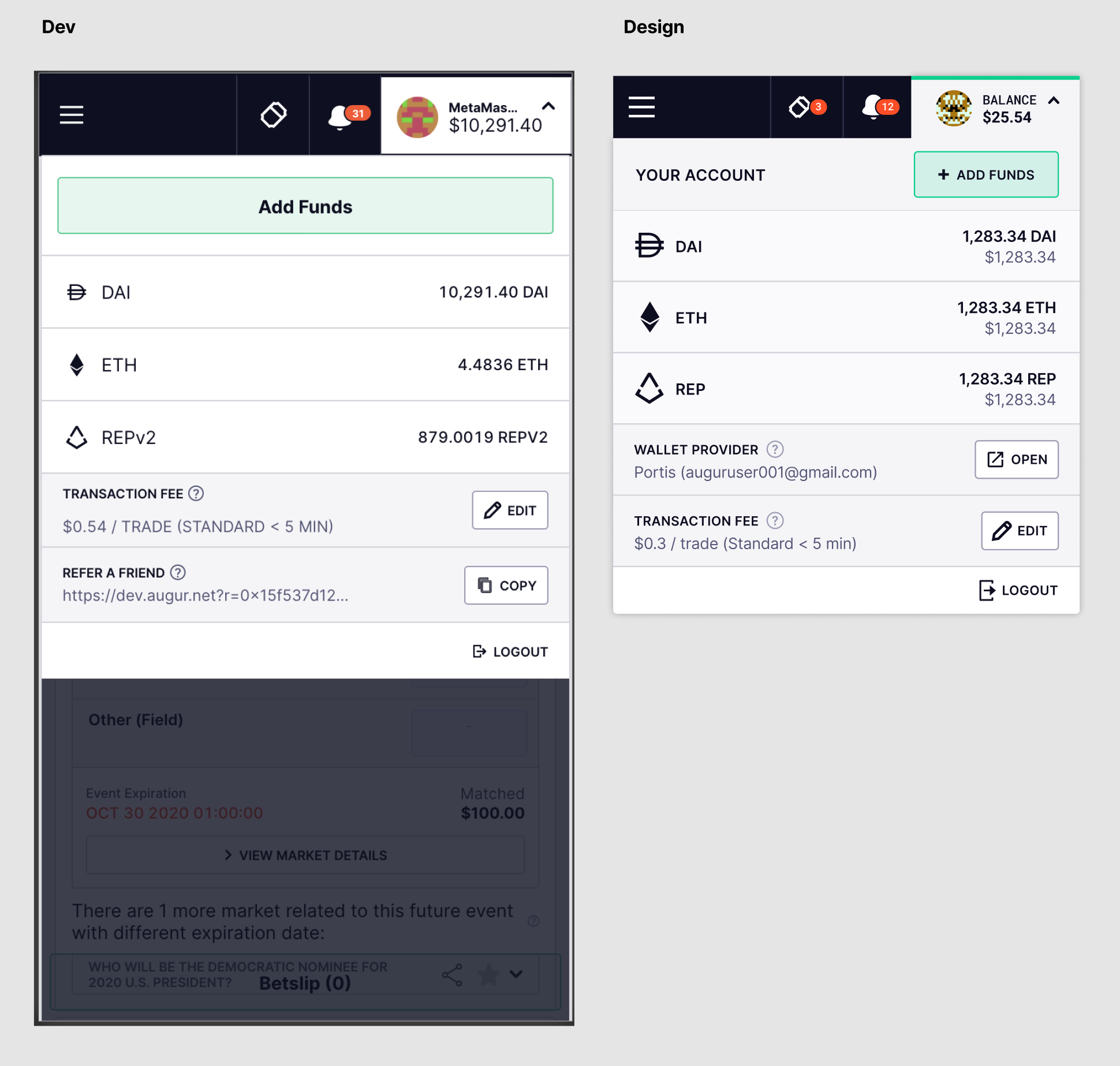
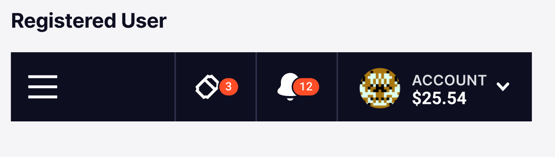
Mobile Account menu QA
- remove lines down left and right sides in background
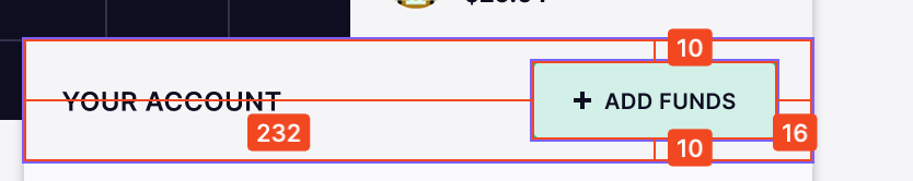
- match design for add funds section
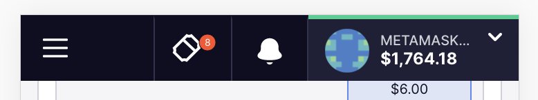
- font size and weight of balance to the top right (under metamask)
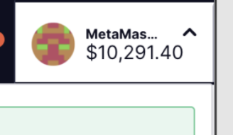
- metama... getting truncated too soon
- green bar at very top is missing
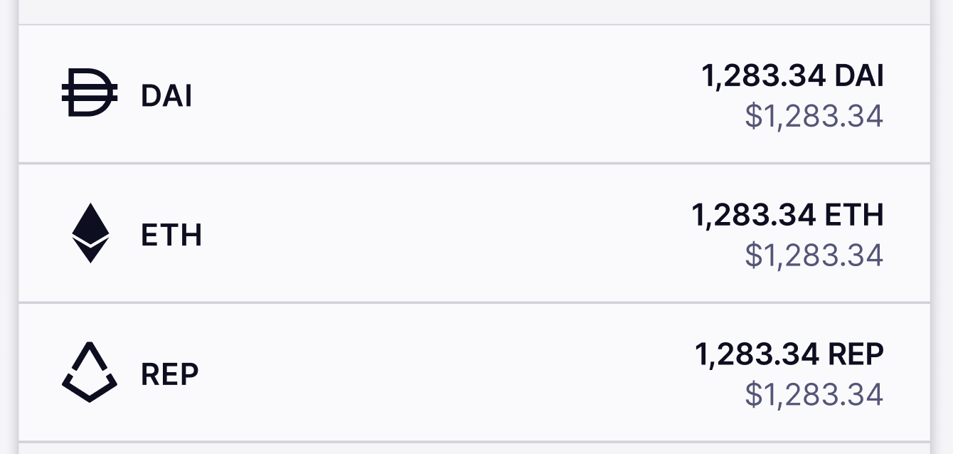
- Keep refer a friend section as we may keep this
- wallet provider section is missing from mobile
- logout icon looks small
- transaction fee section - space too large between texts
- remove this gap:
@bconfortin still a couple of things:
Still seeing white lines down left and ride sides - is the background layer not wide enough or something?
Wallet provider section still missing from mobile
These look like they need to go up a font weight - 600 for both
Can you increase the size of the icons to 24px 24px
Link to design if needed (at the bottom of the linked frame) https://www.figma.com/file/42QoTLQcbObu7esoTPjWRv/Augur-Bet-Design-System?node-id=283%3A145
Button should be slightly smaller at 36px and space above and below 10px
@bconfortin this looks good. Couple of requests:
-
can you turn off background scrolling when the menu is open. If it's a big task, leave it for a later date.
-
Can you centre the dropdown arrow. I've just updated the designs as it looks odd being so high

Hi @bconfortin I'm still seeing the arrow on the Account section top-aligned. Should be centered based on previous comment:
Dev:
Design:
Also, can you turn off background scrolling when the menu is open. Let us know if it's something easy or if we are gonna leave it for later.