Aleksandr Andreev
Aleksandr Andreev
> I still don't understand why on line 312 some words do have the archaic form ZEMLJA and others don't. Only the medial Zemlja should take the archaic form.
> In my opinion, there ought to be more space between the text and the examples after lines 300, 309, 315, 440, 448, 701 and 710. You can try playing...
Strange. Does the same problem occur with other fonts or is this a Ponomar Unicode issue? @pgmmpk any thoughts?
Это баг.
@EliseyP можете прислать пример из печатных книг, как должна выглядеть эта комбинация?
Хотелось бы увидеть пример, перед тем как рисовать.
> Иконописцы посоветовали такой вариант: > 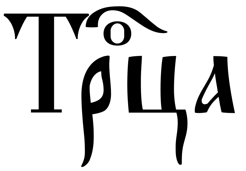 Да, пожалуй этот вариант самый приемлемый.
> I have attached other similar cases where there is a collision between a capital letter and the titlo that should also be fixed. As well, there are a few...
> It's bug? - kamora position seems left shifted. > 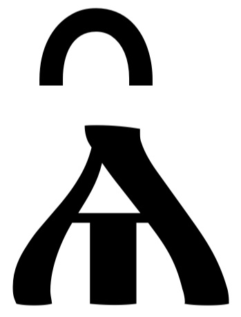 По-моему так решили при дизайне шрифта (центрирование по отношению к основанию, а не к верхней части). Но можно изменить.
Fonts can be loaded using CSS. What's the point of loading fonts in an extension? I don't understand.