fi-
fi-
  it is based on bootstrap popover with changed styling
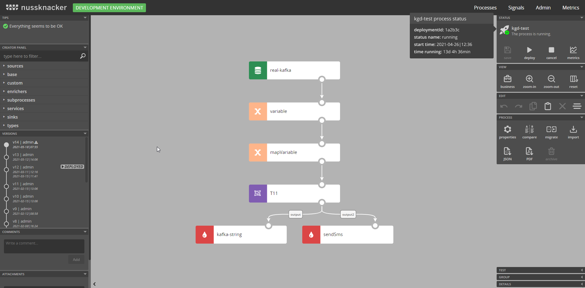
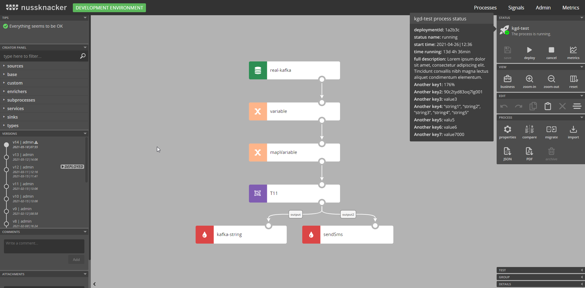
the counts modal was slightly uplifted as a part of general modal redesign https://www.figma.com/file/cYEMFtO1lSYDof54uvLeIN/modal-nk-2021?node-id=0%3A1 it is on far left side of the document. Let me know if there is any...
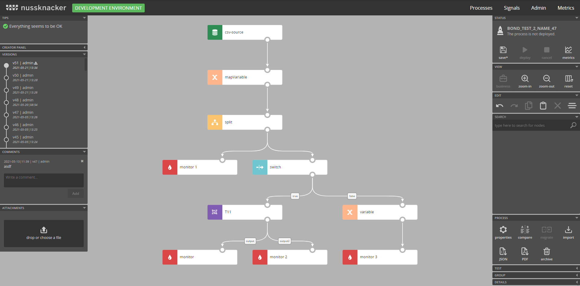 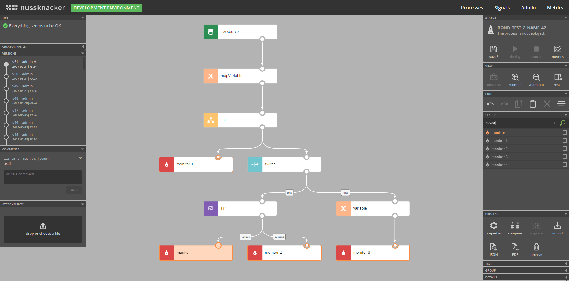 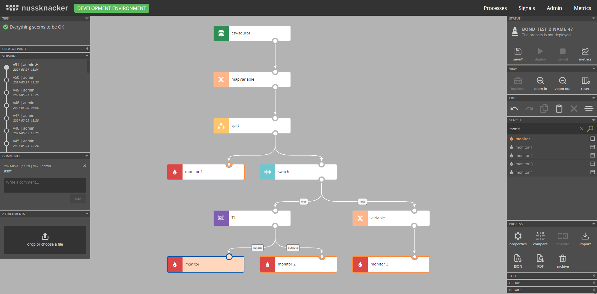 mock1: by default search panel is located on the right side. This is because Creator Panel is on the opposite side by default. Both panels are similar...
After opening node details user should be able to identify required fields. We need to visually indicate which fields are required ones. "This field is mandatory and can not be...