Ana
![]()
![]()
Ana
Table of clickable areas: Icon/Button , Label , Usage Spreadsheet: https://plan4better-my.sharepoint.com/:x:/g/personal/ana_sasso_plan4better_de/EXE-5YlanFpIoeC8tMtB8YUBmIgMvMIYyRJeTSHh_Uo6RQ?e=y533Wm reference: https://docs.qgis.org/3.22/en/docs/user_manual/introduction/general_tools.html#zooming-and-panning:~:text=the%20Layers%20panel.-,Icon,-Label Interface overview: Screenshot of the goat screen state.0 with arrows and labels reference: https://docs.oracle.com/cd/E35328_01/E35332/html/vmusg-ui-overview.html
I agree that the icon of a filter might be a bit misleading. I wonder how much of the interface are you willing to update with the migration aforementioned. But...
- [ ] CUSTOM BREAKS
@EPajares what's the dependency here?
To Do: - [ ] Varying sensitivity parameters [GOAT] - [ ] Scientific Background - [ ] Further reading
Same for Styling Custom Marker after the 6th marker 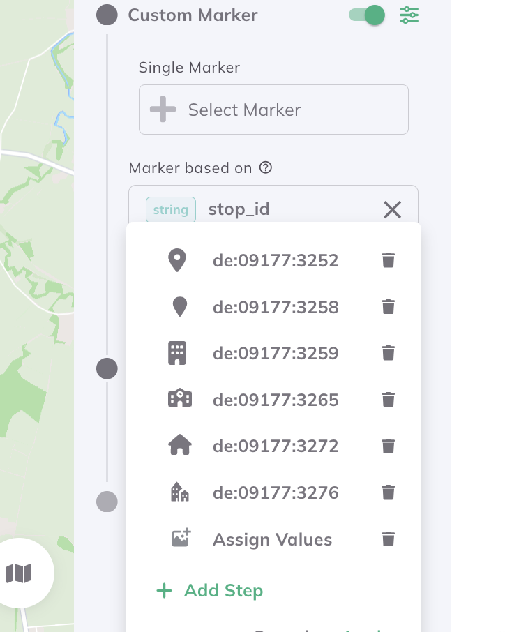
> I think this is because the icon should have a 1:1 ratio (width=height). With other icons this doesn't happen. does it help if I check which ones this happen...
Updated interface