dwsd
 dwsd copied to clipboard
designing with spatial data - workshop materials
Designing with spatial data for the web

Introduction
This workshop is designed to be very hands-on, but slightly less hands-on than the other part of Stamen's workshop series: Working with spatial data for the web. Generally, we teach this class first, and WWSD second, but you can take the classes in either order. We will use some of the same tools that are covered in the other class (like Leaflet and D3.js), and we'll look at a few tools specific to today's class (like CARTO).
We will look at many examples that can be extended as exercises, and many more examples that will give you a taste of the possibilities out there, and some leads you can follow if you want to learn more.
It would be impossible to touch everything that we could find interesting in web mapping, so the hope is that after going through these three acts you will feel empowered to swap in your own data and leverage hundreds of examples in your own data visualization projects!
Before we get started:
We will be using two free online platforms for this class: GitHub (a website for sharing open source software and code), and CARTO (a user-friendly online mapping platform). If you don't have accounts on these two sites, please create accounts now:
Prelude: the landscape
An overview of the state of the art
Some maps we've made at Stamen, and maps we love made by others. What tools did these maps use? Where did the data come from? How and why were they designed this way?
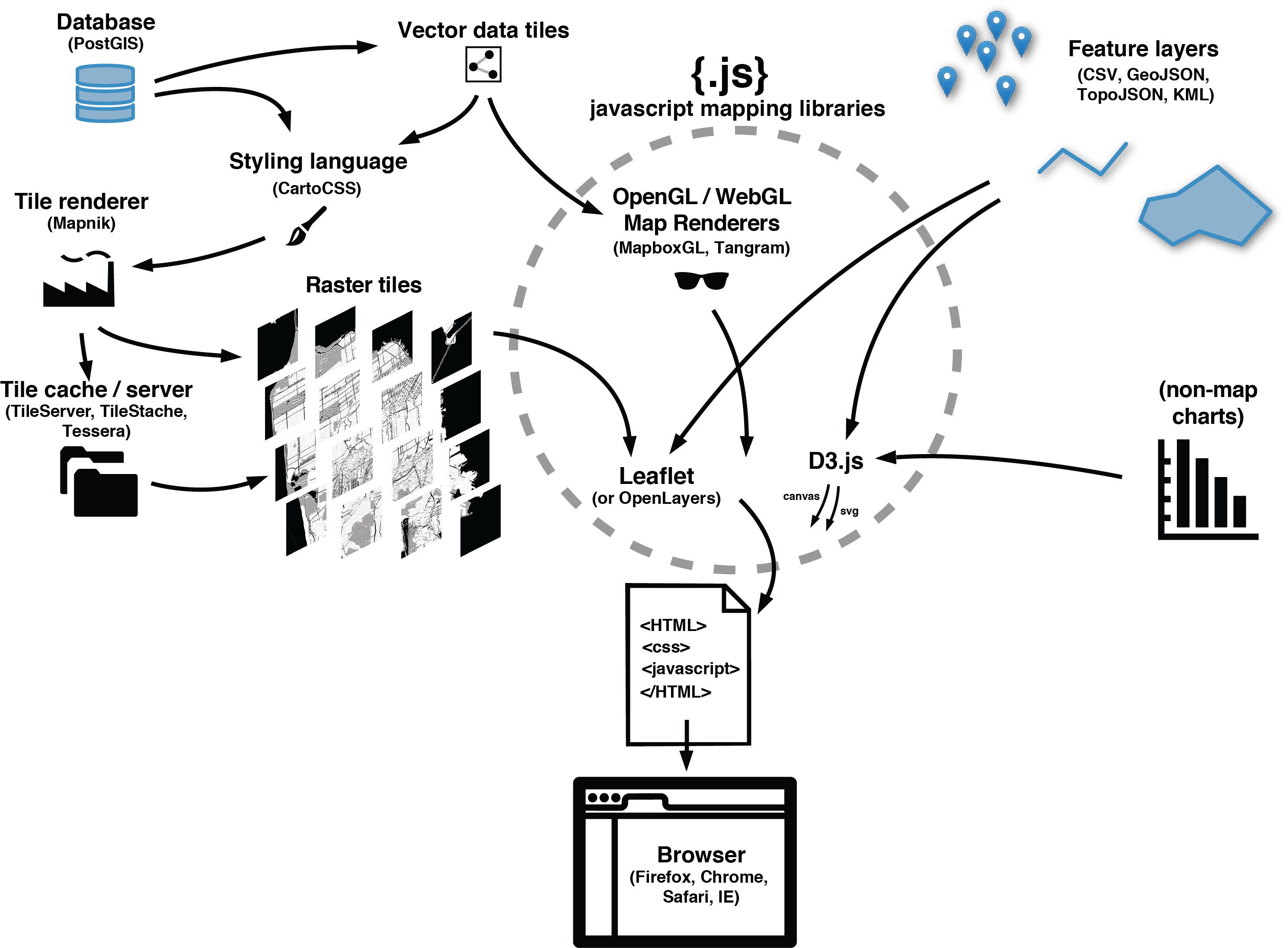
Servers and clients, rasters and vectors
See: Anatomy of a web map
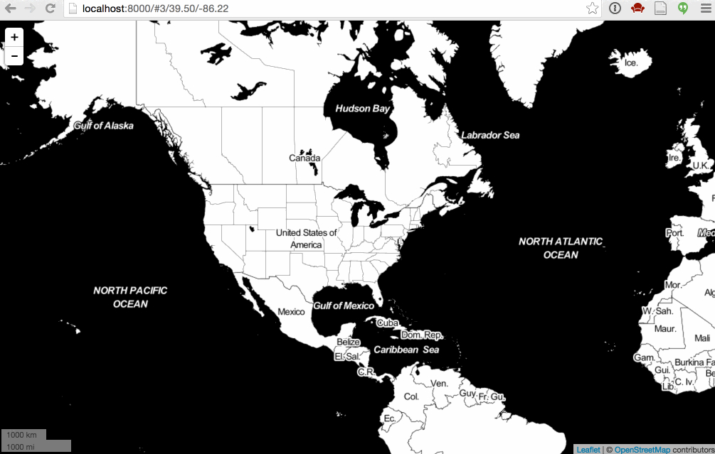
To understand the fundamentals of tiled web maps, we'll look at some very basic Leaflet maps (you don't need to fully understand the code quite yet)
For contrast, here are a few basic D3.js maps:
Act I: data is part of design
Data preparation
Choose your data wisely. Clean it throughly. Remove what you don't need! In general, pre-process your data with the end product in mind.
All the tools we will look at can be used for data exploration, your data needs to change when you transition to data presentation.
You might need to use QGIS, but I'd recommend CartoDB (now "CARTO") for most things!
Let's load some data in CARTO, try the web editor to draw features, edit them, etc. Note, you can get lots of interesting datasets to start with from CARTO's Data Library

Look at the SQL viewer, and if you're familiar with SQL you can do a lot to transform your data really easily! Let's try extracting just a few features.
Note, if you love the command line, you can do most of this with GDAL's program ogr2ogr, especially with @dwtkns's fantastic GDAL cheat sheet. Or you can install PostGIS locally if you like the database interface of CARTO.
Generalization
-
Mapshaper and TopoJSON
- Review, what is TopoJSON?
- generalization is not just for file size, it's also important for the look of the map
- [Use the Brexit data as example]
2) Generalizing with Mapshaper

Natural Earth
Let's do a tour through the wonderful world of Natural Earth datasets. Not just what are they, but why are they?
3) Comparing levels of generalization in Natural Earth

Also note the boundary lines files. Why would we need those when we have the outlines of the countries already?
For one thing, you can apply a thick line to divide countries from each other without adding a thick stroke along their coastlines, for example.
(note, you can also do the same thing with TopoJSON)
Data precision
- You don't really need those 8 digits in your decimal degrees: see geojson-precision
- See Decimal degrees on Wikipedia
Act II: numbers to images
Projections
Why do they matter?
Have you learned to hate Mercator yet?
"Why are we changing maps?" (note, don't use the Peters projection either!)
Unless you're using tiles, you probably shouldn't use Mercator.
But wait, why do tiled maps use Mercator? Let's talk about that.
Let's start with the zoom 0 tile:

Projections as a design decision:
If you're making a choropleth (we'll talk about these later), use an equal area projection.
Map of the US, use Albers USA which has built-in sub-projections for Alaska and Hawaii!
Say, California, use EPSG:3310 California Albers
Map of the world, consider a Winkel Tripel (not equal area)
For a city, maybe it doesn't matter if you use Mercator.
BUT! Don't try to compare two city maps side-by-side using Mercator... the scale will be off!
4) Leaflet with scale bar and URL location
Projected maps vs projected data
Also, projections are not just about how you present your data. Sometimes your coordinates are already projected on disk! GeoJSON is almost always stored in latitude/longitude degrees, but other data sources might be stored in meters, or feet, or pixels (like TopoJSON).
For example, here's a map that uses a pre-projected topojson file and a null projection.
What do these coordinates look like? See EPSG:2163 Coordinates.
Okay, now what's "2163" mean? Let's talk about that...
Can I get your projection's number? :phone emoji:
D3 is convenient and it gives all these projections names, but if you're using anything other than D3, you might need to know your projection's EPSG code.
A few you might memorize after a while:
- EPSG:4326 "unprojected" latitude / longitude (a "geographic" projection)
- EPSG:3857 Web ("Google") Mercator (old docs will use EPSG:900913)
- EPSG:2163 US National Atlas Azimuthal Equal Area
- EPSG:3310 California Albers
And sometimes, just sometimes, all those off-the-shelf projections just aren't enough, and you have to make your own projection. Since a projection is just a mathematical formula, it's not that hard to modify existing ones. See oceanplanning.org
Or, see what I like to call the "Hill-Akella Manhattan Projection"

How to lie to your mapping tools
Jump over to CartoDB again: how do projections work here?
What happens if we make it think the data is in one projection, but it's really in another?
With the right PostGIS query we are able to use raster tiles in non-Mercator projections! Just don't try to overlay them with any other raster maps!

Act III: communicating information on the map
Classification and choropleths
AKA how to lie with maps:
Equal Interval, Quantiles, Natural Breaks: example by @mkfreeman (Note that names from GIS are not the same as in D3)

Also, normalize your data by something (usually population). In our case, our data already comes with a "pct" column, so it's already normalized.
But sometimes you want to show the relative raw values too. Here's a way to do that, called a "value by alpha" choropleth:

Color
Sorry, for election maps you kinda have to choose the awful blue-purple-red colors. It's the law. But for any other kind of map, please choose something better.
Who doesn't love ColorBrewer? But have you really spent some quality time at the source?
Rainbow color ramps considered harmful, please don't use them!
And of course you want to be color-blind friendly, so can we recommend Color Oracle?
Proportional symbols
First, let's switch our choropleth map to a point map of centroids. (dipping back into the data section)
First, let's try using d3.geo.centroid:
7) Proportional symbols with d3.geo.centroid
Why is it so slow? Let's pre-generate those centroids:

Now it's much snappier!
8) Proportional symbols with pre-generated centroids

Okay, back to proportional symbols! Choose your symbols wisely, and scale your symbols appropriately:
- bars scale linearly
- boxes scale with square root of the value
- circles also with the square root (but supposedly people can't accurately judge circle sizes) * spheres scale with the cube root (but you really shouldn't use them anyway)
9) Proportional bars with pre-generated centroids

Legends
- Make your legend a chart!
Labels
Labels are one of the most difficult things to do programmatically...
You want to avoid text overlaps at all costs. Not just for maps, for charts too!
One approach: collision-detection for labels
[Best school day example abbreviations on the dorling maps]

Oh, and to make that dorling, check out this
For tiled maps, you should try to get your labels on top of your data.
CartoDB (now CARTO) does this by default: Let your labels shine!
For inserting labels in the middle of a stack of layers for MapboxGL, see here
...we'll talk a bit more about stacking tile layers after a break.
Act IV: bonus material! Mixing and matching to bring it all together
Leaflet layer stacking
Designing with big(-ish) data
-
Heatmaps: people either love them or hate them. They are usually not normalized (that's kind of the point).

-
Hexbins are another trendy way to deal with large numbers of points. Here's an example mapping social media usage in California parks
-
Adjusting layer opacity and blending styles can create powerful effects, as in Trees, Cabs, Crime or our climate change maps for the Audubon Society
Linked views: combining maps with other charts
- Examples from American Panorama
Some closing thoughts, pet peeves, and our map checklist
- http://content.stamen.com/stamens-checklist-for-maps