empress
 empress copied to clipboard
[WIP] Exploring a group of selected nodes by highlighting the path connecting them and providing tools to better compare their metadata.
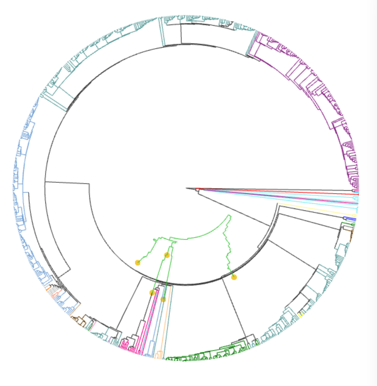
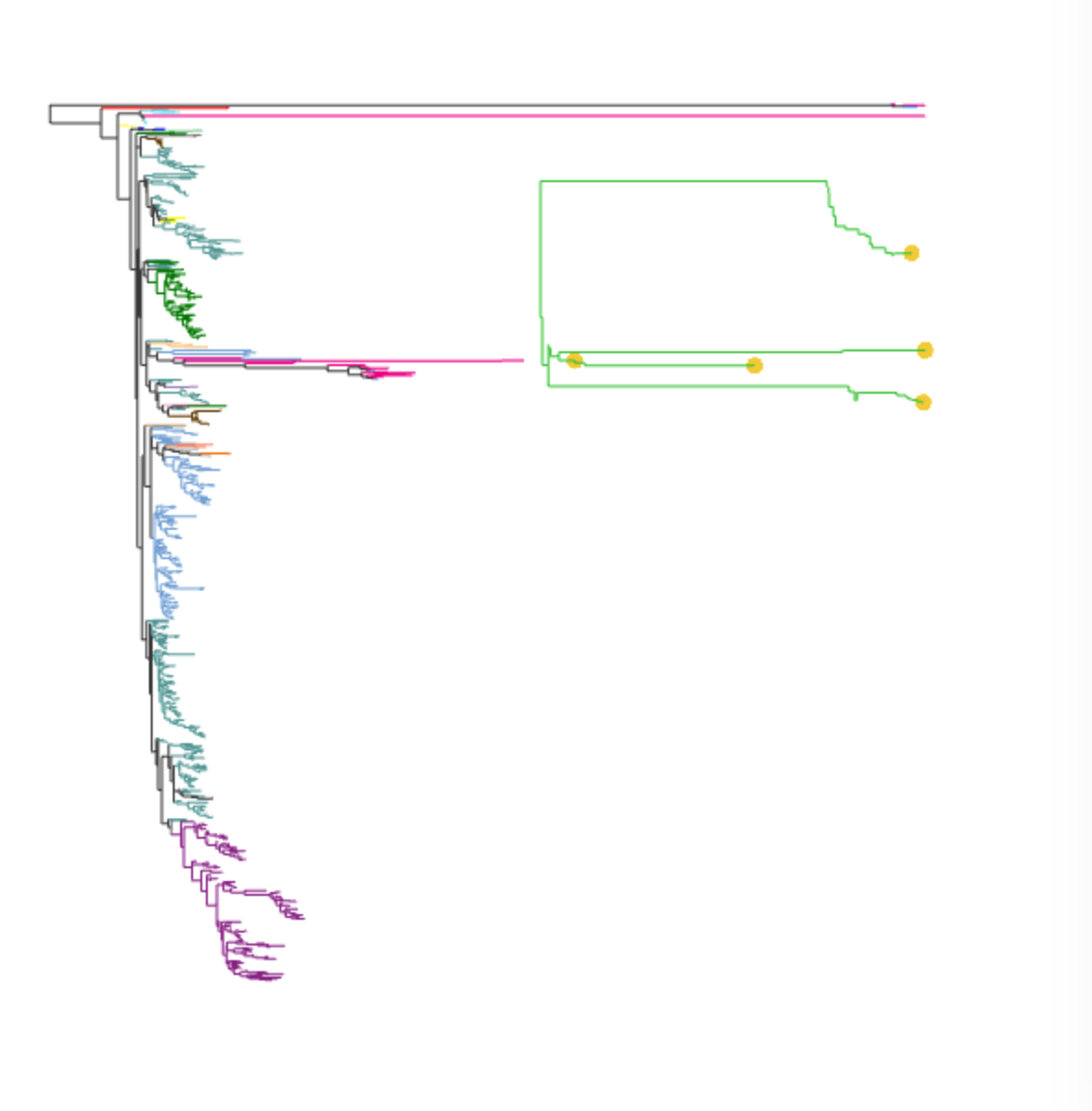
This PR attempts to address #491. The goal of this pr is not necessarily to review the code but to test the basic concept to better improve the interface/way users interact with it. The current method, finds the lca of two nodes on the tree and highlights/calculates the distance of the shortest path connect the two nodes with lca. The code is generalizable enough to adopt other methods and incorporate more nodes but I figured it was easiest to test things out with this method first.
To select the nodes you are interest in, simply hold down the shift key and select the two nodes you want to view. Once two nodes are selected, no more nodes can be selected until the reset button is triggered. The result should look as follows.
 I have tested the interaction of this feature with the rest of EMPress. This is mainly to get feedback on the basic concept of this feature.
The following artifacts were built for this PR: empire-biplot.qzv, empire.qzv, empress-tree.qzv, just-fm.qzv, plain.qzv
Super cool! Some notes from testing this out:
I know we're focusing on broad functionality rather than details right now, but it looks like selecting internal nodes sometimes (but not always) causes an error?
empress.js:558 Uncaught TypeError: Cannot read property '7' of undefined
    at Empress.getNodeInfo (empress.js:558)
    at addCoordsToBuff (empress.js:3859)
    at Empress.colorLCAPath (empress.js:3902)
    at Empress.pathSelectorUpdate (empress.js:3971)
    at abstract-observer-pattern.js:50
    at Function.h.each.h.forEach (underscore-min.js:5)
    at PathSelector.notify (abstract-observer-pattern.js:49)
    at PathSelector.addNode (path-selector.js:44)
    at Empress.setSelectedNode (empress.js:3954)
    at CanvasEvents.placeNodeSelectionMenu (canvas-events.js:428)

I really, really like the idea of using shift to select multiple nodes. However, I think users might be confused by the need to repeatedly click Reset.
What do you think about building up a table of all the shift-selected nodes (like I proposed in #491), and then adding UI controls to let users display distances between arbitrary pairs of nodes in this table? (I'm aware this would probs be a fair amount more work, so if you'd like to put a pin in that for later it's cool with me.) This would remove the need for users testing out multiple distances to repeatedly go shift-click / shift-click / Reset / shift-click / shift-click / Reset / ....
It's possible to select the same node twice:

This is fine, but I'm not sure it makes sense for the distance from a node to itself to be the node's branch length; I think it makes more sense for this distance to be 0 (and maybe to leave this node uncolored).
@kwcantrell, thanks so much for putting this together. Here's a few notes that I gathered from playing around with this over the weekend:
- The marker for selected nodes should be shown in all selected nodes i.e. not just in the last one.
- Shortest Path should be changed to Node Selection Summary or something more generic and a bit less technical. You already have an explanation of what is highlighted when nodes are selected so it should be fine to change the menu's title.
- Node identifiers in the menu should be "explorable". We should be able to compare the metadata associated with the two nodes that have just been selected. One way I can think of is to show one table (nodes as rows, metadata variables as columns). Then also show a button that shows you only the fields that are different between the two rows. And a button to show you only the fields that are the same between the two rows. This should help case investigators quickly figure out date, location, and source differences for two nodes.
- The shortest path should be highlighted behind the tree. Instead of coloring the nodes in green, the shortest path should be highlighted by a separate and thicker (maybe 1.20x the current branch thickness) path drawn behind the tree. Ideal case is with one thicker outline in black and one thiner outline in white so that regardless of the color the path's highlighting will be visible (I understand technically speaking this is much harder).
- Node selection should be done on a first in first out basis. This would help not needing to click on the reset button. This way you could click on node 1 and node 2 -> see the highlighted path between 1 and 2 -> click node three and now see the highlighted path between 2 and 3 (down the road this can be upgraded to support selecting more than 2 nodes at a time without many changes to the UI/UX).
- Show number of nodes in path. Showing the distance between the nodes in the path is very helpful but it would also be helpful to show the number of nodes in the path. In the future you could potentially list the metadata for the nodes in the path.
- What should this do to the EMPeror side of things? Highlight the union of samples that are covered by this path? If so we'll need a new notification/event.
This is super cool! I am very excited at the new use cases that will follow from enabling this functionality. Seeing how performant this is so far is very encouraging.
🔎 🌲 🧙
Thanks @fedarko and @ElDeveloper for the initial feedback. I was able to make some substantial changes by addressing some of the things brought up.
I really, really like the idea of using shift to select multiple nodes. However, I think users might be confused by the need to repeatedly click Reset.
I completely agree. The reset button is definitely not an ideal solution. So, I have begun creating a menu tab as @fedarko suggested.

This menu (similar to the shear menu) provides checkboxes that allow users to quickly toggle on and off selected nodes. Additionally, it is now possible to shift-click a selected node to unselect it (which I think will help address some of the concerns @fedarko had).
The marker for selected nodes should be shown in all selected nodes i.e. not just in the last one.
This is a good point. All selected node markers are now shown and I also changed the color to differentiate from the normal node menu marker .
Node identifiers in the menu should be "explorable". We should be able to compare the metadata associated with the two nodes that have just been selected. One way I can think of is to show one table (nodes as rows, metadata variables as columns). Then also show a button that shows you only the fields that are different between the two rows. And a button to show you only the fields that are the same between the two rows. This should help case investigators quickly figure out date, location, and source differences for two nodes.
I think this is a really good idea! I included three options to view metadata: Same metadata, All metadata, and Different metadata. (still try to think of better names for them:smile:) Essentially, they work as @ElDeveloper described. For example, by selecting these two features, we can now easily view their metadata and see what values they do/don't share.

| Values Shared | All metadata | Values that are different |
|---|---|---|
 |
 |
 |
You can also select more than two nodes :boom:!

If we look at the metadata table for all the selected nodes, it would probably take a few minutes to see what these feature have in common. However, if you click on a column header, the table will not only sort itself but also color the cells based on similar values. You can do this with either the Same metadata or All metadata tables. The only difference being that I remove all unique values in the Same metadata. In the below example, I wanted to see which selected values shared a Level 3 taxonomic assignment. I used the both the Shared metadata and All metadata tables so you can see the difference.
| Values Shared | All metadata |
|---|---|
 |
 |
Currently, I am just using the Qiime2 color scheme but it shouldn't be too difficult to add the other ones.
For completeness, here is the Different metadata table for the selected nodes. We can see that only two features do not share a taxonomic assignment with at least one other selected node.

There are still a few things I need to address for example, however the shortest path is being visualized. Currently I am just coloring the branches green which is not ideal.
@kwcantrell this is spectacular. The Node Selection tab is super fun to play with. I very much like the ability to keep all selected nodes around and leaving it up to the user to determine when those should be disposed. Particularly important for cases when someone is looking at a set of interest. The metadata exploration capabilities are also crazy helpful! Taxonomy metadata is not the best to showcase this, but with more phenotype metadata this is super helpful (dates, collection locations, etc).
Sorting the columns values is super helpful - great idea. Highlighting the values with colors is helpful but might be redundant with the sorting. That being said, I would say let's keep this around and see how users respond to this.
The multi-node selection works very smoothly.
Some minor UI suggestions:
- Can you label the metadata table according to the button that was pressed. For example if showing the full metadata, the header of the metadata window should read
All Metadataor something like that. Maybe this is a good place to add an explanation of what's being displayed. - When holding shift, it would be good if we could give users feedback about "entering a selection mode". I think the easiest way to do this is if you use the browser's native cursor types. For example I think you can change the mouse to
pointerwhenever shift is being held and on the canvas.
For other's convenience, here's a direct link to a tree with these new features:
https://view.qiime2.org/visualization/?type=html&src=https%3A%2F%2Fmchelper.ucsd.edu%2Fdownloads%2Fempress%2F547%2Fjust-fm.qzv
For the pointer comment, here's Mozilla's documentation on the topic: https://developer.mozilla.org/en-US/docs/Web/CSS/cursor
This is amazing!!!
Had an observation of a "pointer-gone-missing" though. See the gif. Am using firefox. If I right click accidentally in the phylo window, the pointer then seems to disappear and unsure how to get it to come back

Fantastic work!!
I found an amusing bug: when rescaling the tree, the highlighted branches are not rescaled, leading to some fun art: