echarts
 echarts copied to clipboard
Apache ECharts is a powerful, interactive charting and data visualization library for browser

### What problem does this feature solve? 我想将线图分为几段,然后给每段分别渲染颜色及线下区域的颜色 ### What does the proposed API look like? ` visualMap: { type: 'piecewise', show: false, dimension: 0, seriesIndex: 0, outOfRange: { color:...
### Version 5.3.2 ### Link to Minimal Reproduction _No response_ ### Steps to Reproduce 点击图例隐藏图表,轴单位未隐藏 ### Current Behavior  隐藏图例的时候,轴的单位未自动隐藏 ### Expected Behavior 期望隐藏图例的时候,轴的单位也隐藏 ### Environment ```markdown - OS: -...
### Version 4.2.1 ### Steps to reproduce X轴为对数轴,图表类型为bar,堆积图,会导致X轴数据与实际的总数据不匹配 ### What is expected? 正常显示echarts图 ### What is actually happening? 数据没办法对起来 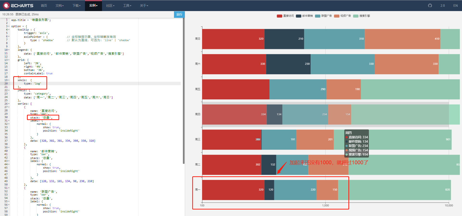
### Version 5.3.3 ### Link to Minimal Reproduction https://echarts.apache.org/examples/zh/editor.html?c=funnel&version=5.3.2&code=PYBwLglsB2AEC8sDeAoWtJgDYFMBcya6GOAHmAQOQBiArtNDlpUQL4A0RYwwWkIBVMQwAnCAHNxOEVQhgcAW0qdhAM2AiFAQzDyZsSki2tYAHgBGIgPQA-JOZOCAxqwCkLdBy48s54KUEidFUcHVoRfEJhdAATHS0ANQgcAHdBWAitGIB5aCwATwJVLSwAZxxYL2iMnFLuCMEq6NKtADccAEFSgEltKUagyrYVWFwpaBjA4TiwLQIAbUoAZQALYBTlAwBhLAgnAGtNyiTSuSPu6ABHWggRfKPskRjpSgBdYaJysVqFwaFo6BaBSRGj0RjMEbCMD5EAg1RgpjKQboXCqCgGACMAAZ3JDiNwBLAAGxYvHoPy6YAKAgksmwFIQGJgFZUAAcOKR1QUEGgBFJyNg2gCsGx_K5PKWEAAXiCOXShZKZVRRbiBaUNOjKM9Sk4cBMeeJOdFxFpCQAmOlYLTmJhTaqwUprNKiWg4OnoEDAU6QGCyaCnZ4eaJNYRWm1YAAyPMi_2quGg4mZBGx7tG0aW0Nwdvt9MZSZFqfQ0NhVHVuxiQeqrAFIeIYaYEa0-WAtHRseiwsoAFZ3DW6XJFBn8lmova_E9pFteBoqABiVQLo3VcfPEQAdTzLJFfYFihAKy0p1K2ei9awJ-q6mgYEVkTNWIFnh31Rmc1g80fyFgrRKrpppNgQFgSoE4zkqVMkG_X9IgAFgAoCQQua5bnucDP0gn8sD_WB73YQCgRBR5V0oNCcww6CCHZPCEKoHY9kOUj7XIrDIlFaiCKoVZ1hI6tqneYReNgd5WAAbiAA ### Steps to Reproduce 1. 使用示例图中第一个漏斗图。 2. 增加labelLayout配置,将标签水平放置于左侧统一的 `x` 处。 3. 运行后漏斗图展示正常,标签位置正常。 4. 点击任意图例,隐藏某一列后,图形重绘,此时发现标签的位置错乱。 ### Current Behavior - 错误的情况 ...
### Version 5.3.2 ### Link to Minimal Reproduction https://codepen.io/ling310/pen/zYRwjJp ### Steps to Reproduce https://codepen.io/ling310/pen/zYRwjJp ### Current Behavior  the rightmost symbol and axisLabel(as red) is show before them move inside...
### What problem does this feature solve? 碰见一个问题, 在使用 Series.Custom 开发自定义样式的饼图时, 使用Legends组件只能映射到 series.name. 没有映射到 dataset 上面, 考虑到 Custom 图 是为了应对特殊场景下echarts官方提供的Chart无法满足使用的情况, Legends 只映射到Legend可以理解。 但是有一个更好的想法, 在 Custom Chart 的配置项中, 暴露一个`LegendVisualProvider`的接口, 允许引入自定义的LegendVisualProvider实例, 就可以满足...
### What problem does this feature solve? now only a bar without range, if use piecewise, it show several stacked bar ### What does the proposed API look like? 
### What problem does this feature solve? 需要使用自定义系列实现转化漏斗图,希望legend的name也可以像echarts本身支持漏斗图那样,可以映射到单个数据的name上(或者能映射到renderItem返回的对象的name上),否则legend默认就是映射到series.name ### What does the proposed API look like? https://echarts.apache.org/examples/zh/editor.html?c=funnel 希望自定义系列的legend,也能像原生支持的漏斗图那样,可以和单个数据的name对应上
### Version 5.2.0 ### Link to Minimal Reproduction _No response_ ### Steps to Reproduce I attempted to create a static title text in the center of the pie chart which...
### Version 5.3.1 ### Link to Minimal Reproduction _No response_ ### Steps to Reproduce 在5.2.2中正常,5.3.0之后异常 示例option ```ts option = { title: { left: 'center' }, color: [ '#F73809', '#0909F7', '#09F7F7'...