amshak
amshak
I don't think this is as intended design for this bottom sheet as it's not at the bottom of the screen :)
Will close this as we are redoing the space switching experience on Android.
It's looking great, thanks for working on this. I am proposing a few visual changes to make the errors clearer. 1. Consider putting the banner msessage in a headline body...
All sounds good to me!
It's looking great. Thanks @duxovni 😃
No this is not how it should look. I can create dark mode reference designs to make it clearer.
Here are a the dark mode screens covering most used components in the new proposal. [Link to figma](https://www.figma.com/file/Hw4gjP3pknMZUir8jQqmWH/%5BMobile%5D-IA-early-proposals?node-id=3986%3A172776) 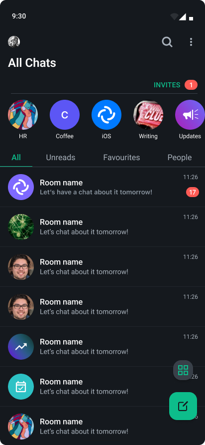
We should follow the standrard Android behavior in such scenarios.
According to material 3, on scrolling FAB should be visible still: https://m3.material.io/components/floating-action-button/guidelines. We should stick to native behavior. We can change it later if needed
We wanted to use a default bottom sheet but I agree it doesn't look very nice. Ill work on this next.