Bluewave2
![]()
Bluewave2
Any thoughts? :)
> Not a fan of the dark theme (too grey for my taste), otherwise looks pretty good. However, this not up to me. ping @Chocobo1 @sledgehammer999. Thanks, by too grey...
@FranciscoPombal what do you think? alternate color scheme 1 ff style  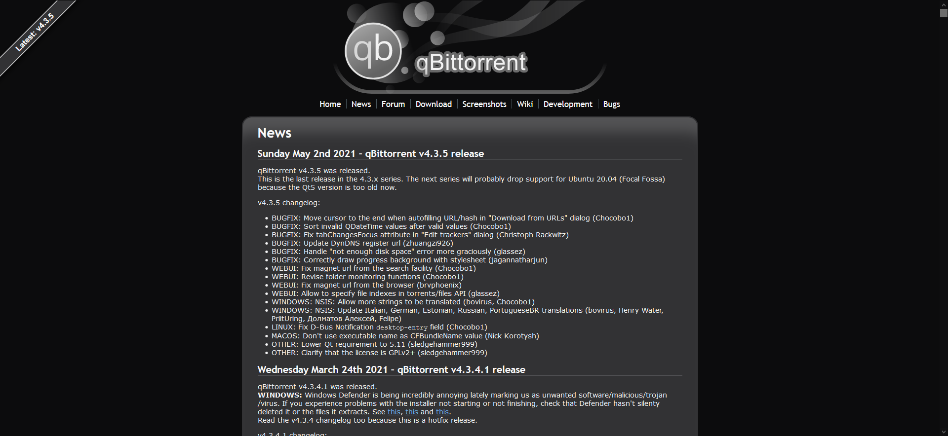 2 windows style (text color is off , but generally you get the idea) 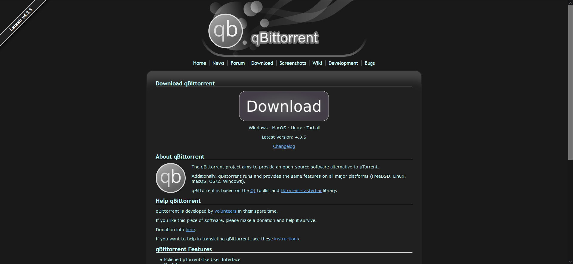...
> Unfortunately I'm not a fan of any of them, but out of all of them, the first is my favorite. Again, you don't have to please me, since I...
> GitHub itself is nice; darker than your original proposal and without a "tint", but not as dark as some of the follow-up ones. The one from stackoverflow is also...
@Chocobo1 @sledgehammer999 could I get your feedback please?
> could you please use the new windows icon? x Sure, I will make it when I have the time.
- Improved dark mode color scheme - Improved gradient on download button - Improved dark mode coloring of download button - Improved dark version of QB logo - Replaced old...
@sledgehammer999 @Chocobo1
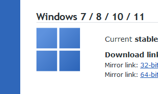
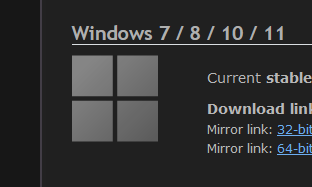
Replaced Windows 10 logo with Windows 11 (I thought it didn't look as good as the 10 logo but I understand) Screenshots: