zulip
 zulip copied to clipboard
settings: Convert names to pills in organization settings.
- [x] Convert the plan anchor tags to pills displaying the user's avatar with the proper user name.
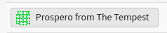
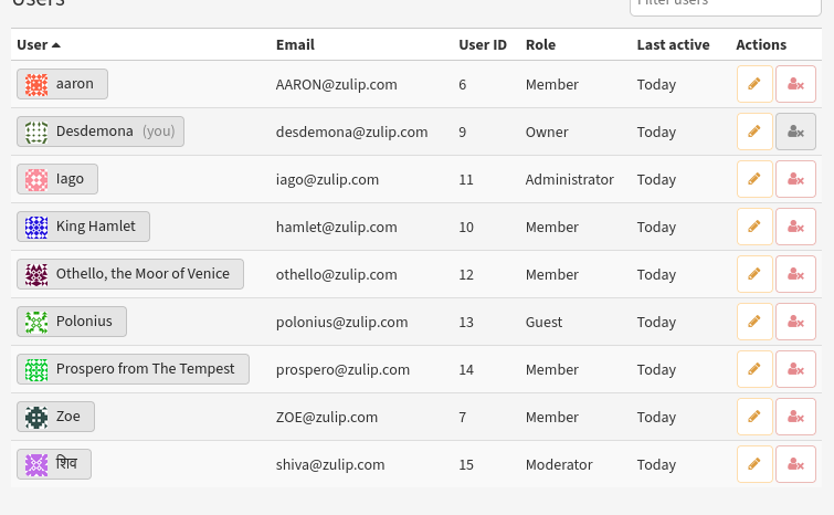
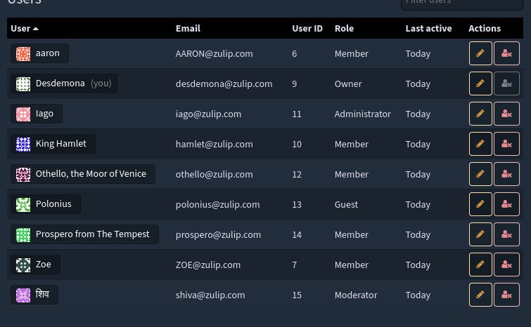
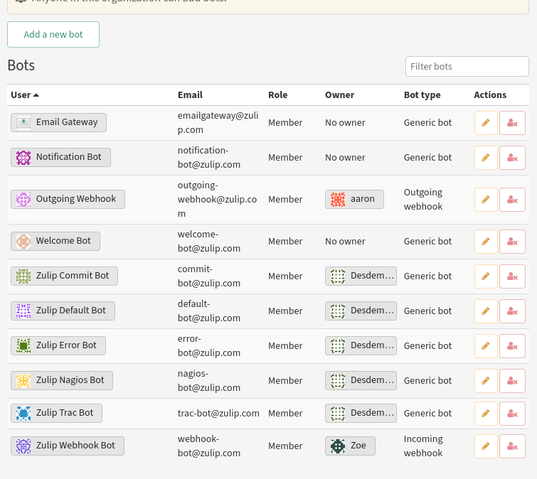
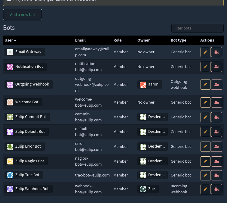
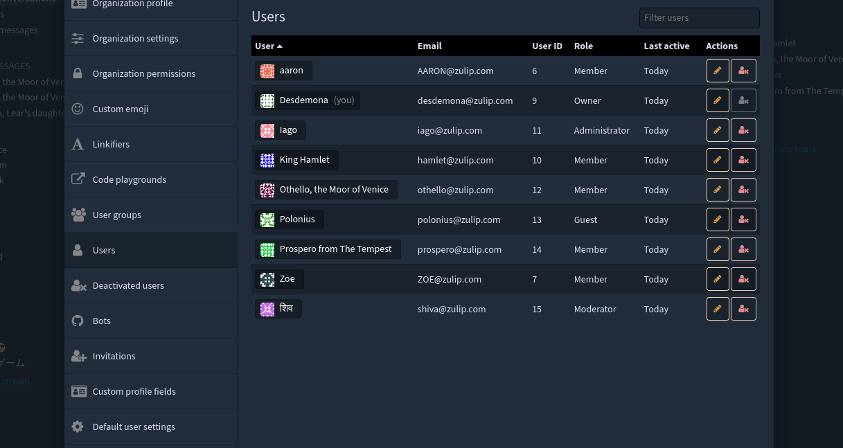
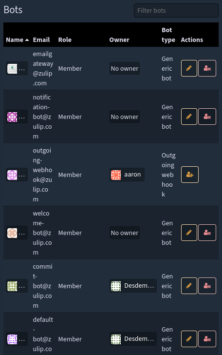
- [x] Users, Bots, Bot owners, Deactivated users all are migrated to pills.
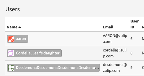
- [x] If the name is too long or the viewport becomes smaller, the user's name is trimmed and abbreviated with ellipsis
... - [x] When the viewport goes below 'lg_min' (992px), the email column is dropped from all three tables: users, deactivated
users, and bots. - [x] Show
no owneras a plain text inside bots table. - [x] Rename name column to
User. - [x] Adjust the column widths to improve the visibility of tables.
- [x] Change the color of the pills for the dark theme.
- [x] Change the default width of the user column from 100px to occupy 30% of the space.
- [x] Add a tippy tooltip for name pills.
Fixes: #24229 CZO: Thread for Rows issue: Thread
Screenshots and screen captures:
Overall Changes:
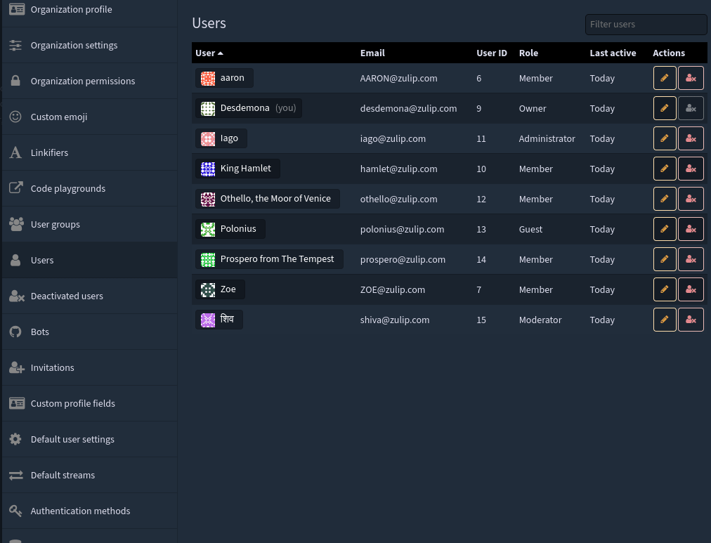
User Pill:
| Light | Dark |
|---|---|
 |
 |
Ellipses Change:
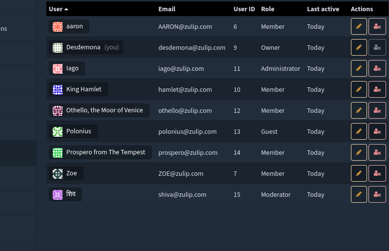
Users UI:
Light:
Dark:
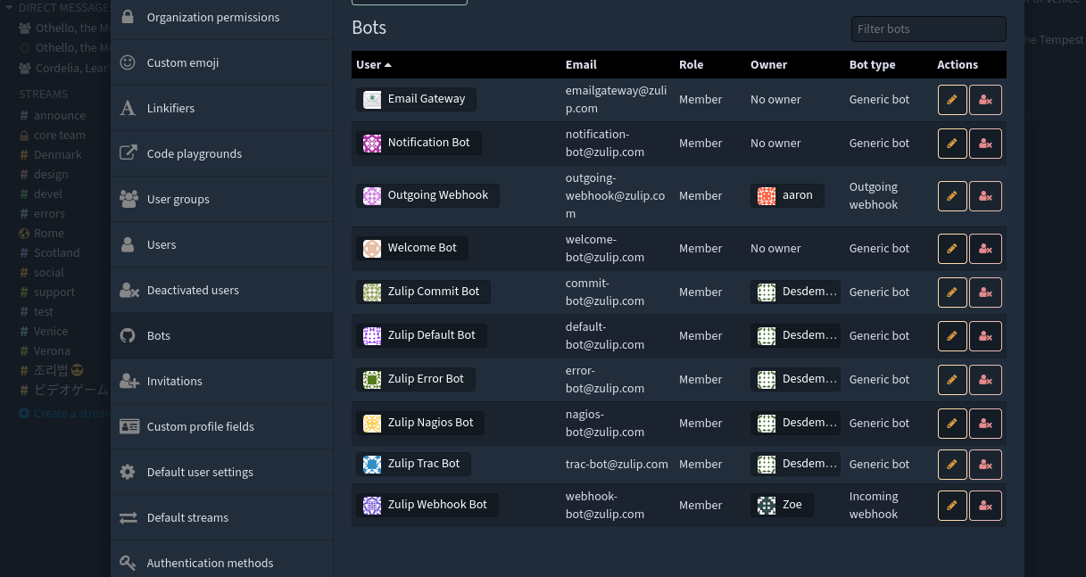
Bots list:
Light:
Dark:
View port changes:
Bots list:
Users list:
Tippy tooltip:
Self-review checklist
- [x] Self-reviewed the changes for clarity and maintainability (variable names, code reuse, readability, etc.).
Communicate decisions, questions, and potential concerns.
- [x] Explains differences from previous plans (e.g., issue description).
- [ ] Highlights technical choices and bugs encountered.
- [x] Calls out remaining decisions and concerns.
- [ ] Automated tests verify logic where appropriate.
Individual commits are ready for review (see commit discipline).
- [x] Each commit is a coherent idea.
- [x] Commit message(s) explain reasoning and motivation for changes.
Completed manual review and testing of the following:
- [x] Visual appearance of the changes.
- [x] Responsiveness and internationalization.
- [x] Strings and tooltips.
- [x] End-to-end functionality of buttons, interactions and flows.
- [x] Corner cases, error conditions, and easily imagined bugs.
Hello @zulip/server-settings members, this pull request was labeled with the "area: settings UI" label, so you may want to check it out!
I have tested this on current Firefox (109.0.1). It works according to the screenshots and almost - to the description in #24229 except Bots panel. If I understand #24229 corectly, bot and owner names must have avatars too, but now they don't.
Hey @sov-j , the multiple columns in the bot-panel have limited space, which is causing an issue as the inclusion of both bot and bot owner's avatar is taking up too much space, resulting in the names being obscured on narrow screens due to the lack of space.
This is how it looks on narrow_screen:
Sure, it makes sense to me, it is just not exactly what #24229 states as requirements, so as a tester I had to mention it :)
Hey @alya , could you please review the PR and suggest if any changes are required, Thanks.
The pills do not look right in light theme:
Please post updated screenshots when this has been fixed, and be sure to test visual changes in both themes next time. See https://zulip.readthedocs.io/en/latest/contributing/code-reviewing.html#manual-testing for detailed manual testing guidelines.
Other notes:
- Clicking anywhere in the pill (not just the name) should open the user card.
- The hover colors look quite bad in dark theme. We probably don't need to make the pill green on hover, and we definitely don't need to make the name within it blue.

Hey @alya , I have implemented all the changes suggested by you and updated the PR description with the latest changes in both light and dark mode. Could you please review the PR again? Thanks.
Thanks! This looks reasonable to me now, but I think it would be worth posting some screenshots in #design in case other folks have feedback.
The one tweak I noted is that we shouldn't show a hand cursor for "No owner" on the bots tab, since clicking on it doesn't do anything. I'm not sure if "No owner" works best as a pill or just plain text.
Dropped a message in the #design thread for both the suggestions. Thread
Hey @alya , I have made all of the suggested changes and updated the description, could you please review it again? Thanks.
Thanks! All the screenshots / screen captures look good to me.
@sahil839 maybe you can review at this point?
Update: I have made all the suggested changes, and only the last part of the issue remains, which is to make the user's column sticky on narrow screens. I have exams until April 15th, so I will continue working on this after that and will refactor the code. Thanks.
Edit 1: My exams are over; however, I am prioritizing the release goals (PRs) more right now. I will get back to this PR once those are completed.
Posted few comments. A couple of points -
* Is there a reason the pills in these sections are different? And do we plan to make all the user pills consistent? * We increased the role column width to fit the `Administrator` text, especially as it is quite long in a couple of languages other than English. In English also, it looks odd with current minimum width value 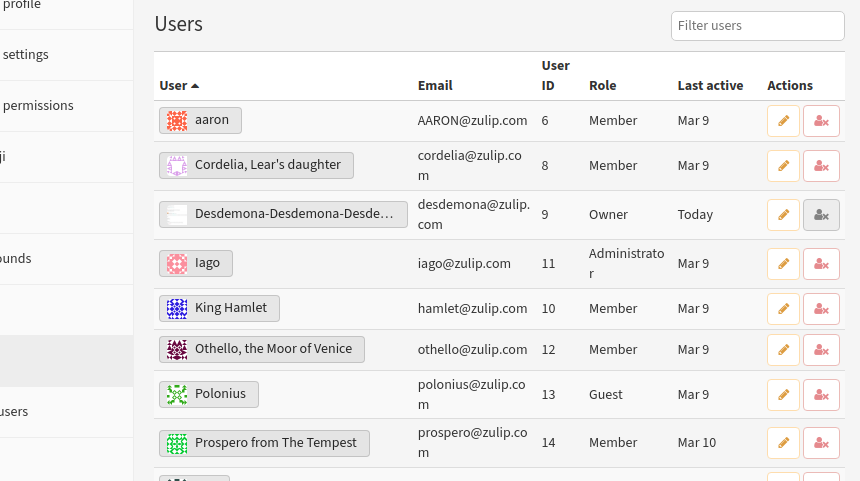 * We can probably add tooltips when hovering hover the pills. It can be helpful to show long names.
-
We can open a separate issue to simplify all the user pills throughout the app. There are many instances where we use different user pills, so it would be a good idea to have a separate issue for this migration.
-
Recently, we have set a minimum width of 100px for every column in the table. This fixes the administrator issue you mentioned.
-
Yes, we can add a tooltip for user pills. Would you like me to make that change in this PR or should I open a new PR? Additionally, I believe this can be done for every user pill throughout the app.
Update:
There is a small CSS issue, started a thread for this :CZO
We can open a separate issue to simplify all the user pills throughout the app. There are many instances where we use different user pills, so it would be a good idea to have a separate issue for this migration.
I am not sure what version would be better, the one we have in this PR or the existing one. We can have more feedback on this.
Yes, we can add a tooltip for user pills. Would you like me to make that change in this PR or should I open a new PR? Additionally, I believe this can be done for every user pill throughout the app.
Would be fine doing in this PR as well, and having a separate commit would be ideal. For other pills in the app, I am not sure. I think it will be helpful where we clip the names due to width restriction, but maybe not helpful for all cases.
@sahil839 , I have implemented all the changes you suggested and added a tippy tooltip to display the names. I have also updated the pull request (PR) description with the latest changes and included screenshots.
@sahil839 @karlstolley I have updated the PR with the latest changes and the method you suggested, could you please review the PR, thanks :) and this is the overall change after removing the alpha dependency, I have updated the CZO thread in the PR description for any review:
I am not sure why backend tests are failing, I haven't made any changes in it.
The pill does not live-update correctly when I change a user's name (I have not tested by changing other settings) from the "Manage user" modal. Looks good to me otherwise.
And as I mentioned above, the pills added here are inconsistent with the ones that exist already. I also noticed, we do not show the user's status emoji in the pills added here. So, would be useful to make them consistent in future and also probably remove some duplicate CSS.
I agree with @sahil839 here, quite strongly:
And as I mentioned above, the pills added here are inconsistent with the ones that exist already. I also noticed, we do not show the user's status emoji in the pills added here. So, would be useful to make them consistent in future and also probably remove some duplicate CSS.
Would it not be possible to rework the input_pill.hbs file? I could even imagine making that into something like user_pill.hbs in a way that perhaps takes a variable for whether or not to display the X--which is needed in the compose box but not in this case.
@karlstolley @sahil839 Thanks a lot for the feedback, I have started a CZO Thread for further conversation on this, Thanks a lot :)
Heads up @palashb01, we just merged some commits that conflict with the changes you made in this pull request! You can review this repository's recent commits to see where the conflicts occur. Please rebase your feature branch against the upstream/main branch and resolve your pull request's merge conflicts accordingly.
Hey @alya. This PR could be marked as close as the issue has been completed by another PR.
Thanks for all the work on this @palashb01. Closing this since this completed in #30371.