In documentation, style breadcrumbs navigation to look less like tabs
Problem
I used the documentation at https://ziglang.org/documentation/master/std/ on two previous days. Both days, I failed to understand what this section with the orange rectangle was supposed to mean:
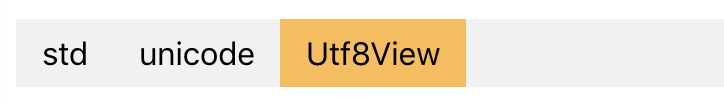
(The example page is unicode.Utf8View (Struct). That confusing section in context:)

On all the pages I noticed that list on, I recognized that the orange rectangle part (e.g. “Utf8View”) was the current page, but didn’t understand the meaning of the previous parts. My best guess was that it was a list of open tabs. I thought “I don’t remember opening any tabs… I guess it opens tabs for me automatically based on my history. Yet I don’t remember visiting pages named “std” or “unicode”… well, whatever. Let me just read the documentation I searched for.”
It was only today that I realized that those aren’t supposed to be tabs – they are supposed to show the hierarchy of the current type. In other words, they are breadcrumbs. (I realized that after finding std.mem.split – I think the shortness of that name helped me recognize the fully-qualified name in the breadcrumbs more easily.)
Search keywords: the navigation section’s HTML has ids sectNav and listNav.
Ideas for solutions
I think the styling of those breadcrumbs could make their purpose clearer. Some ideas:
-
Put ‘>’ between the segments.
std > unicode > Utf8View -
Put only textual dots between the segments. Rust’s documentation uses styling somewhat similar to this.
std.unicode.Utf8View -
Put dots between the segments with a bit of extra spacing to suggest that each part is clickable.
std . unicode . Utf8View -
Turn the rectangles into chevron shapes. It would look something like this:
❯ std ❯ unicode ❯ Utf8View ❯
This warning?
These docs are experimental. Progress depends on the self-hosted compiler, consider reading the stdlib source in the meantime.
I had already read that. I’m not sure what you mean.
Are you trying to suggest that it’s useless to leave feedback about the docs because they’re not finished yet? I don’t think that follows. The docs website, though unfinished, has benefits over reading the source code – for example, it’s easier to use on mobile. Thus, improving the docs website would help people who use it now for those benefits.
Even if nobody is interested in changing the docs website until the self-hosted compiler is better, I think it’s worth noting this opportunity for UI improvement so that it isn’t missed when that time comes. I wouldn’t want the brand-new, fancy docs website to unthinkingly carry over the current website’s breadcrumb design.