The market chart is hard to understand at a glance and hard to understand at longer.
The chart is hard to read. A user without much knowledged would struggle to understand what is going on.
Suggestions (not all can happen):
- Show between max and min ZTG
- Allow user to scale y axis
- "Implied % odds" on left-hand-side
- ZTG scale on right-hand-side / by clicking a button
- Coloured bars for different options
The market Who will win the 2022 FIFA World Cup? is a good example for that:
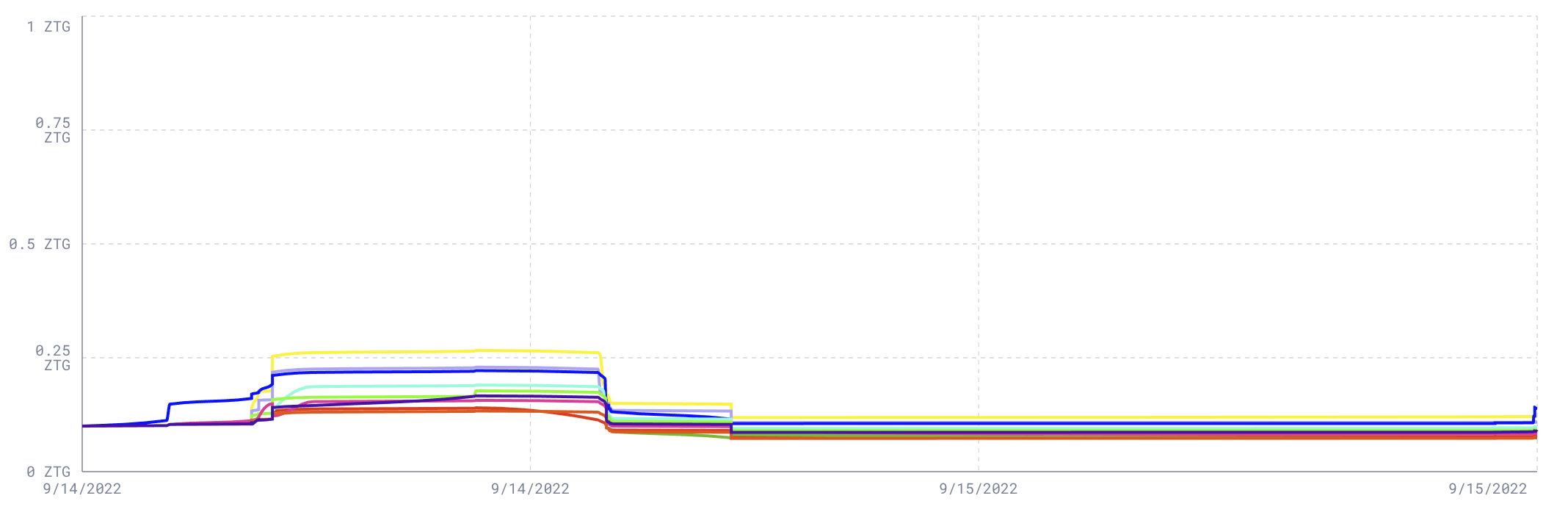
As we can see in the image above, much information gets visually lost due to the representation. Applying functions on the values of the chart might also be helpful, such as showing the logarithmic values.
Here is an alternative way that Manifold does it:

I suggest that it would make more sense if it was "Implied % odds". That feels more like how users will think.
I agree @Nathanpmyoung . In that case a normalization must happen, such that sum(outcome_percentages) = 100, since currently arbitrage is possible (i.e. sum(outcome_percentages) can be greater than 100).
Sure, seems reasonable. and it’s fine because it says, implied
Yours,
Nathan Young
M 07891 020271 W nathanpmyoung.com T @.** https://twitter.com/nathanpmyoung
Personal newsletter https://tinyletter.com/nathanpmyoung
If I can put you in touch with someone, please ask.
Sent via Superhuman iOS @.***>
On Fri, Sep 16 2022 at 3:33 pm, Harald Heckmann @.***> wrote:
I agree @Nathanpmyoung https://github.com/Nathanpmyoung . In that case a normalization must happen, such that sum(outcome_percentages) = 100, since currently arbitrage is possible (i.e. sum(outcome_percentages) can be greater than 100).
— Reply to this email directly, view it on GitHub https://github.com/zeitgeistpm/ui/issues/273#issuecomment-1249447285, or unsubscribe https://github.com/notifications/unsubscribe-auth/AE4IQNAEHQ3AK2I4YMMDDG3V6SAK7ANCNFSM6AAAAAAQNJRVXI . You are receiving this because you were mentioned.Message ID: @.***>
We used to use 0 to max values though @lsaether requested it be adjusted to this, do you still feel the same way?
I think the manifold graph in the description is the best way. Stacks of colours for each outcome.