blog
 blog copied to clipboard
 yanyue404
vant2 popup 源码学习
选取 [email protected] https://github.com/yanyue404/vant/tree/t_2.12.54/src/popup
在线文档:https://vant-contrib.gitee.io/vant/v2/mobile.html#/zh-CN/popup
popup 组件的用法
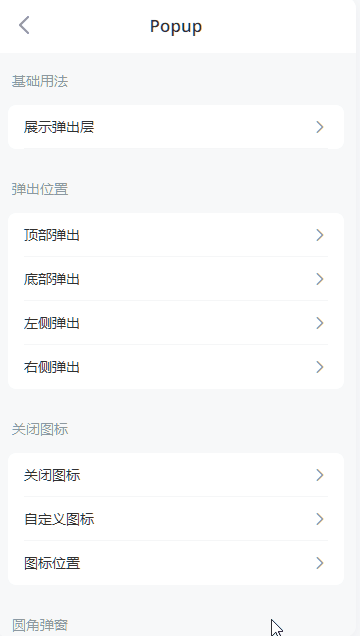
基础用法
通过 v-model 控制弹出层是否展示。
<van-cell is-link @click="showPopup">展示弹出层</van-cell>
<van-popup v-model="show">内容</van-popup>
export default {
  data() {
    return {
      show: false,
    };
  },

  methods: {
    showPopup() {
      this.show = true;
    },
  },
};
弹出位置
通过 position 属性设置弹出位置,默认居中弹出,可以设置为 top、bottom、left、right。
<van-popup v-model="show" position="top" :style="{ height: '30%' }" />
常用 api
官方文档(https://vant-contrib.gitee.io/vant/v2/#/zh-CN/popup)
| 参数 | 说明 | 类型 | 默认值 |
|---|---|---|---|
| v-model (value) | 是否显示弹出层 | boolean | false |
| overlay | 是否显示遮罩层 | boolean | true |
| zIndex(我的补充) | 自定义层级 | number | 2000 |
| position | 弹出位置,可选值为 top bottom right left |
string | center |
| overlay-class | 自定义遮罩层类名 | string | - |
| overlay-style | 自定义遮罩层样式 | object | - |
| duration | 动画时长,单位秒 | number | string | 0.3 |
| round | 是否显示圆角 | boolean | false |
| lock-scroll | 是否锁定背景滚动 | boolean | true |
| lazy-render | 是否在显示弹层时才渲染节点 | boolean | true |
| close-on-popstate | 是否在页面回退时自动关闭 | boolean | false |
| close-on-click-overlay | 是否在点击遮罩层后关闭 | boolean | true |
| closeable | 是否显示关闭图标 | boolean | false |
| close-icon | 关闭图标名称或图片链接 | string | cross |
| close-icon-position | 关闭图标位置,可选值为top-leftbottom-left bottom-right |
string | top-right |
| transition | 动画类名,等价于 transition 的name属性 |
string | - |
transition-appear v2.10.14 |
是否在初始渲染时启用过渡动画 | boolean | false |
| get-container | 指定挂载的节点 | string | () => Element | - |
| safe-area-inset-bottom | 是否开启底部安全区适配 | boolean | false |
进入组件源码
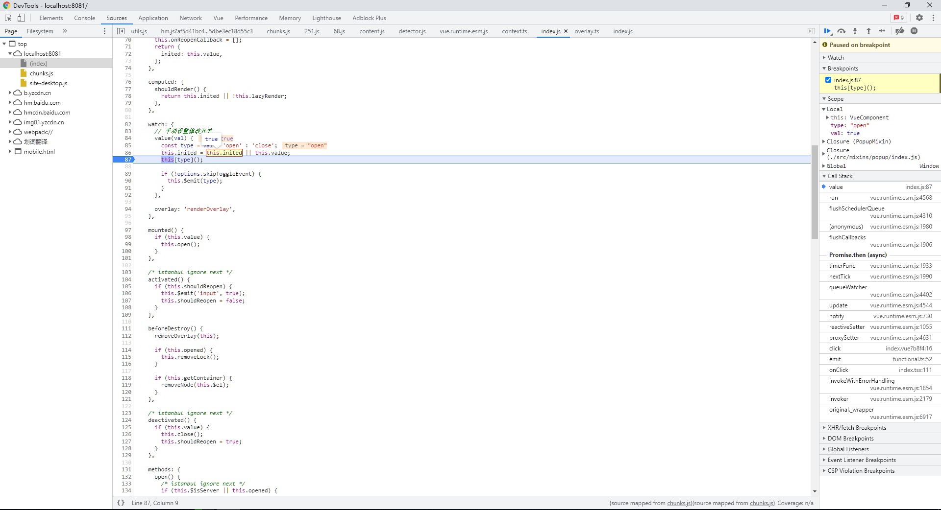
1. source-map 调试
[email protected] 是最后一个大的 vue2 语法的版本,vant 项目采用 git 多包管理项目。
vant 本地开发和打包使用的是 vant/packages/vant-cli, 据 changelog 可以看到 @[email protected] 版本开始支持在 webpack.config.js 中修改内部 Webpack 配置, 这样方便我们修改 source-map 配置而不用改源码。
在 vant 根目录已有的 webpack.config.js 文件添加 devtool 开启调试模式。
module.exports = function () {
  if (process.env.BUILD_TARGET === 'package') {
    return {};
  }

  return {
    devtool: 'source-map',
    entry: {
      'site-mobile': ['./docs/site/entry'],
      'site-desktop': ['./docs/site/entry'],
    },
  };
};
2. 组件声明
组件采用对象式 options 的方式构成,render 函数代替 template 语法, 可以更精细化的控制组件的逻辑渲染。
- createNamespace 创建组件命名空间
export function createNamespace(name: string): CreateNamespaceReturn {
  name = 'van-' + name;
  return [createComponent(name), createBEM(name), createI18N(name)];
}
- createComponent
export function createComponent(name: string) {
  return function <Props = DefaultProps, Events = {}, Slots = {}>(
    sfc: VantComponentOptions | FunctionComponent
  ): TsxComponent<Props, Events, Slots> {
    // 函数式组件
    if (isFunction(sfc)) {
      sfc = transformFunctionComponent(sfc);
    }

    // 普通对象式的
    if (!sfc.functional) {
      sfc.mixins = sfc.mixins || [];
      sfc.mixins.push(SlotsMixin); // 混入了 slot 的 mixin
    }

    sfc.name = name;
    sfc.install = install;

    return sfc as TsxComponent<Props, Events, Slots>;
  };

  function install(this: ComponentOptions<Vue>, Vue: VueConstructor) {
    const { name } = this;
    Vue.component(name as string, this);
    Vue.component(camelize(`-${name}`), this);
  }
}
- createBEM
/**
 * bem helper
 * b() // 'button'
 * b('text') // 'button__text'
 * b({ disabled }) // 'button button--disabled'
 * b('text', { disabled }) // 'button__text button__text--disabled'
 * b(['disabled', 'primary']) // 'button button--disabled button--primary'
 */

function gen(name: string, mods?: Mods): string {
  if (!mods) {
    return '';
  }

  if (typeof mods === 'string') {
    return ` ${name}--${mods}`; // 装饰类
  }

  if (Array.isArray(mods)) {
    return mods.reduce < string > ((ret, item) => ret + gen(name, item), '');
  }

  return Object.keys(mods).reduce(
    (ret, key) => ret + (mods[key] ? gen(name, key) : ''),
    ''
  );
}

export function createBEM(name: string) {
  return function (el?: Mods, mods?: Mods): Mods {
    // createNamespace 绑定了 'button'
    if (el && typeof el !== 'string') {
      mods = el;
      el = '';
    }

    el = el ? `${name}__${el}` : name;

    return `${el}${gen(el, mods)}`;
  };
}
动画交互
popup 组件的打开关闭蒙层和抽屉式打开效果采用 vue 的 transition [内置过渡组件](https://v2.cn.vuejs.org/v2/api/#transition)完成。
Vue 提供了 transition 的封装组件,在下列情形中,可以给任何元素和组件添加进入/离开过渡:
- 条件渲染 (使用 v-if)
- 条件展示 (使用 v-show)
- 动态组件
- 组件根节点
当插入或删除包含在 transition 组件中的元素时,Vue 将会做以下处理:
-
自动嗅探目标元素是否应用了 CSS 过渡或动画,如果是,在恰当的时机添加/删除 CSS 类名。
-
如果过渡组件提供了 JavaScript 钩子函数,这些钩子函数将在恰当的时机被调用。
-
如果没有找到 JavaScript 钩子并且也没有检测到 CSS 过渡/动画,DOM 操作 (插入/删除) 在下一帧中立即执行。(注意:此指浏览器逐帧动画机制,和 Vue 的 nextTick 概念不同)
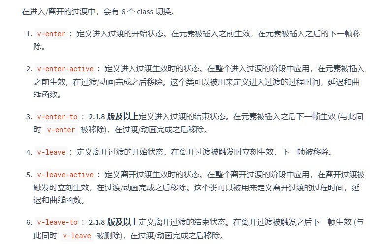
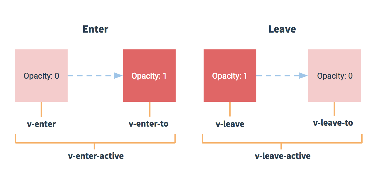
过渡的类名:
popup 组件用到的过渡 transition
-
蒙层
- 默认居中: van-fade
-
弹出层
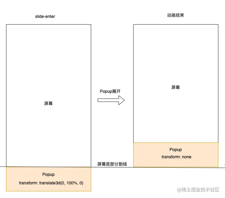
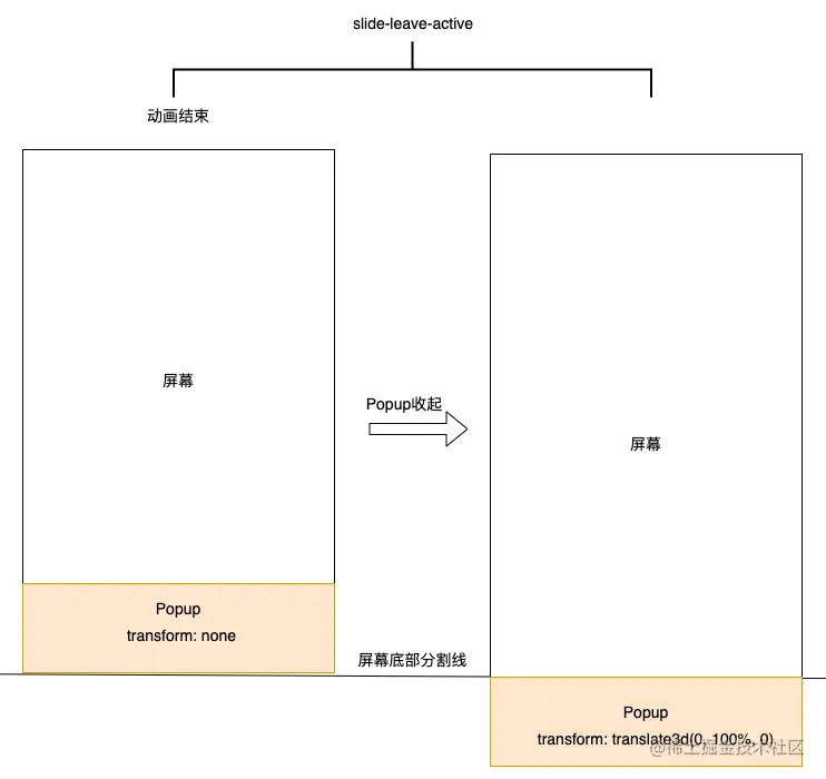
- 底部弹出 , van-popup-slide-bottom
蒙层 CSS 过渡类名(animation.less) :
- van-fade-enter(进入过渡开始), van-fade-enter-active(进入过渡生效),van-fede-enter-to (进入过渡结束)
- Van-fade-leave(离开过渡开始), van-fade-leave-active(离开过渡生效), van-fade-leave-to (离开过渡结束)
@keyframes van-fade-in {
  from {
    opacity: 0;
  }

  to {
    opacity: 1;
  }
}

@keyframes van-fade-out {
  from {
    opacity: 1;
  }

  to {
    opacity: 0;
  }
}
弹出过渡类名
- van-popup-slide-bottom-enter, van-popup-slide-bottom-enter-active,van-popup-slide-bottom-enter-to
- van-popup-slide-bottom-leave, van-popup-slide-bottom-leave-active, van-popup-slide-bottom-leave-to
@import '../style/var';

.van {
  &-overflow-hidden {
    overflow: hidden !important;
  }

  &-popup {
    position: fixed;
    max-height: 100%;
    overflow-y: auto;
    background-color: @popup-background-color;
    transition: @popup-transition;
    -webkit-overflow-scrolling: touch;

    &--center {
      top: 50%;
      left: 50%;
      transform: translate3d(-50%, -50%, 0);

      &.van-popup--round {
        border-radius: @popup-round-border-radius;
      }
    }

    &--bottom {
      bottom: 0;
      left: 0;
      width: 100%;

      &.van-popup--round {
        border-radius: @popup-round-border-radius @popup-round-border-radius 0 0;
      }
    }

    &-slide-bottom-enter-active {
      transition-timing-function: ease-out;
    }
    &-slide-bottom-enter,
    &-slide-bottom-leave-active {
      transform: translate3d(0, 100%, 0);
    }
  }
}
层级展示
当前后打开两个弹窗,用户的预期是按照打开的先后顺序,越后打开的弹窗在越上层,简而言之就是新弹窗永远在最上层。可以通过记录当前出现过的最大 zIndex,新弹窗zIndex = zIndex+1。 另外滑动穿透问题在多弹窗情况下也需要处理,对于非当前最高层级弹窗,不应当收到滚动影响。
this.$el.style.zIndex = ++context.zIndex + 1; // popup 加 2
context.zIndex++; // overlay 加 1
1. zIndex 控制层级
通过 mixin 的方式 openOverlay 打开遮罩层组件 Overlay
  renderOverlay() {
    if (this.$isServer || !this.value) {
      return;
    }

    this.$nextTick(() => {
      this.updateZIndex(this.overlay ? 1 : 0);

      if (this.overlay) {
        openOverlay(this, {
          zIndex: context.zIndex++,
          duration: this.duration,
          className: this.overlayClass,
          customStyle: this.overlayStyle,
        });
      } else {
        closeOverlay(this);
      }
    });
  },

  updateZIndex(value = 0) {
    this.$el.style.zIndex = ++context.zIndex + value;
  },
2. 层叠上下文
overlay、popup 两个组件展示是平级的,且 van-popup 始终比 van-overlay 层级高一级,确保 popip 内容 一定在遮罩上层展示。
<div class="van-doc-demo-block__card">
  <div role="button" tabindex="0" class="van-cell van-cell--clickable">
    <div class="van-cell__title"><span>顶部弹出</span></div>
    <i class="van-icon van-icon-arrow van-cell__right-icon"><!----></i>
  </div>
  <div role="button" tabindex="0" class="van-cell van-cell--clickable">
    <div class="van-cell__title"><span>底部弹出</span></div>
    <i class="van-icon van-icon-arrow van-cell__right-icon"><!----></i>
  </div>
  <div role="button" tabindex="0" class="van-cell van-cell--clickable">
    <div class="van-cell__title"><span>左侧弹出</span></div>
    <i class="van-icon van-icon-arrow van-cell__right-icon"><!----></i>
  </div>
  <div role="button" tabindex="0" class="van-cell van-cell--clickable">
    <div class="van-cell__title"><span>右侧弹出</span></div>
    <i class="van-icon van-icon-arrow van-cell__right-icon"><!----></i>
  </div>
  <div class="van-overlay" style="z-index: 2003; display: none"></div>
  <div
    class="van-popup van-popup--top"
    style="height: 30%; z-index: 2004; display: none"
  ></div>
  <div class="van-overlay" style="z-index: 2001; display: none"></div>
  <div
    class="van-popup van-popup--bottom"
    style="height: 30%; z-index: 2002; display: none"
  ></div>
  <!----><!---->
</div>
popup 组件为了避免 overlay 组件反复创建销毁,还在组件内部采用局部变量的方式维护了 popup context 的上下文。
import { OverlayConfig } from './overlay';

export type StackItem = {
  vm: any; // 每一个 popup 实例维护了一个与之对应的 overlay
  overlay: any; // overlay 实例,可以直接控制开关
  config: OverlayConfig;
};

export const context = {
  zIndex: 2000,
  lockCount: 0,
  stack: [] as StackItem[],
  find(vm: any): StackItem | undefined {
    // 全等也不怕,人家比较的是 this 指向的引用地址
    return this.stack.filter((item) => item.vm === vm)[0];
  },
  remove: function remove(vm: any) {
    const item = this.find(vm);
    if (!item) return;
    item.vm = null;
    item.overlay = null;
    const index = this.stack.indexOf(item);
    this.stack.splice(index, 1);
  },
};
3. 一个完整的打开关闭的代码流程
- van-popup 组件,v-model 默认关闭,用户通过按钮等途径触发打开 value 变为 true
- 监听器捕捉到 value 变为 true,调用 open
- open
- 记录已经打开 opened 为 true
- 设置 popup => zIndex + 2
- 记录 overlay => zIndex + 1
- 打开遮罩 openOverlay(如果 context 记录已经创建过则直接复用,否则再创建并收集到 context)
- 更新遮罩 updateOverlay,更新 overlay 与 popup 的层叠关系并更新 zIndex 为上次记录的
- 用户点击遮罩,默认关闭调用 close
- close
- closeOverlay,找到 context 里记录的遮罩 overlay 并设置
show = false - 记录已经打开 opened 为 false
- 同步 v-model,
this.$emit('input', false) -
vShow={this.value} = false, popup 也隐藏了
- closeOverlay,找到 context 里记录的遮罩 overlay 并设置
滑动穿透
- overflow:hidden 对移动端无效
- 直接阻止 document的 touchmove事件 (passive event)
- 浮层上面的滚动元素 (简单地规定带有 can-scroll类名的元素是可滚动的)
- 多个浮层同时存在时 (每个浮层一个实例,在lock变化时调用 lock或 unlock来解决滚动穿透)
  addLock() {
    if (this.lockScroll) {
      on(document, 'touchstart', this.touchStart);
      on(document, 'touchmove', this.onTouchMove);

      if (!context.lockCount) {
        document.body.classList.add('van-overflow-hidden');
      }
      context.lockCount++;
    }
  },

  removeLock() {
    if (this.lockScroll && context.lockCount) {
      context.lockCount--;
      off(document, 'touchstart', this.touchStart);
      off(document, 'touchmove', this.onTouchMove);

      if (!context.lockCount) {
        document.body.classList.remove('van-overflow-hidden');
      }
    }
  },
    onTouchMove(event) {
      console.log('touchmove 事件触发:');
      this.touchMove(event);
      const direction = this.deltaY > 0 ? '10' : '01'; // 10 向上, 01 向下
      const el = getScroller(event.target, this.$el);
      // scrollTop 已经滚动的高度(内容顶部卷起来的部分 >= 0)
      // scrollHeight 可滚动内容的高度
      // offsetHeight 元素内部的高度(含内边距)
      const { scrollHeight, offsetHeight, scrollTop } = el;
      let status = '11';

      /* istanbul ignore next */
      // 默认状态下,能滚动也还没滚
      if (scrollTop === 0) {
        // 00 不能滚,01 可以滚
        status = offsetHeight >= scrollHeight ? '00' : '01';
      } else if (scrollTop + offsetHeight >= scrollHeight) {
        // 10 可以滚
        status = '10';
      }

      console.log({
        el,
        scrollHeight,
        offsetHeight,
        scrollTop,
        status,
        direction,
      });

      /* istanbul ignore next */
      if (
        status !== '11' &&
        this.direction === 'vertical' &&
        // ! 拦截向上下两个方向不能滑动的情况,不要穿透了
        // 第一个 parseInt:选中 00 不能滚的情况 ('00', 2) = 0
        // & 按位与(在 a,b 的位表示中,每一个对应的位都为 1 则返回 1,否则返回 0)
        // 第二个 parseInt:选中上下两个方向,('10', 2) => 2, ('01', 2) => 1
        !(parseInt(status, 2) & parseInt(direction, 2))
      ) {
        console.log('滚动穿透被拦截了!');
        preventDefault(event, true);
      }
    },