Optimize list item layout for mobile.
The list of albums is not the best layout for mobile. This takes a long time to scroll through and it would be great if we could have the layout a little more mobile friendly. The same would also apply for playlists.
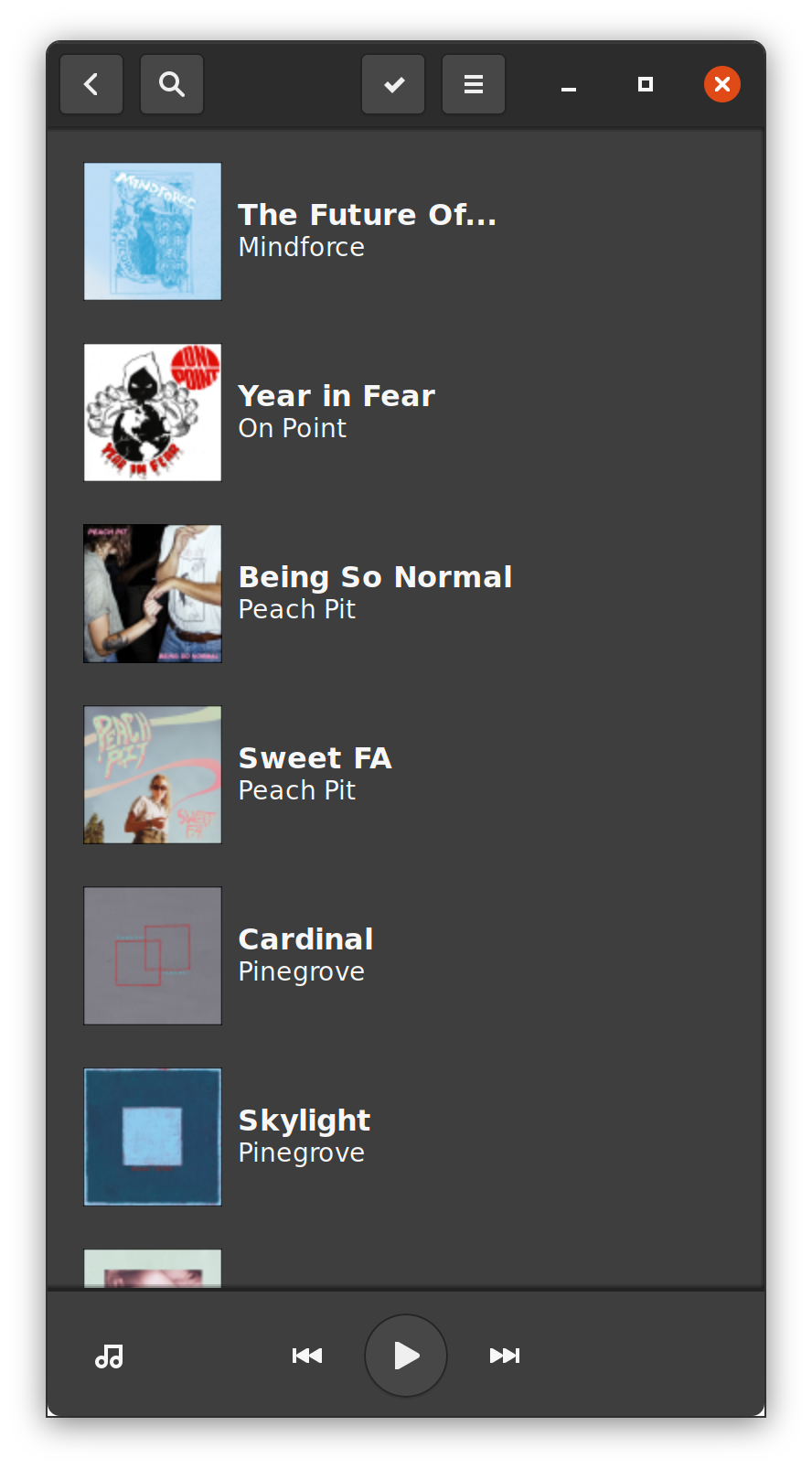
I managed to get a better layout to work using glade. However I haven't been able to figure out how to transition back to the original layout using libhandy. I build APIs for a living so this isn't really my forte. I'd love to pair with someone on this so I can learn and contribute more in the future.
I love this project by the way. It looks great on my pinephone, and my laptop!
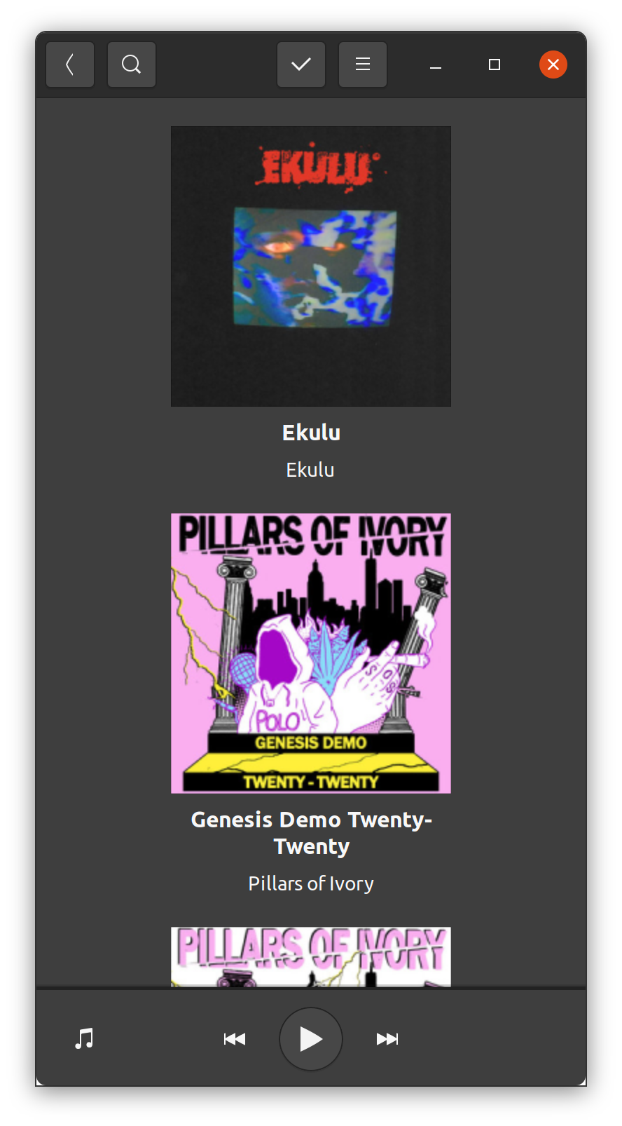
Screenshots
I like it! :) If someone wants to take a stab at it, I'd be more than happy to give some pointers!
There was also another person interested in a more compact list view (#162 ), both concerns could be addressed, with compact mode being used below a certain width threshold.
Probably can be done with a Squeezer
I'm definitely interested in giving this a shot. As far as the implementation goes, would creating two separate .ui files for mobile and desktop, then using a squeezer to switch between the two using a threshold be an acceptable solution? Part of me feels like that would be duplicating code in too many places. But again, I don't really have much experience with this stuff so perhaps that is the best solution.
There might some duplication, but not all that much I believe!
Both the classic album widget and this new compact widget could use the same AlbumModel.
Then the Squeezer and the ListBox could be added to library.ui, and they could be bound to the same ListStore, use the same ScrolledWindow for loading more content, etc... haven't had a proper look but it seems possible, definitely!
Sorry for the delay on this. I've opened #254 which should get the ball rolling, but this is a bit above my pay grade.