Aurora.Music
 Aurora.Music copied to clipboard
[Enhancement] UI/UX renewal
Hi everyone, I'm planning to make a bit layout change in Aurora Music, since some pages are not perfect yet, and the sidebar is still not quite easy to use...
Thus I opened this issue to collect some of your ideas to make a more fluent appearance of Aurora Music, I'll post some idea below, please give :+1: or :-1: to show your prefers. Obviously, don't hesitate to put your own idea in this issue. All of us will pick the best!
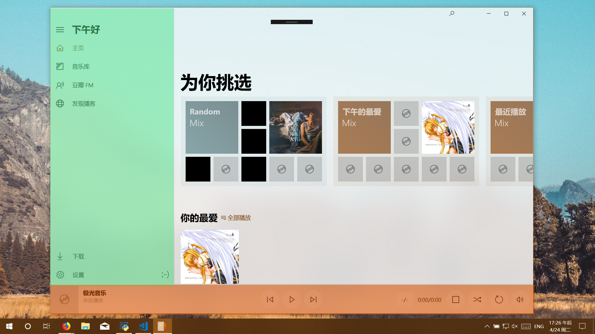
What do you think of this layout:
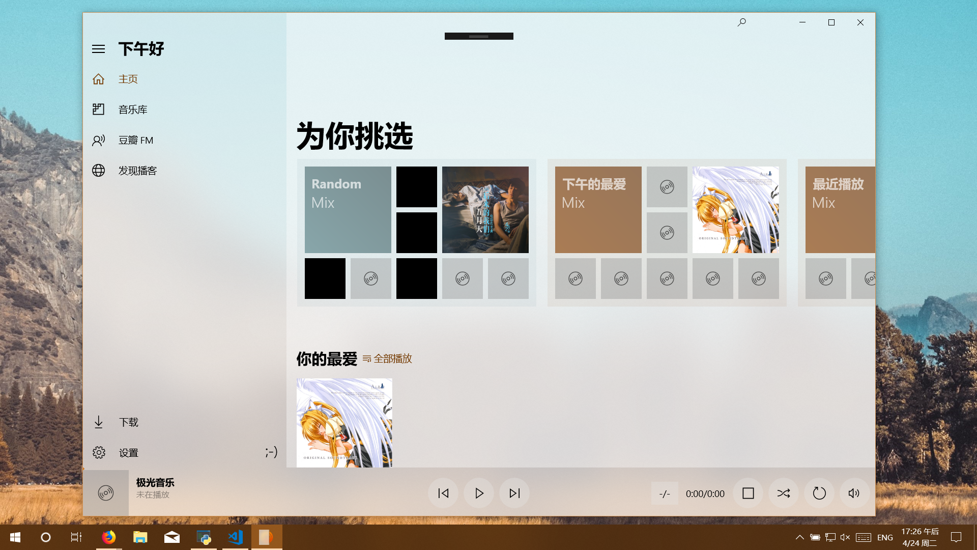
which the playing panel is placed at bottom and always visible, and the ham panel is opened
Here's a new layout created by a nice guy:
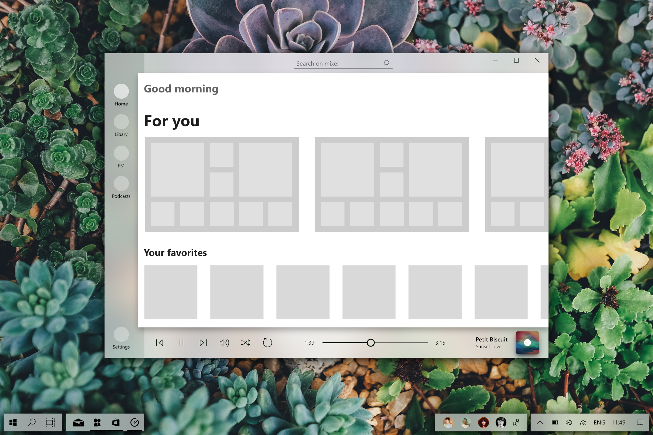
What have changed:
- Remove the acrylic on the main area for a white background
- Change the opacity of the title "Good Morning"
- Change the hamburger menu (HM) with a left bar for navigation
- Make it large
- Add the label for each icon under its icon
- Center the search icon, and replace it by a custom search bar
- Change the position (z axis) of the player bar to appear at lvl 0
- layer 0 : navigation & player bar
- layer 1 : main area (with the content)
- Change a bit the design of the player bar.
UI with more Acrylic is better, more Fluent. I think UI is good already, add more Acrylic and it be perfect!
I want to ask, In new Hamburger menu so little space for the titles of category (and they always visible), in some localisations (Russian for example) very long typing titles. They may not fit. In English all looking good.
Hi @lionnexx1986 @biqiu-ssw @dakehero I've finished(may be not) renewal of app, please upgrade to 2.0.69 and check if there're bugs of displaying text or interaction. Thanks a lot 😄
Hi @pkzxs! I already tested! It seems all looking and works good! Good update! thank you very much for the work! Very needed new nice renewal of mini player and black theme! Keep it up!
If FM,Lib,Home also use fluent design like about will be better
主页,曲库,fm等如果像关于界面一样使用fluent design的模糊效果或许会更好点?


@pkzxs If use Fluent from desktop wallpaper like it used in FM will be more better.
In about is constant picture.


Hi @pkzxs! Wow! Nice new mini player! Im very like it! But please make option in setting "Behind all windows" or something like that. As for me very important thing. Please! About Dark theme. It is cool that you add Dark theme but it is dont work ( Thank you for you work! From me donat!)
Hi @pkzxs! Black theme work and looks very good!
But there are a couple of nuances
1 This white frame on main window, looks very discord

- In now playoing screen nothing see. Seems becouse the accent color,

Thank you very much!

Hi @lionnexx1986 very thanks for your correction, I will soon fix these 👍
@pkzxs You done well and making a very good music player! 👍 other than these corrections, Please make mini player function "behind all windows" in option, and make mini player saving size and position. Im very offen use mini player, and this two functions very necessary. Wil be waiting next update!
@lionnexx1986 Oh yes, I'll try to add it. Due to the limitation of the window manage API, I think it may not work so well as expectation, But I'll work hard to find if it can be done!
@pkzxs oh i got it thank for explain. I have few more proposition for you.
1 Genres in album category
2 Increasing rewind bar click zone (you now have to small, need to target, exacly in the bar)
3 Increasing artist picture and album picture (too small now, like i think)


And thats all i think...
@pkzxs Well, about everything in order
- Appears strange Effect in All Covers and text (Like Decreased Brighteness)
 2 You work well with mini player! But then i exit from mini player, resets main window position, I think it is have to be, I can move it, but i cant! Need to maximize window first, then minimize, and then main windows moving
Thank you!
2 You work well with mini player! But then i exit from mini player, resets main window position, I think it is have to be, I can move it, but i cant! Need to maximize window first, then minimize, and then main windows moving
Thank you!
@pkzxs Update
Mini player is OK! Thank you very much!
Main window not moving, becouse you now have small draggable zone, in corner, and it dont work nothere else. )))

@lionnexx1986
Agreed, dark theme is not night mode, should not apply dark mask on images.
 And the mask has different size with the cover image, is that a feature?
Another problem is that the fly-out will not close automatically after navigation.

@OpportunityLiu @lionnexx1986 Oh I've missed the difference between dark mode and night mode, I'll add an option in settings to toggle this mask on/off.
Make some padding at the right. So that opaque area does not look sticking to the right.
Hi @pkzxs, im just sending to you 3 cup of cofee) Thankfully for your job! Im like your player!
Can you please make that main window and mini player save their positions! It will be very good!

@lionnexx1986 I'm really appreciated to your kindness ❤️ Thanks.
About the window position, I'm afraid it can't change. Because of the limitation of UWP, the window only have the ability to change its size, but can't set the position, I've tried to find a solution but at this time I didn't make it. If I've found out how to set the position, I'll make it ASAP.
@pkzxs OK i understand. Thanks for the explain! Its very...dissapointing For more beauty UI. I recommend bigger album picture and artist picture. Then i enter to the artist and album im see the big picture, then i start scroll - picture setting smaller. Like in Music Groove Player. Somekind effect you have in a "Home Screen" there title "Good morning" "Good Evening" "Good morning" For better functionality. Please make Genres in Album category and Tag Editor for Albums!
What do you think you can make it?
@pkzxs By the way music groove save the position then switchtin between mini playerand maim window. @pkzxs And your Aurora save too, but in only "Always on top" Mode. It saves only in this mode? @pkzxs And (sorry for multiple message) Im just set Aurora on fullscreen and mini player save the position)
@lionnexx1986
About the pictures of albums and artists, these are exactly what I will do in next several updates 😄 please give me some time to do it, it's a bit hard work.
Then about the mini player, on the UWP, the position is manged by system, there's no API to set the position, or even know where this app is placed. Groove and this app can save position is because we're going to another display mode called CompactOverlay (always on top), and the system can remember position automatically when changing to another display mode.
So, I think at this moment, there's no way to custom the window position, if I find out how to set it, I will add it immediately, thx. 😄
@pkzxs OK i got it, about mini player! I've found solution (Fullscreen). I understanstand, it's very hard to work on player alone. Music Groove made by dozens of coders in big corporation. You alone made that they do. So i very I appreciate your work!
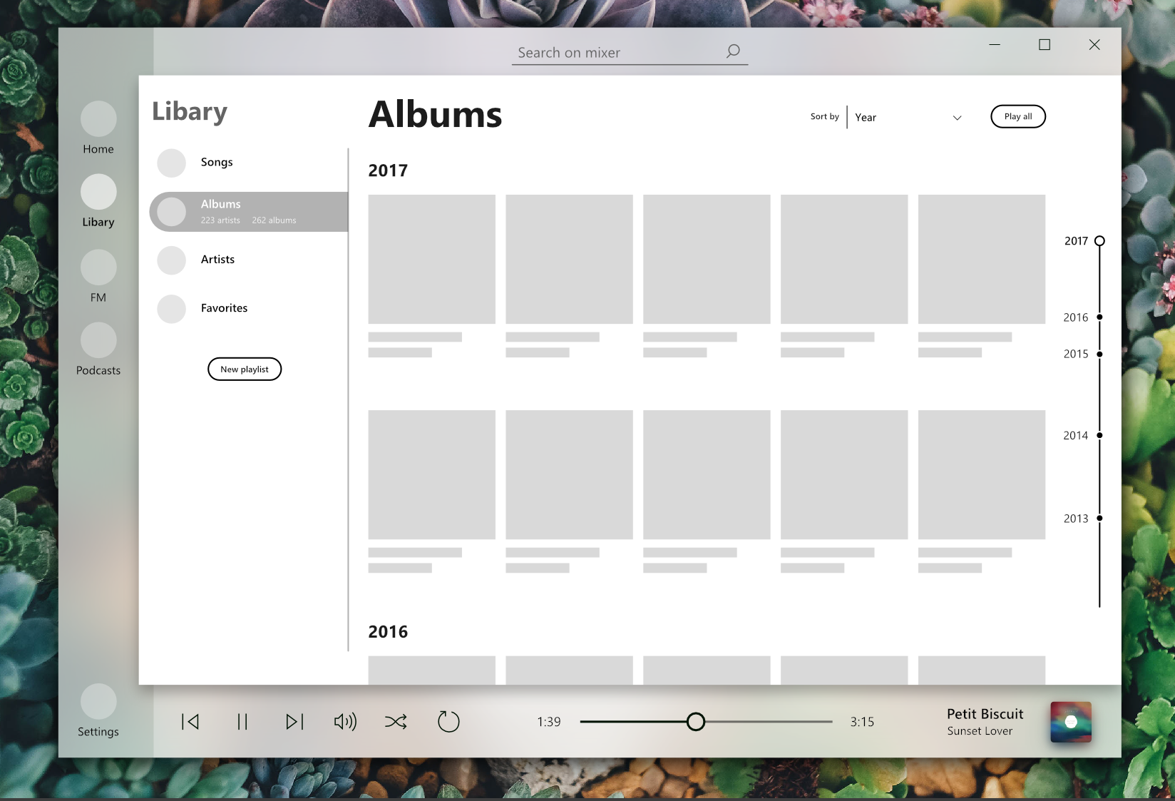
Hi @pkzxs I like new artist and album pages. In albums category, then call artist submenu, title "Albums" stay on the screen.
