Kore
 Kore copied to clipboard
The new floating button to play video items ("+") is confusing
Hi, The new feature in 2.4.0 that makes it possible to chose to play on Kodi or locally on the Android device is very nice. However, it is also confusing to regular users: there are now 2 different "+" icons on the screen and they do different things. One adds to playlist (next to "download to device" and 🗸) and one opens a sub-menu that offers option about where to play.
Two suggestions:
- Change the floating + button back to a play sign (⏵). If one wants to play something, one expects a play button, anything else is confusing (except possibly for a button clearly labeled "play", but we are lucky that ⏵is almost universally recognised).
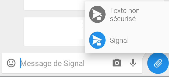
- Second idea: differentiate the default choice (play on Kodi) from the secondary choice (play locally on Android device) by making the two choices two different colours.
Signal does this for its "send message" button for instance: the normal option is the default blue, the other option is grey.
 Looking at the colours, I was thinking "Play on Kodi" could be the same colour as the theme's default and "Play locally" could be the same but less saturated. This might be the tricky bit, finding a colour type that works with the different themes.
Thanks!
We kind of mimicked other FAB speed dial designs. I wouldn't mind changing it to the play icon. @SyncedSynapse what do you think? I'm not sure about the coloring. I don't think "Play locally" is less important than "Play on Kodi". Making it less saturated might give the idea it is.
Cool!
Regarding "play locally", thing is, it is less important. We've been able to play on Kodi since day 1, and only years later locally. It's a lovely bonus, but it's an extra, it's not as fundamental as playing back on Kodi, which is Kore's raison d'être ;)
But it could just be a different colour that shows it's an alternative, it doesn't need to imply it's less important really.
Regarding changing the play icon, i don't have a preference. There are pros/cons for each solution and i don't think one overwhelms the other so i'm a bit indifferent (+ icon signals that it is a menu, but is duplicated on the screen, play icon signals its function, but will confound users when it opens).
Anyway, if it changes, there should be a nice animation on the play icon, and i'm not sure which one would work. The current animation on the + icon is nice and standard.
As for the colors, i wouldn't bother with it.
By the way, there's an option on settings to disable local play if you don't use it (we should discuss if it shouldn't be named "enable local play" instead).
Closing, since the + button has been replaced by a traditional one