Bad padding-left on header bar user-menu
I have a weird display bug since a long time on my instance. As no-one has already reported it, it may be a problem only on my instance, but maybe no one really care.
All the user-menu items have a padding-left of 55px in desktop mode. The cause line is this one.
If I remove it, everything come back to normal.
Does anyone has the same problem? What is the reason behind this big padding?
Thank you very much
Hi! This isn't a bug, it is the expected behavior, so the menu items are aligned with your username. But that can be changed if we (you included) find it better to not have that left padding.
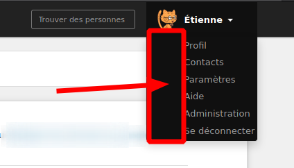
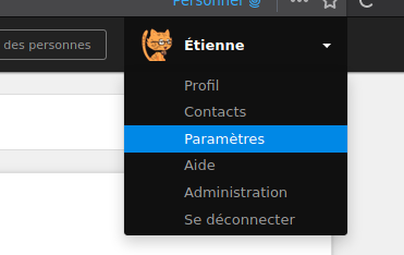
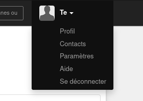
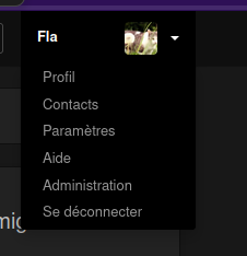
Maybe it's the french translation of logout (« Se déconnecter ») and admin (« Administration »), but as you see in my screenshot, the result is a bit ugly (for me, at least) as the words are very close to the right side of the menu. I was even wondering if my menu was lacking icons or something else.
I understand your point, but maybe we should enlarge the menu in order to give more room to the right of the words? But my opinion is that removing the padding to make text align with the avatar would be better.
It's probably a mix between a short name (the dropdown is as wide as your name) and long french translations. But I agree that in this edge case, it's to close to the right border of the dropdown, so we should probably add a little padding at the right side to give it a little more space.
Do you have a screenshot of the actual and expected result (on your instances for exemple?)
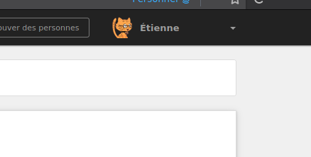
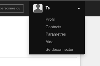
On my user it looks like this:
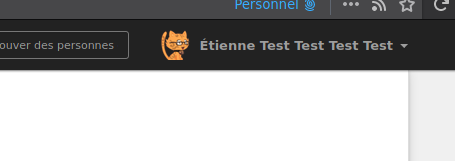
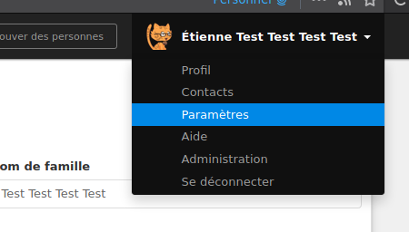
But if you change your name to something longer, or switch to a language with shorter translations, it would look the same on your instance, so it's not about the instance, it's about the individual users.
And if we enforce padding to the right, that wouldn't change my result, but it wouldn't be as close to the right border on your view anymore.
Yes I already understood that it was not because of my instance… but I would like to see another wild exemple (like other system fonts…). Sorry for bothering you :/
I think I maybe find a good compromise. I add the following rules to my stylesheet. What do you think of it?
@media (min-width: 992px) {
    #user-menu span.user-name {
        display: inline-block;
        min-width: 120px;
    }
}
120px seems to be the right width, on my system, to have the little arrow aligned with the right border of the main content.
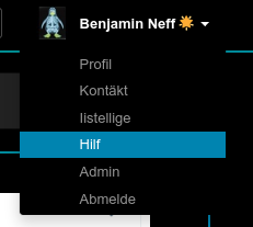
That looks like, with short names:
And with long names (min-width is ignored, thus obviously that's the default rendering):
If it's ok, I can open a PR with these lines inserted in the right place.
Just to understand correctly, what's bothering you, the missing space on the right, or the wasted space on the left?
Btw, I remember a discussion about adding icons in the left space for each menu item. I don't remember if we took any decision though.
Just to understand correctly, what's bothering you, the missing space on the right, or the wasted space on the left?
Both actually. But from your previous answer, I understand that you don't want to remove the left space, hence my proposal about enforcing a confortable right space in any cases.
As stated before, my own opinion is that left space should be removed to align text on the avatar, not the name. But I understand that decision was already taken and I don't want to modify them.
I don't have a strong opinion here honestly, I'm also fine with the left padding removed.
So @milouse it looks like you didn't open a PR about this in the end. I can do it, should be pretty quick. Do we also want to add some icons on the left, or would that clutter the UI?
As I'm dealing with #7676 and adding a max-width for long usernames I was wondering if I should add a min-width at the same time to deal with this. However I'm not too sure it's better.
Here is how diaspora* actually looks like:
Here is how it could looks like with a min width:
So when the menu is open, it looks better for sure. But when it isn't, the caret looks lost in the right of the screen. What do you think?
I have two thoughts on this that might help 'fix' it.
- Create the div that contains the drop-down menu based on the field that contains the name only, not the avatar.
- Place the avatar to the right of the user name in the header bar, aligned left of the down arrow.
Both of these, if I'm right, would mean the menu items would be at the left-hand side of the drop-down area, with no indent needed. The second would also mean that the down arrow is not isolated if the user name is very short (mentioned in @Flaburgan's latest comment).
Any use?
I was wondering if I should add a min-width at the same time to deal with this.
We already have a min-width:
https://github.com/diaspora/diaspora/blob/d1e0b163e25cca972f8a382b7206022f3701bb90/app/assets/stylesheets/header.scss#L222-L228
But it's too small for some translations (french for example), where it then comes to close to the right with longer texts.
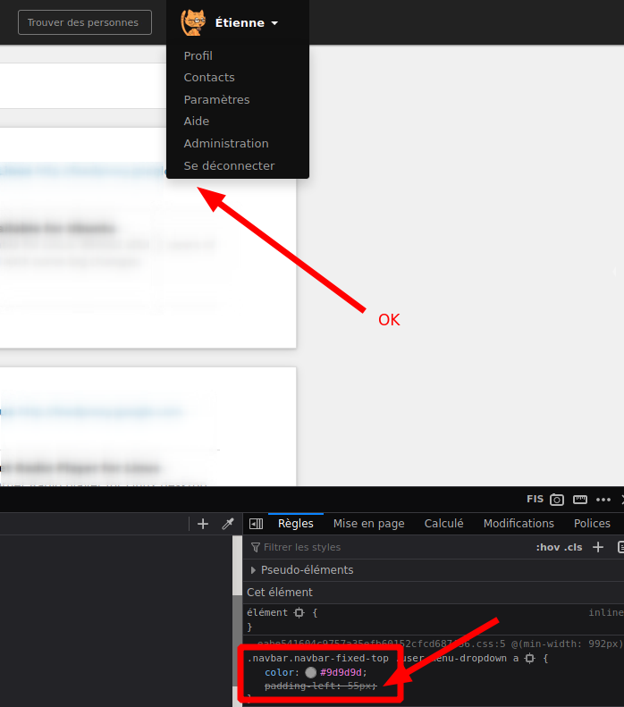
And as already mentioned, I don't like to just increase that min-width, I'd rather have a padding so the width depends on the translation. There already is a padding for menu entry links, but they are ignored and the text goes behind the limit and the menu doesn't grow with longer text:

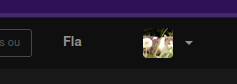
Another solution could be to move the avatar to the right:
But that doesn't really work when it's closed: