analytics-apim

analytics-apim copied to clipboard
Labels overlap when large number of apis are selected in API usage chart
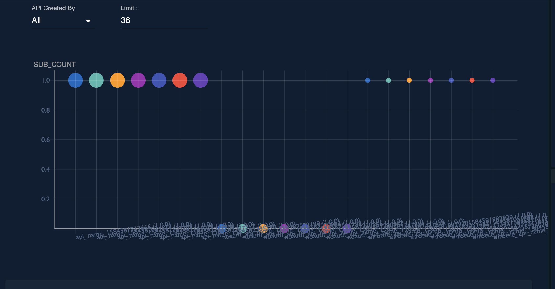
Since apis can be selected via checking/unchecking selection box in the table bottom of this chart, reducing the severity.
Since tooltips are available, we can show limit x-axis label as an improvement.