autocomplete
 autocomplete copied to clipboard
Provide better support for viewing suggestion descriptions
Aim
Make it ridiculously easy and simple to view descriptions about a given suggestion More specifics:
- Fully keyboard accessible
- Don't require users to memorise any keyboard shortcuts - should be able to get anywhere from the UI
- Don't make the app jumpy or flash - have smooth transitions
- Make sure we use a hotkey that doesn't override any existing terminal / IDE hotkey
Proposed Solution
Have a keyboard shortcut that adds a mini popover within the autocomplete window which has the full description. A hotkey should show and hide it
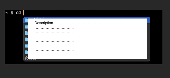
My shitty mockups macOS preview (could've made this beautiful in Figma, but implementation and usability is more important issue first. We will obviously make it look nice and sleek).
Figure 1: Normal state. If the user clicks cmd+i it will open up description state
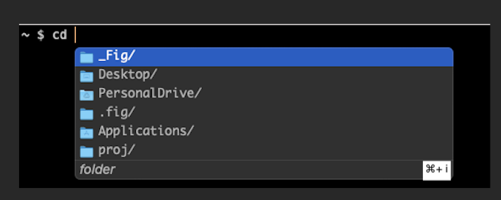
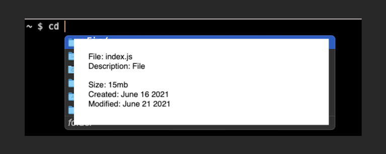
Figure 2: Description state.
- If user clicks
cmd+iit will revert back to normal state. The description box should have max height of 120px. Any more text should scroll - The description box should take up the full autocomplete window screen
- Clicking the up and down and down arrows should overflow with vertical scroll
- The background colour should fit in with the colour scheme. Perhaps a light grey?
Other notes
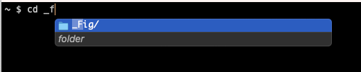
If there is only one suggestion in normal state and the user hits cmd+i, we should still expand the description box to fit all the text
e.g. if the user hit cmd+i here it should still expand to be the same as Figure 2, capped at max height 120px
Cool things for the future
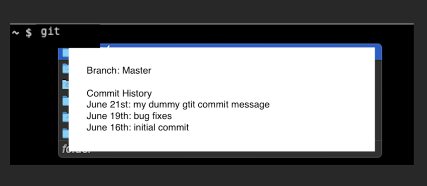
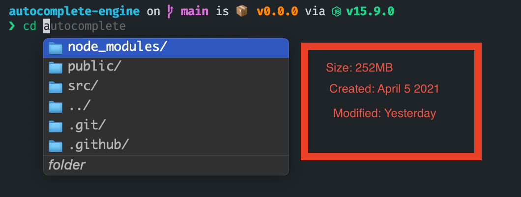
Why should this description box be limited to just simple descriptions. Why can't we provide more info about a specific suggestion type. e.g give much more info about files and folder, give commit history for a given git branch etc
Examples
Please comment thoughts + other ideas below!
A more descriptive box seems like a good idea, but I feel like it's a bit strange to hide the whole autocomplete suggestions.
I came up with this idea (badly designed sorry) which is more like VSCode's types/doc box:
This can sit at the right (or left if not enough spaces) so it won't hide the suggestions.
@QuiiBz Yes I agree, the way VSCode has built this is very nice and would likely be better. It is quite hard for us to build an entirely new box and position it accordingly, however, there is no reason why this couldn't be baked into the existing window and we have some delimiter... Will discuss with @mattschrage tomorrow.
We want to make this fully keyboard accessible. I imagine when you have the description box open, you would want to use arrow keys to navigate up and down the description. Would this still make sense? I guess we could also do shift+arrow key to navigate the description and then normal arrow key to navigate the suggestions... Could work quite nicely. I like it
And don't worry, your drawing couldn't be worse than mine haha
Exactly, there is no need to summon a new fig window, it can simply be embedded into the same.
I agree with the Shift+Arrow shortcuts, along with normal mouse/trackpad scrolling. There also can be another shortcut to show/hide this information box. VSCode does this with Command+Space, which I find pretty handy.
Concern is when there is only one suggestion what we do...
We would have to expand the box from this:
To this
Can’t we provide a sort of Master-Detail approach, where the master is not upscaled in that case? Maybe it would be a bit strange(?)
@fedeci the current constraint we're operating under is that the description text needs to be contained in a single NSWindow/WKWebview.
Right now we can't easily make parts of the view transparent, but this is something @Monkeyank is looking into.