spicetify-fluent
 spicetify-fluent copied to clipboard
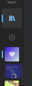
Playlist icon width is inconsistent
Playlist icons are sometimes wider than expected, which also cuts off the bottom of the image for the playlist. This seems to only affect playlists which have been downloaded and are not currently being played. Playlists that are either not downloaded, or have been downloaded and are currently playing have the expected width.
This may be because the download-icon has no CSS mapping for the class name GN_mYTMDEtwPsSIMKxez (which would be a spicetify bug rather than this theme).
(background colour changed to white to help show problem)

This problem revolves around the status-icon of the playlist sidebar entries. If it has one, e.g. if you are a Playlist Collaborator, if you're downloading songs from within that playlist, or playing from that playlist, then the width of the playlist image will go all screwy due to weird margin settings.
While I could fix this using position absolute or perhaps even relative margin insets, I don't know how the status icons are expected to be placed. E.g., if placed in the middle the color of these icons could often be hard to see.
I also personally don't see the point of these status icons, unless used as a literal status icon ONLY, e.g. not as a togglable play button or such. If I had the choice, I would instead position these icons at the top-right corner of the image, with a circle background, and inverted color compared to the sidebar background color. This results in status icons being very visible, not in the way of clicking the playlist, and not in the way of stuff like Folder Arrows.
I also personally don't see the point of these status icons, unless used as a literal status icon ONLY, e.g. not as a togglable play button or such. If I had the choice, I would instead position these icons at the top-right corner of the image, with a circle background, and inverted color compared to the sidebar background color. This results in status icons being very visible, not in the way of clicking the playlist, and not in the way of stuff like Folder Arrows.
Yes, this sounds like a good implementation. Though, the play button status icons should remain togglable if its positioned out of the way in the corner like the InfoBadge XAML control in Windows:

Yes, this sounds like a good implementation. Though, the play button status icons should remain togglable if its positioned out of the way in the corner like the InfoBadge XAML control in Windows
Good example yes, but I feel it should be a fair bit smaller than that of a status icon. Regardless, I don't see the need for the play icon to be kept as togglable, if there needed to be a decision on that. I've always thought of that play button status icon as simply an indicator of which playlist is being played, and nothing more. Why the ability to pause from there is necessary doesn't make any sense to me, especially when it doesn't let you resume.
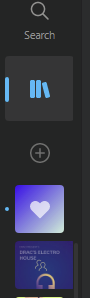
What if we replace the Playing status icon entirely, with something analogous to the left-side accent bar seen in the sidebar tabs?
E.g., a quick test:
My only thought is that it may not be clear what that little accent bar means, and it may be confusable with meaning "this playlist menu is active" not "this playlist is being played".
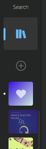
Or how about a little dot instead?
Regardless, I don't see the need for the play icon to be kept as togglable, if there needed to be a decision on that. I've always thought of that play button status icon as simply an indicator of which playlist is being played, and nothing more. Why the ability to pause from there is necessary doesn't make any sense to me, especially when it doesn't let you resume.
Fair enough, I just figured why remove functionality when you don't have to
What if we replace the Playing status icon entirely, with something analogous to the left-side accent bar seen in the sidebar tabs?
E.g., a quick test:
My only thought is that it may not be clear what that little accent bar means, and it may be confusable with meaning "this playlist menu is active" not "this playlist is being played".
Or how about a little dot instead?
I think the little dot is a good indicator for when a playlist is being played. The notification style badge can be reserved for other status icons (downloads, etc.)