ANSI output looks off
Discord username (optional)
No response
Describe the bug
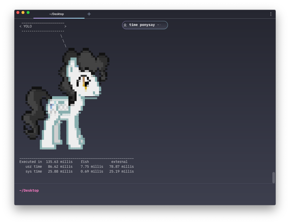
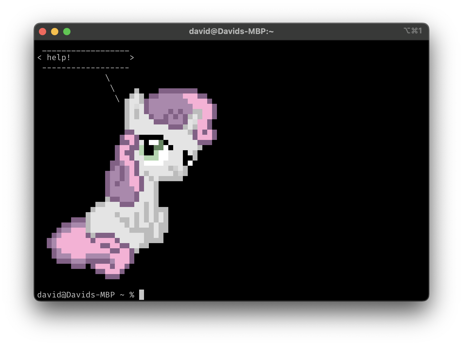
Comparing different Terminals, I have noticed that more complex ANSI graphics look a bit off in Warp.
To Reproduce
For ease of use, I'm going to use ponysay to output ANSI graphics, but any other tool with ANSI output should work as well.
ponysay --pony milkyway "Hello World"
I'm using the same font (IBM Plex Mono) at the same size (14px) in both terminal, though the font should be irrelevant for running the test. As you can see in the screenshots, there are some horizontal hairlines in Warp.
Expected behaviour
The output should be well-formed, without visible glitches such as the mentioned hairlines.
Screenshots
Warp v0.2022.07.18.09.06.stable_01
iTerm v3.4.16

Operating System
No response
OS Version
macOS 10.15.7 (19H1922)
Shell Version
fish, version 3.5.0
Warp Version
0.2022.07.18.09.06.stable_01
Additional context
It should be noted that Apple's own terminal also displays the ANSI characters incorrectly
Does this block you from using Warp daily?
No
Warp Internal (ignore): linear-label:b8107fdf-ba31-488d-b103-d271c89cac3e
No response
Hey @idleberg, thanks for the report! My assumption here is that you're using the default iTerm value of "No" for this setting:

This would explain why iTerm is the outlier - they're not actually using the glyphs from your font, but instead are drawing their own (guaranteed to perfectly align) rectangular shapes for the Unicode box drawing characters.
At some point we'll probably adopt iTerm's approach of using custom rendering logic for these (to fix the hairlines), but it might be a little while before we do.
Sounds reasonable, but the appearance in iTerm2 remains the same, no matter whether that setting is Yes or No (I tried restarting)
I suppose it's different for different fonts (unsurprisingly). I'm using FiraCode Nerd Font Mono, and there are differences in the alignment:
With the setting set to "No":
With the setting set to "Yes":
