styleguide
 styleguide copied to clipboard
 vtex
vtex
Render the Percentage in the Progress component
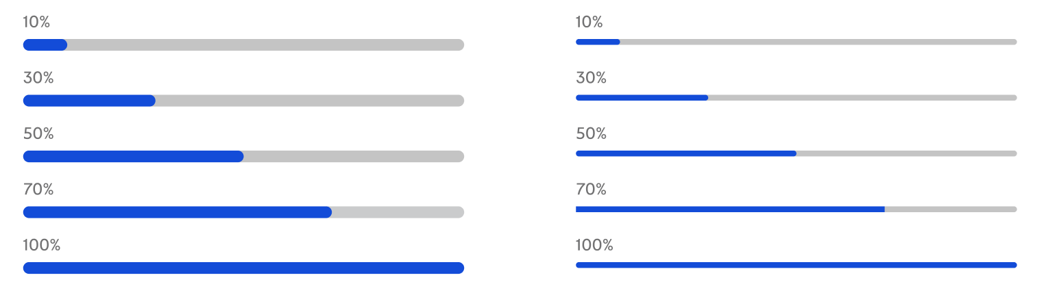
We need to find a place to render the percentage in the Progress component of line type.
ref: #924
In the Uber Component Library the ProgressBar component has a prop called showLabel that if checked with true, the component will display the percentage number in the bottom center.
I think we could have two props:
showLabel: To show percentagelabelPlacement: To define position of percentage (top, topLeft, topRight, right, bottom, bottomLeft, bottomRight, right)
I like this suggestion, I don't see the progress bar being used always in a specific way. It's an atom, there are many applications for it and we can't lock down a position for the percentage.
@rsimoens @davicosta99 we already have some visual iterations of this issue at Figma. Can we use these?
@jonathasbsouza we currently have this progress (called a line), but it does not have the percentage value.
ref.: Progress in VTEX Styleguide
@emersonlaurentino those images I attached are from our official styleguide file at Figma, so I think we can progress with that.
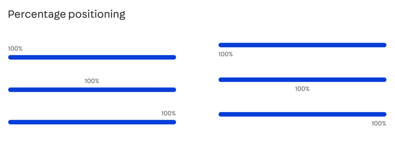
As this is a new feature to the component (even if already existing) I think it is valid to be implemented and available in Styleguide 10.
I will add this Issue to the project.