Filter not kept when switching from Bar chart to Table
The filters applied to the bar chart are not kept when switching to the table type. The reverse works. If filters are applied in the table, they are kept when switching to the bar or pie chart
To Reproduce
-
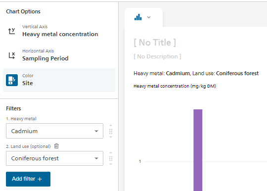
Open "Heavy Metal Soil Contamination" in Visualize INT
-
Set Filter like here:
-
switch to Chart type 'Table'
-
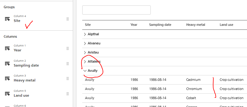
the grouping is ok on "Land use" but all sites and all Land use are displayed
Expected behavior The filter applied on the dimensions "Heavy Metal" and "Land use" should be kept
Environment (please complete the following information):
- Visualize environment : v3.6.4 (dc5a883)
- Browser and version : Edge
Additional context Add any other context about the problem here.
Hi @ortnever,
we didn't implement this behavior initially, because filters in tables and other charts are kind of a different concept – in charts, just have single-value filters, while in table you can select more than one value.
I think that the tables are mostly used when user wants to show more data than possible with other charts types; especially now, when we have a table preview enabled for every chart type (the exact same table we would get by default if we carried over single-value filters from other chart types).
We could keep all the filters when switching to a table, but then if we would like to see a whole dataset, we would need to go one by one and un-filter each dimension after such switch (and run a lot of queries to do so).
Anyway, it shouldn't take a lot of time to implement this. Do you think we should change this behavior to carry over filters from other chart types 1:1 to the table?
Thanks for the explanation. I'm hesitating...I think of publishing different types of graphs as a dashboard (next step). In this case, we would want to show in the table exactly the same data as in the other charts. One solution of course is that the editor adds the filters manually to the table before publishing the graphs as a dashboard. @Rdataflow, do you have an opinion on this?
I tend towards let's keep and apply the same filters everywhere exactly for this reason as you might want to display the very same numbers out of a much larger cube.
NB: Does this issue also exist for the switch to table view button? - If yes I would fix this in the same go.
Dear @bprusinowski , For the reason mentioned in our comments, we propose to implement this change: filters from other chart types should be carried over 1:1 to the table. Thank you very much.
Thanks @ortnever and @Rdataflow for your inputs! It makes sense, we will change this behavior to match other charts types :)
@Rdataflow switch to table view should always show the same data as in the chart, we are not showing the full dataset there.
Dear @ortnever and @Rdataflow
Thanks for your input and considerations regarding this topic. After consulting internally I'd like to propose to wait with the implementation as it might require some conceptual work first.
Following our reasoning: Currently when a user selects a dataset visualize automatically applies filters (in the left side bar) to avoid duplicates. This provides a good starting point to the user and allows visualize to immediately display a visualization without any needed interaction. The table chart is bit of a different case. So far when selecting the table chart type the user could always see the full dataset and then start filterting to narrow down the content, which feels more natural.
If we would now implement that all the filters are carried over, it would mean that if a user has selected a dataset and then switches from a bar chart to a table chart (without having interacted with the visualization at all) that the table would appear pre-filtered, as the filters from the left sidebar in the bar chart would be carried over. That means the user would never be able to see the full dataset except he clears all filters in the table, which would be a bit cumbersome as they are “hidden” in each of the columns.
I do agree, that once the user has interacted with a chart type and then switches over to the table chart, that the user might expect that the filters are carried over. But without any interaction at all, it might be a bit misleading to see an already pre-filtered table.
So therefore we’d propose to first have a closer look at it from a conceptional point of view and find a solution how we could best deal with this, before we implement anything.
What do you think?