Inconsistency in h2 font size of WP section headers
There seems to be an inconsistency on the h2 font size:
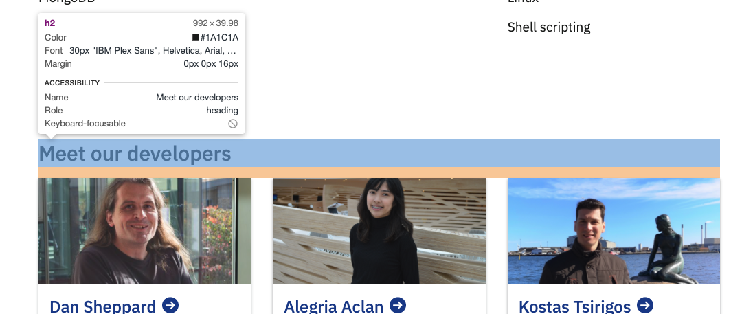
A normal h2 on a wordpress page is 30px:
However vf-section-headers within the sidebar of the EMBL grid and VF grid or headers of a (card?) container are 24px (which is the size of h3 of wordpress):
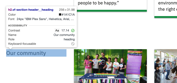
<h2 class="vf-section-header__heading">Our community</h2>
See this page for examples of these headers: https://wwwdev.ebi.ac.uk/sample/about/jobs/career-profiles
My understanding from the Figma library is that h2 should be 30px. This is also suggested on the Type sizes page (albeit much less clearly).
so all vf-section-headers are 24px and visually treated as "h3"s.
I think making all section headers 30px would be disruptive in the visual hierarchy and probably against the direction stakeholders are pushing.
also just a note that that <h2> element plays a different semantic role from Heading 2 visual element -- this is why Stu and I had concerns about tying the "heading 2" design token with the h2 html element.
Also a note: for vf-section-header we've also considered allowing it to be a semantic h2 or h3 element
So vf-section headers are currently treated as h2 semantically but as h3 visually (with 24px font instead of 30px).
I'd recommend against treating them as h3 semantically because this will cause a lot of "skipped header" errors in accessibility tests in pages like this one: https://wave.webaim.org/report#/https://wwwdev.ebi.ac.uk/sample/about/jobs/meet-our-people
It also feels like that h2 is the actual intended semantic level on the page above given that it appears within a container which is one level below h1 (the page header) and one level up from the cards (the headers of which are marked as h3).
When there is a h2 and a vf-section-header on the same page, the difference in font size may give the impression that the vf-section-header is embedded in the h2 section. This is why I used a h2 header instead of a vf-section-header in the technical careers page (in addition to the open question about the alignment of headers and cards when there is centered text above the card container): https://wwwdev.ebi.ac.uk/sample/about/jobs/tech-careers
Maybe we can change the h2 header to be 24px (from 30px currently) like the vf-section-header so that both can be used on the same page?
This might mean that h3 headers (and card headers?) become 21px (from 24px currently) and h4 headers become 19px (from 21px currently).
Also just to remind you that a vf-section-header with a link is still not a h2, at least according to WAVE. An example is the "Recruitment" link in this report: https://wave.webaim.org/report#/https://wwwdev.ebi.ac.uk/sample/careers
I found this pull request but not sure if this has been resolved: https://github.com/visual-framework/vf-core/pull/1685
Also the report above mentions that the page doesn't have a h1. This is because the header in the hero is also marked as h2 (even though it's 42px which is the font size of h1)...
Maybe we can change the h2 header to be 24px (from 30px currently) like the vf-section-header so that both can be used on the same page?
This might mean that h3 headers (and card headers?) become 21px (from 24px currently) and h4 headers become 19px (from 21px currently).
As you can tell this is a pretty broad change, so it would be best until the new product designer joins and came make new reference designs.
Also just to remind you that a vf-section-header with a link is still not a h2, at least according to WAVE. An example is the "Recruitment" link in this report:
This has been solved for some time in vf-core. I suspect the component may need to still be update in vf-wp (editor hub).
Also just to remind you that a vf-section-header with a link is still not a h2, at least according to WAVE. An example is the "Recruitment" link in this report: https://wave.webaim.org/report#/https://wwwdev.ebi.ac.uk/sample/careers
I found this pull request but not sure if this has been resolved: #1685
This has been solved for some time in vf-core. I suspect the component may need to still be update in vf-wp (editor hub).
Is @kasprzyk-sz meant to follow up on this or will someone else do it?
As you can tell this is a pretty broad change, so it would be best until the new product designer joins and came make new reference designs.
I agree but this means that we'll have to live with these inconsistencies for a while...
This issue came up again in our review of the accessibility of the EMBL-EBI site with @sandykadam (see slides 23-24, 32 and 36: viewing the presentation may require access).
We want to follow up on the following points in relation to this issue in subsequent VF sprints:
-
[ ] Review vf-heading classes and the corresponding design token type sizes.
-
[ ] h3 could be adjusted to 21pt by applying the
vf-text-heading--4type size as specified in the regular variant of vf-heading:<h3 class="vf-text vf-text-heading--4">This heading size is regular</h3>We have applied this approach to maintain the 21pt type size but resolve the skipping header alert on the "Principles of service provision" section of the EBI Services page.
Putting this issue on hold as the related issue https://github.com/visual-framework/vf-core/issues/1926 has addressed inconsistencies found in the typography heading levels.
This issue will be considered for further analysis during the review of vf-patterns https://github.com/visual-framework/vf-core/issues/2049