Qogir-theme

Qogir-theme copied to clipboard
 vinceliuice
Theming GNOME Web's new tab bar (HdyTabBar)
During the GNOME 40 development cycle, Web (a.k.a. Epiphany) started using a new tab bar widget, implemented inside libhandy as the HdyTabBar widget.
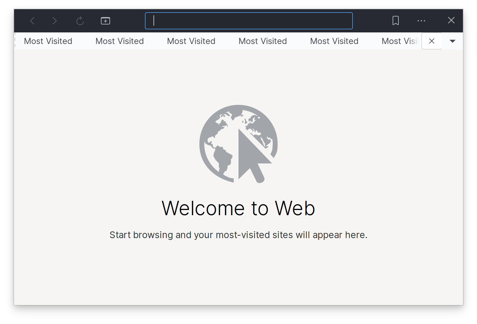
This is how Web currently looks:
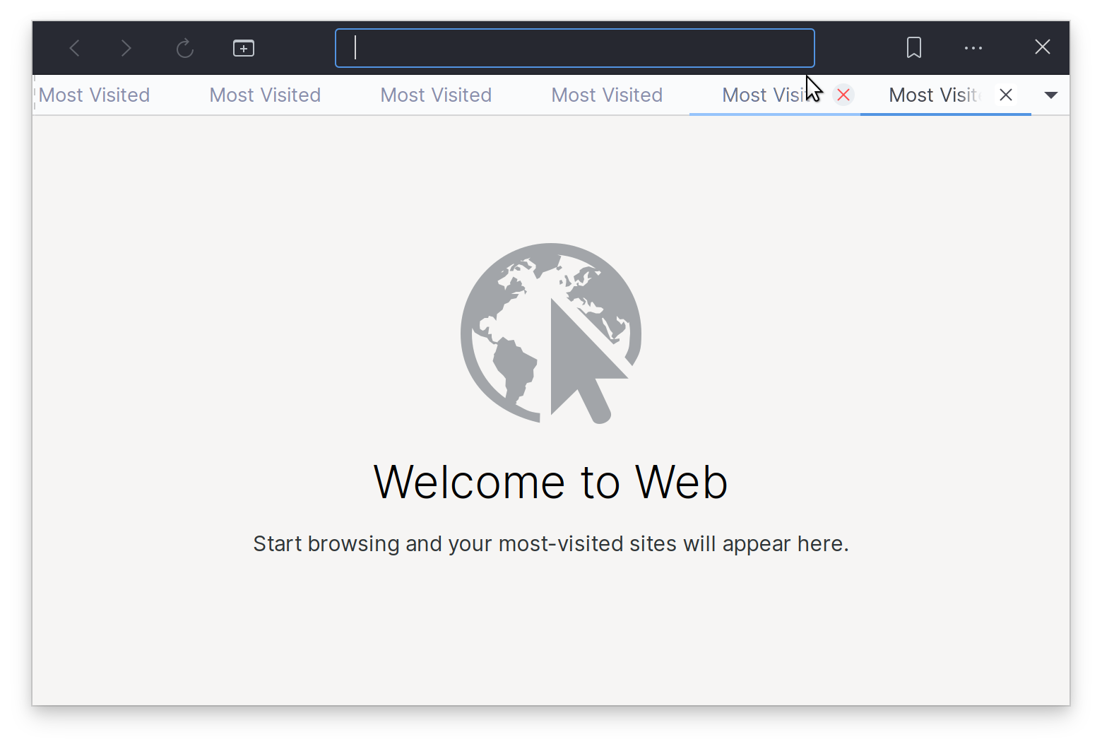
With some fiddling in the CSS tab of the GTK inspector I managed to have something that looks reasonably consistent with the rest of the theme:
This is the CSS snippet I am using, and it seems to work okay when placed into ~/.config/gtk-3.0/gtk.css:
tabbar .box {
  background: @bg_color;
}

tabbar tab {
  padding: 1px 0 1px 3px;
  background: @bg_color;
  border-bottom: 1px solid rgba(0, 0, 0, 0.15);
}

tabbar .end-action {
  border-bottom: 1px solid rgba(0, 0, 0, 0.15);
}

tabbar .end-action button {
  margin: 2px 2px 3px 2px;
  padding: 0;
}

tabbar tab:not(:only-child):first-child { padding-left: 6px }
tabbar tab:not(:only-child):last-child { padding-right: 6px }

tabbar tab label {
  color: shade(@fg_color, 2.0);
}
tabbar tab:hover label {
  color: shade(@fg_color, 1.7);
}
tabbar tab:checked label,
tabbar tab:checked:hover label {
  color: @fg_color;
}
tabbar tab.needs-attention {
  background-image:
        radial-gradient(ellipse at bottom,
                        alpha(white, .2),
                        alpha(@selected_bg_color, .8) 15%,
                        alpha(@selected_bg_color, 1) 15%);
}

tabbar tab:hover {
   border-bottom: 1px solid lighter(@selected_bg_color);
   box-shadow: inset 0 -1px lighter(@selected_bg_color), 0 1px lighter(@selected_bg_color);
}
tabbar tab:checked,
tabbar tab:checked:hover {
   border-bottom: 1px solid @selected_bg_color;
   box-shadow: inset 0 -1px @selected_bg_color, 0 1px @selected_bg_color;
}

tabbar tab > button {
  border: none;
  padding: 0;
  margin: 5px;
  min-width: 16px;
  min-height: 16px;
}

tabbar tab > button:hover {
  border-radius: 100%;
  background-color: #eaeef2;
  color: #ff4d4d;
  transition-property: color, background-color;
  transition-duration: 150ms;
  transition-timing-function: ease-out;
}
tabbar tab > button:hover:active {
  color: #5294e2;
  background-color: #e1e7ed;
}
Note that some things in the CSS snippet above do not exactly match how Qogir currently themes the GtkNotebook widget. I am no theming expert, so some corners were cut. Nevertheless, I thought it would be a good idea to provide something starting point.