buttonbox
 buttonbox copied to clipboard
 verbb
verbb
A collection of utility field types for Craft
Button Box Plugin for Craft CMS
The plugin’s package name has changed to
verbb/buttonbox. Button Box will need be updated to 3.0 from a terminal, by runningcomposer require verbb/buttonbox && composer remove supercool/buttonbox.
A treasure trove of shiny buttons for you to make use of in your Craft control panel.
Installation
You can install Button Box via the plugin store, or through Composer.
Craft Plugin Store
To install Button Box, navigate to the Plugin Store section of your Craft control panel, search for Button Box, and click the Try button.
Composer
You can also add the package to your project using Composer.
-
Open your terminal and go to your Craft project:
cd /path/to/project -
Then tell Composer to load the plugin:
composer require verbb/buttonbox -
In the Control Panel, go to Settings → Plugins and click the “Install” button for Button Box.
Usage
We provide the following types of button fields:
- Buttons
- Colours
- Text Size
- Stars
- Width
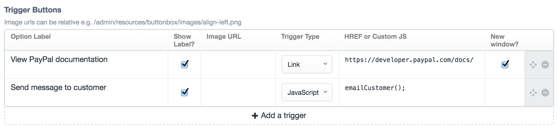
- Triggers (thanks @lindseydiloreto)
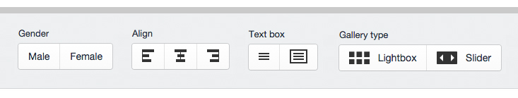
Make your own button group with optional labels and icons. We’ve provided you with a set of icons for common use cases but any image can be used.
Display as graphic
Toggle this on and Button Box will not restrict the height of the buttons to allow for larger images. For example you might want to allow the user to choose a layout:
Display full width
If you check this Button Box will allow the button group to flow full width, useful for allowing larger graphics to be more responsive.
Button Options
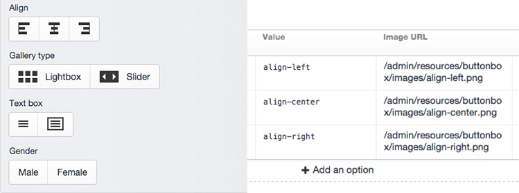
- Option label: The name of your option (e.g. ‘Male’, ‘Female’, ‘On’, ‘Off’, ‘Cat’, or ‘Dog’)
- Show label?: Hide the label on output.
- Value: This appears in your template.
- Image URL: The path to your image. Image URLs are relative to your
@webroote.g./images/align-left.pngishttp://site.test/images/align-left.png. Icons work best when they are 30 x 20px or less. - Default: Optionally choose one row to define as your default option for users.
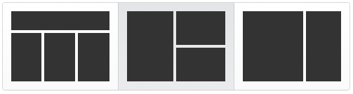
Provided images
We have provided some sample icons for common scenarios.
| Image | Filename |
|---|---|
 |
align-center.png |
 |
align-left.png |
 |
align-right.png |
 |
grid.png |
 |
slider.png |
 |
text-bold.png |
 |
text-light.png |
 |
text-box.png |
 |
text.png |
 |
col-1.png |
 |
col-2.png |
 |
col-3.png |
 |
text-col-1.png |
 |
text-col-2.png |
 |
text-col-3.png |
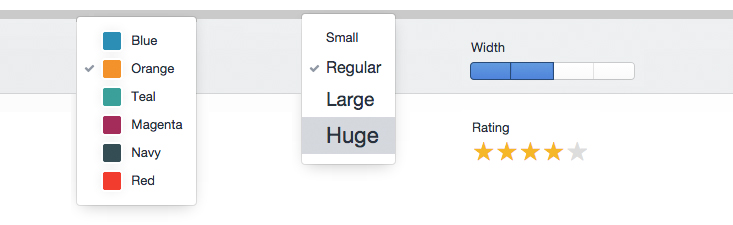
Colours (with a 'U')
Create a select drop-down of colours.
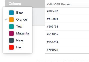
- Option Label: Name of your colour (e.g. 'Grey', 'Orange', or 'Mountain Honey Dew')
- Value: This appears in your template and will most likely be a CSS class name
- Valid CSS Colour: This creates the preview colour and just needs to be valid CSS (i.e. CSS colour names, Hex, RGB or RGBA values should all work for you).
- Default: Optionally choose one row to define as your default option for users.
Text Size
Give your users some preset text sizes.
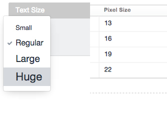
- Option label: Give your size a name e.g. (e.g. ‘Normal’, ‘Large’, or ‘Small print’)
- Value: This appears in your template and will most likely be a CSS class name, but could be a pixel or em value should you be that way inclined.
- Pixel Size: This is the size the option will appear in your select menu – it does not necessarily need to correspond to the font-size you want to use on the front-end.
- Default: Optionally choose one row to define as your default option for users.
Stars
Make your star ratings shine. Simply choose how many stars you’d like to make your rating. No fuss, that’s it!
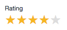
(N.B. No half stars here. The laws of physics suggests that this is ridiculous)
Width
Our idea for this is to allow users to select widths or columns on a layout – you’ll most likely want to use the values as classes in your templates to line up with your CSS grid system. You are of course free to use this as you see fit and the generic nature of a row of empty boxes suggests that it could be used for a lot more – let us know what you come up with.
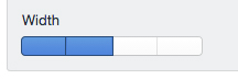
Each row you add, creates an extra box.
- Value: This appears in your template and will most likely need to be a CSS class name.
- Default: Optionally choose one row to define as your default option for users.
Credits
Originally created by the team at Supercool Ltd.
Show your Support
Button Box is licensed under the MIT license, meaning it will always be free and open source – we love free stuff! If you'd like to show your support to the plugin regardless, Sponsor development.

 verbb
verbb