web-components
 web-components copied to clipboard
 vaadin
app-layout: closed drawer only hidden visually
WCAG Level
Level A
Priority
High
Pages/screens/components affected
Description
For people who navigate using a keyboard or keyboard-like device (such as a switch control or a joystick) the focus order of interactive controls in a document should be logical and intuitive. For sighted keyboard users, it's important that there is always a visible focus indication that denotes their current position within the page. Lastly, for assistive technology users, it is important that visually hidden and inactive content (for instance, the content of a closed dropdown menu or disclosure widget) is not read/announced.
In all the drawer examples for app-layout we found that drawer content was both focusable and exposed to assistive technologies even when the drawers are closed.
User impact
Invisible focus stops can be very confusing for sighted keyboard users, as they make it difficult for the users to understand where their current focus may be on the page. When the invisible elements that receive focus are also unavailable/inactive (i.e. controls that are hidden because they can't currently be operated), this can further be problematic for non-sighted assistive technology users, who may not realise that the element that received focus is in fact inoperable (though in this particular case, the drawer content is still fully operable, even when closed).
Required solution
When an element is visually hidden, it must not receive focus. In addition, the element must be hidden not just visually, but from assistive technologies as well.
This solution must be applied to all instances of the issue identified within the test sample, then applied to all other instances of the same issue identified throughout the rest of the components, their variants, and the documentation website.
Implementation guidance
In all app-layout examples with a drawer, the currently active tab in the tablist contained inside the drawer receives focus even when the drawer is currently closed. For a sighted keyboard user navigating through the layout, their focus will seem to "disappear" once they land inside the closed drawer.
When focus is inside the closed drawer, it appears the hidden tablist is still active - meaning a user can potentially change the currently shown tab panel accidentally without realising that they are in fact interacting with the tab widget.
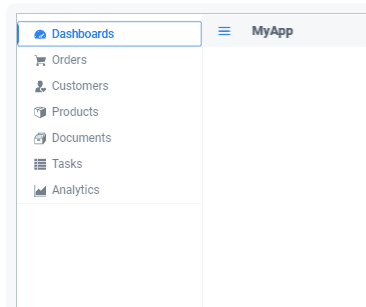
When navigating the examples with a screen reader, users are able to read through the contents of the drawer, even when the drawer is closed.
The simplest solution to make sure that a focusable element that is visually hidden does not receive focus is to hide the element with display:none. This effectively removes the element and any of its focusable child elements from the browser's default focus/tab cycle. It also removes the element and its children from the exposed accessibility tree, meaning that it will be hidden from assistive technologies.
One drawback of display:none is that it cannot be animated, so it cannot simply be inserted into the existing styles for the drawer (which rely on CSS animations to just move the drawer in and out of view). One approach is to programmatically set display:none at the end of the closing animation, and to remove it before the opening animation starts.
Alternatively, when the drawer is closed, add tabindex="-1" to all focusable elements inside the drawer, and programmatically add aria-hidden="true" to the drawer container. Remove these again when the drawer is opened.
Test procedure(s)
Use these steps to confirm that the solution has been correctly applied to issues identified within the test sample, and to test the rest of the components, their variants, and the documentation website for instances of the same issue:
- Navigate through the page using the
Tab/Shift+Tabkeys. - Close the drawer.
- Verify that using
Tab/Shift+Tabfocus does not land on any of the visually hidden drawer or its contents. - Using a screen reader, navigate through the page.
- Verify that the contents of the drawer can't be read/navigated when the drawer is closed.
- Open the drawer and verify that it returns to its working state once opened (elements inside receive focus, screen readers can read the contents).
Definition of done
Complete all of these tasks before closing this issue or indicating it is ready for retest:
- All issues identified within the test sample have been resolved.
- The rest of the components, their variants, and the documentation website have been tested for the same issue.
- All issues identified throughout the rest of the components/website have been resolved or filed as new issues.
Related standards
- WCAG 2.1 Success Criterion 1.3.1 Info and Relationships (Level A)
- WCAG 2.1 Success Criterion 1.3.2 Meaningful Sequence (Level A)
- WCAG 2.1 Success Criterion 2.4.3 Focus Order (Level A)
- WCAG 2.1 Success Criterion 2.4.7 Focus Visible (Level A)
More information
Test data
Test date: March 2021 Website: vaadin.com/components, vaadin.com/docs-beta
Here is a proof of concept which contains a solution:
- Adding
inertandblocking-elementspolyfills - Making the drawer inert when it is closed in overlay mode - this adds
aria-hidden="true"andtabindex="-1" - Making the content inert when the drawer is open in overlay mode (the opposite as above, also traps focus in drawer)
I have tested this solution in VoiceOver on Safari and Chrome and it looks good to me (#96 was also tested).
So the remaining work here is to test in other screen readers (NVDA, JAWS, TalkBack) and write unit tests.