 vaadin
Collapsible icons only drawer mode for app-layout

The behavior is not obvious from this single screenshot. But I assume you mean that the nav items are shown without their labels (are they shown as tooltips instead?). But what are the ··· items? Visual dividers?
Can this component show like this when collapsed?
Not sure what you mean by “when collapsed”. You can make the nav item label visually hidden (while keeping it accessible for screen readers). Something like this:
<vcf-nav>
  <vcf-nav-item path="">
    <span class="icon-dashboard" slot="prefix"></span>
    <span class="sr-only">Dashboard</span>
  </vcf-nav-item>
</vcf-nav>

<style>
.sr-only {
  display: block;
  position: absolute !important;
  height: 1px;
  width: 1px;
  padding: 0;
  overflow: hidden;
  clip: rect(1px, 1px, 1px, 1px);
  white-space: nowrap;
}
</style>
You already have this feature in Business app. Here is the screenprint showing the same
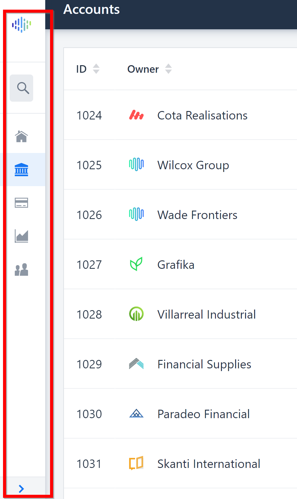
Is your above code will show the nav item like this when collapsed?
The Business App Starter has been discontinued (use starter projects start.vaadin.com). The <vcf-nav> componen hasn't been tested with it. The official App Layout component doesn't have a built-in feature to collapse the drawer/menu. You’ll need to build that yourself if you need that feature.
Can you also tell me what the ··· items are? Are they simply dividers/separators?
Wanted to add, that even though this collapsable menu/drawer is not built-in to the current App Layout or nav component, it doesn't mean they wouldn't be in the future. 🤞
Appreciate if we can have it in the App Layout or nav component in the future