web-components
 web-components copied to clipboard
 vaadin
[menu-bar] Add slot to provide custom overflow button
The overflow button shows text via CSS, but it would be useful to be able to use an icon or another component.
The approach we have chosen with [part="overflow-button"] is pretty much the same as with any other Vaadin components (e.g. toggle button, clear buttons, rich text editor toolbar buttons etc).
The only actual difference is this extra element we have in the markup: https://github.com/vaadin/vaadin-menu-bar/blob/4db8dd98b1a7917f66ca6bda3d2d5557036945f7/src/vaadin-menu-bar.html#L52
That one we had to introduce because vaadin-button already used ::before and ::after pseudo elements in CSS for different purpose (effects and alignment), so we couldn't use them here.
I think we should change that only after we agree on new approach on the icons and implement that in all the components so they would be customisable in the same way for consistency.
What about a slot for the overflow button component, which defaults to <div class="dots"></div>?
Sounds good to me. That might be one of the ideas for the next minor release.
We added slot="overflow" in #4687, but supporting a custom overflow button would still require some more tweaks.
In particular, currently the dots element is always added. Also, opening the submenu doesn't work properly.
I would leave this issue open for now, we could consider making these improvements if there is some interest.
Is there a workaround to style the content of the overflow button?
In a custom theme file for the vaadin-menu-bar-button I can change the color of the dots but I can't change the content.
I am using this CSS:
:host([part='overflow-button']) {
      margin-left: 16px;
      border-radius: 50%;
      border: 1px solid var(--on-grey-200, #E8E8E8);
      background-color: var(--on-neutral-white, #ffffff);
      color: var(--on-grey-900, #1c1c1c);
}

:host([part='overflow-button']) ::slotted(.dots)::before {
	content: "\203A\203A"
}
I am trying to achieve something like this:
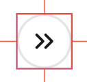
So far the best I have achieved is this:

In Vaadin 24 the Menu Bar overflow button can be styled with
/* Hide default content without hiding pseudo-elements */
vaadin-menu-bar-button[slot="overflow"] > div {
    display: flex;
    align-items: center;
    font-size: 1px;
    letter-spacing: -1px;
    color: transparent;
    padding: 0 var(--lumo-space-xs);
}

vaadin-menu-bar-button[slot="overflow"] > div::before,
vaadin-menu-bar-button[slot="overflow"] > div::after {
    display: block;
    font-size: var(--lumo-font-size-m);
    letter-spacing: initial;
    line-height: 1;
    color: var(--lumo-primary-text-color);
}

vaadin-menu-bar-button[slot="overflow"] > div::before {
    content: var(--custom-overflow-label, "More");
    margin-right: var(--lumo-space-xs);
}

vaadin-menu-bar-button[slot="overflow"] > div::after {
    content: var(--lumo-icons-dropdown);
    font-family: 'lumo-icons';
}
Would look like this