Umbraco.UI
 Umbraco.UI copied to clipboard
 umbraco
Feature: Color picker
Based on some comments here https://github.com/umbraco/Umbraco-CMS/issues/11713 it would be great to have a color picker similar to the current <umb-color-picker> component in Umbraco.
Features
- Zero dependencies / Vanilla JS
- Touch support
- Accessible
- Alpha channel (opacity)
Nice to have
- Popup or inline
- Palette / predefined colors
I found an example here: https://www.npmjs.com/package/color-picker-web-component https://gh.grahamsh.com/color-picker/
@bjarnef That would be great, is this something you would be up for building?
@nielslyngsoe maybe I could find some time to look at this and learn about web components, but if HQ or other from the community want to work on this feel free to start building.
I guess the components should be vanilla JS - or depend on other components, but not external libraries?
Today we use these libraries in property editors:
- Flatpickr (date picker)
- noUiSlider (slider)
- Spectrum (which use tinyColor) (color picker)
I found this also as inspiration: https://github.com/juchar/color-picker
Which also use TinyColor library.
@bjarnef exactly, we want to avoid dependencies as much as it makes sense.
If using dependencies it would be nice to have them as small as possible.
And then overall think about separation and simplification.
If I can put some scope to it, then I would just solve the Color Picking, not as an Input or in a Modal, Just the Color Picking UI.
Then it should be another components concern to implement it for as a form input and open up the Color Picker in a modal/pop-out.
Ideally, we will just be using a Color Util(Like the https://github.com/bgrins/TinyColor) and then the UI of the Color Picker is something we own. So we can use our own buttons etc. then we are free to make it look as Umbraco UI and this enables us to adjust in the future :-) so we are not stuck with a certain UI/UX solution.
I guess that's my 50cents :-)
Would be cool to get your input on this, I know this one is not on top of our ist currently, so we will not have the time to pick this one up by HQ in recent time. :-)
Yes that would be great. I guess the spectrum color area could be a component, e.g. something like this https://iamkulykov.com/vanilla-colorful/
I found this example which could be useful as inspiration: https://shoelace.style/components/color-picker?id=color-picker
Cool, the last one is feature-wise really good for Umbraco.
Why I think that is because:
- Many users like to paste a color string(often a hex-value) from elsewhere.
- I can see it begin handy to have the option to add some swatches in the color picker. I think that opens up great flexibility, so editors can have a set of predefined colors but still have the option to customize and pick their own.
I do though think it's important for reuse and separation of concerns that we split this into smaller components, so we end up having multiple color display components, like this division:
uui-input-color-box
uui-input-color-hue-slider

this composition could then be called: uui-input-color-picker

The swatches would be a component on its own, like: uui-color-swatch-grid

It could come together in the total composition component( the little input showing the color which then opens a modal, it could be called 'uui-input-color') in UI Library but that might just be part of BackOffice.
@nielslyngsoe yes, I think it works great and also well on touch devices (at least on android - not sure about iOS).
I agree the pasting a color in a input is useful. Even when pasting rgba(255,0,0) it resolves the value to #ff0000.
And to swatches are useful too for pre-defined theme/brand colors.
We would probably also need a uui-input-color-alpha-slider

or maybe uui-input-color-hue-slider and uui-input-color-alpha-slider could be combined in a single component.
Besides the color picker there are also other components we could be inspired from:
Avatar https://shoelace.style/components/avatar
Badge https://shoelace.style/components/badge
Divider/separator https://shoelace.style/components/divider
Split Panel https://shoelace.style/components/split-panel
Progress Bar https://shoelace.style/components/progress-bar
Progress Ring https://shoelace.style/components/progress-ring
Range https://shoelace.style/components/range
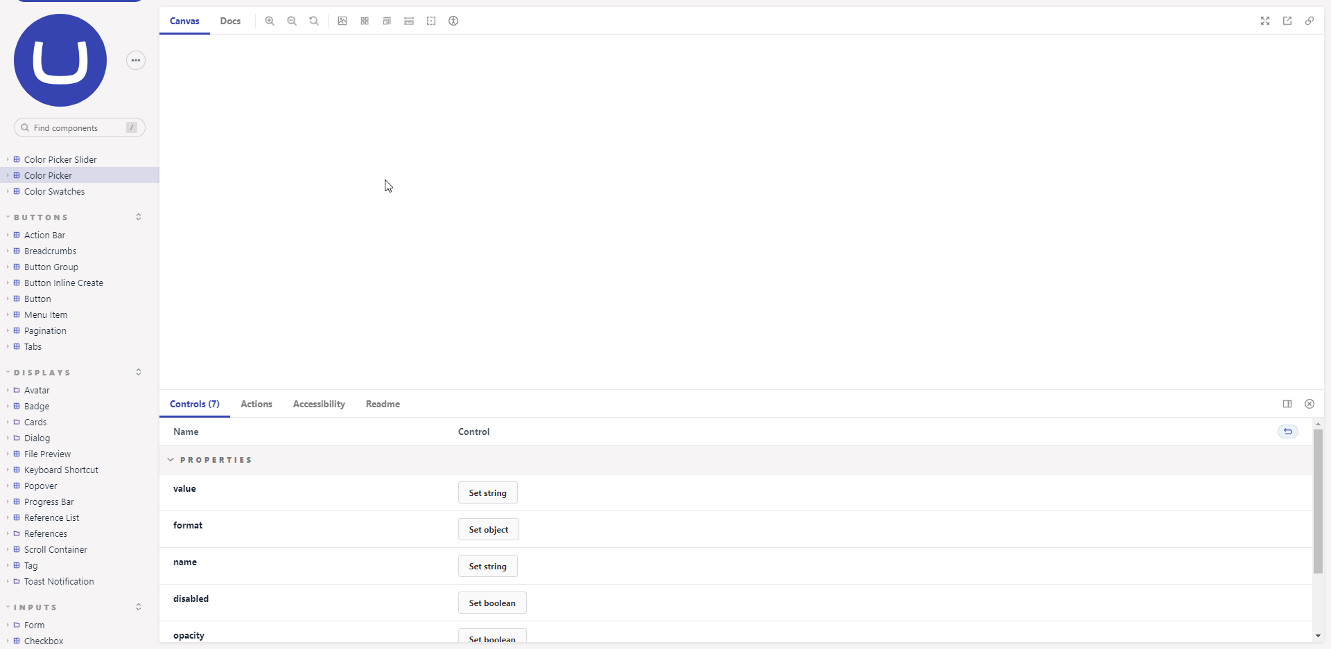
I noticed we already have some components for progress/loading: https://uui.umbraco.com/?path=/story/uui-progress-bar--overview
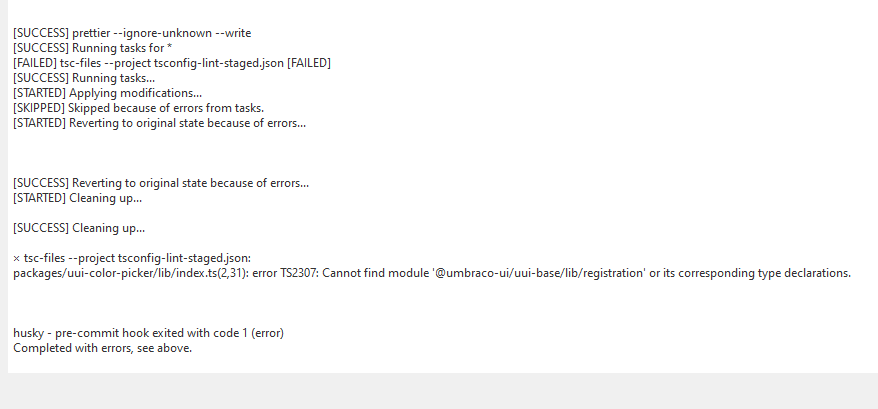
@nielslyngsoe I have looking at the contribution guide here: https://github.com/umbraco/Umbraco.UI/blob/dev/docs/CONTRIBUTING.md
but when I commit changed to e.g. a uui-color-picker I guess this error:
Program: No such file or directory
husky - pre-commit hook exited with code 127 (error)
Completed with errors, see above.
Have you seen this error before? :)
In /.husky/_/husky.sh it apparently had these lines at bottom (but not in /node_modules/husky/husky.sh)
'PATH=$PATH:'$PATH
'PATH=$PATH:'$PATH
When I removed these lines it continued.
I also needed to remove as any (generated by npm run new-package)
defineElement('uui-color-picker', UUIColorPickerElement as any);
so it instead is this:
defineElement('uui-color-picker', UUIColorPickerElement);
Now I have this error:
@bjarnef I think we have seen this before on Windows, I will investigate tomorrow.
Hi @bjarnef now we have made a fix for windows, I hope you are open to try it out.. (btw its in the dev branch)
You might need to do some clean-up for it to work(remove .husky/_/ and /node_modules/) and then run npm install.
Eventually its simplest to do a new clone? Let me know how it goes :-)
@nielslyngsoe yes, that fixed it :)
I have submitted this draft PR https://github.com/umbraco/Umbraco.UI/pull/112
The uui-input-color-hue-slider component could probably be combined to a single component uui-color-picker-slider, some properties like min and max value, current value and css class.
The color spectrum in the slider seems to be all css:
.color-picker__hue {
    background-image: linear-gradient(to right, rgb(255, 0, 0) 0%, rgb(255, 255, 0) 17%, rgb(0, 255, 0) 33%, rgb(0, 255, 255) 50%, rgb(0, 0, 255) 67%, rgb(255, 0, 255) 83%, rgb(255, 0, 0) 100%);
}
and for alpha/opacity:
.color-picker__transparent-bg {
    background-image: linear-gradient(
45deg
, var(--sl-color-neutral-300) 25%, transparent 25%), linear-gradient(
45deg
, transparent 75%, var(--sl-color-neutral-300) 75%), linear-gradient(
45deg
, transparent 75%, var(--sl-color-neutral-300) 75%), linear-gradient(
45deg
, var(--sl-color-neutral-300) 25%, transparent 25%);
    background-size: 10px 10px;
    background-position: 0px 0px, 0px 0px, -5px -5px, 5px 5px;
}
plus the following based on current color value:
background-image: linear-gradient( to right, hsl(0deg, 0%, 100%, 0%) 0%, hsl(0deg, 0%, 100%) 100% );
Horizontal / Vertical direction on the sliders would also be a nice feature.
Hi @bjarnef,
We're writing to let you know that we would love some help with this issue. We feel that this issue is ideal to flag for a community member to work on it. Once flagged here, folk looking for issues to work on will know to look at yours. Of course, please feel free work on this yourself ;-). If there are any changes to this status, we'll be sure to let you know.
For more information about issues and states, have a look at this blog post
Thanks muchly, from your friendly Umbraco GitHub bot :-)
@nielslyngsoe @iOvergaard
Do I need to configure something specific to run / build the packages locally.
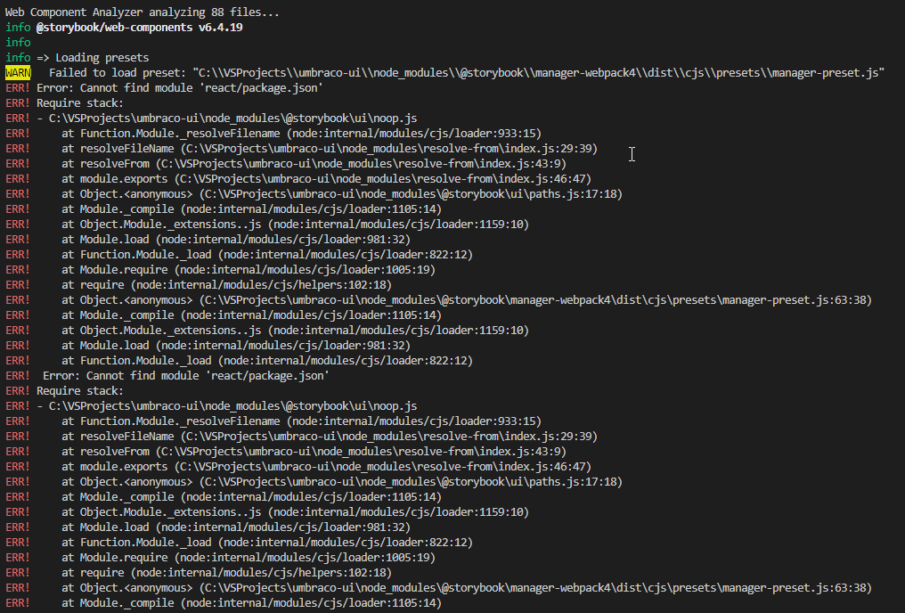
When running npm run storybook it seems I get this error:

I think the changes in PR https://github.com/umbraco/Umbraco.UI/pull/112 now should be using the new package structure, which was changed after I initially started on the PR.
@bjarnef
It works on the dev branch for me. I seem to remember I had to delete the node_modules folder at some point because of an update to Storybook. Have you tried that?
Also you build is failing because you need the new components registered in the main package-lock.json file, so you need to run npm install and commit that as well.
@iOvergaard yea, just tried again remove entire node_modules folder and afterwards ran npm install.
But seems to fail here:
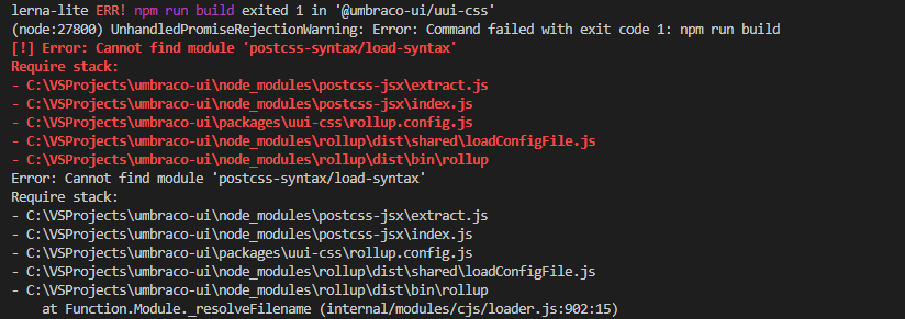
@bjarnef
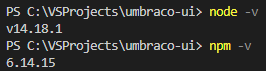
Could I persuade you to try with Node 16 and npm 8? The build on your PR is failing with even more missing packages now.
The recommendation for building UUI is as follows from package.json:
  "engines": {
    "node": ">=16.0.0 <17",
    "npm": ">=8.0.0 < 9"
  }
@iOvergaard thanks, that seem to help so far (should be documented btw in the contribution guide) Now I get this error.
Okay, I ran npm install again and then npm run storybook.
Now in spin up storybook on http://localhost:6006/
It seems I have a minor issue, which need to be resolved.

Ahh good, good. I actually ran into the same problem on your repo as you described above. I think the issue stems from npm trying to upgrade the old lockfile. Better to delete both lockfile and node_modules when upgrading node/npm 😮💨
There are some great inspirations in the Shoelace library but also in the Storybook showcase
E.g. the Adobe component library has some interesting components, e.g the color components: https://5f0dd5ad2b5fc10022a2e320-xoceijqwcs.chromatic.com/
@nielslyngsoe @iOvergaard are there convension for internal functions/utilties, e.g. something like this: https://github.com/shoelace-style/shoelace/blob/86706f31c61f4b0943a5161c85af2e3665fcd733/src/internal/math.ts
We may want to add a utility to parse color string. Either a dependency on tinyColor which Umbraco currently use or invent our own color utility (but we may re-invent the wheel), which could be useful to package developers in future (or if developers just want to extend with a custom web component).
It seems the the Shoelace library has a dependency on Color module: https://github.com/shoelace-style/shoelace/blob/next/package.json#L59
Color: https://github.com/Qix-/color TinyColor: https://github.com/bgrins/TinyColor
Hi @bjarnef
Yes, good one, we should add utility methods in UI Library.
I'm imagining that such would be located in packages/uui-base/lib/utils
and exposed like import { Color } from '@umbraco-ui/uui-base/utils'
Yeah, would be good to have. I imagine it can be useful in other components. We probably also need some of the same calculation methods in various components.
It seems both Color and TinyColor have many of the same features, but based on this analyzer TinyColor seems a bit more lightweight. https://onlinedevtools.in/online/npmpackageanalyzer

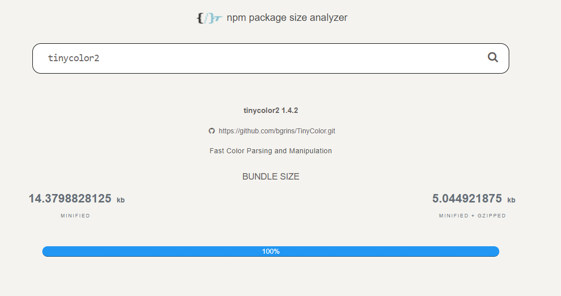
I considered TinyColor2 but is hasn't had a release in 2 years, so not sure it is actively maintained:
I found this which is a fork of TinyColor2 reformated into TypeScript: https://www.npmjs.com/package/@ctrl/tinycolor
@nielslyngsoe @iOvergaard do you prefer one one these?
https://www.npmjs.com/package/@ctrl/tinycolor (demo: https://tinycolor.vercel.app/ )
or
https://www.npmjs.com/package/color
I started using the fork of tinyColor since it is smaller and also seem to contain better color parsing.
I then came across this which looks interesting: https://colord.omgovich.ru/