Please keep the original interface list design
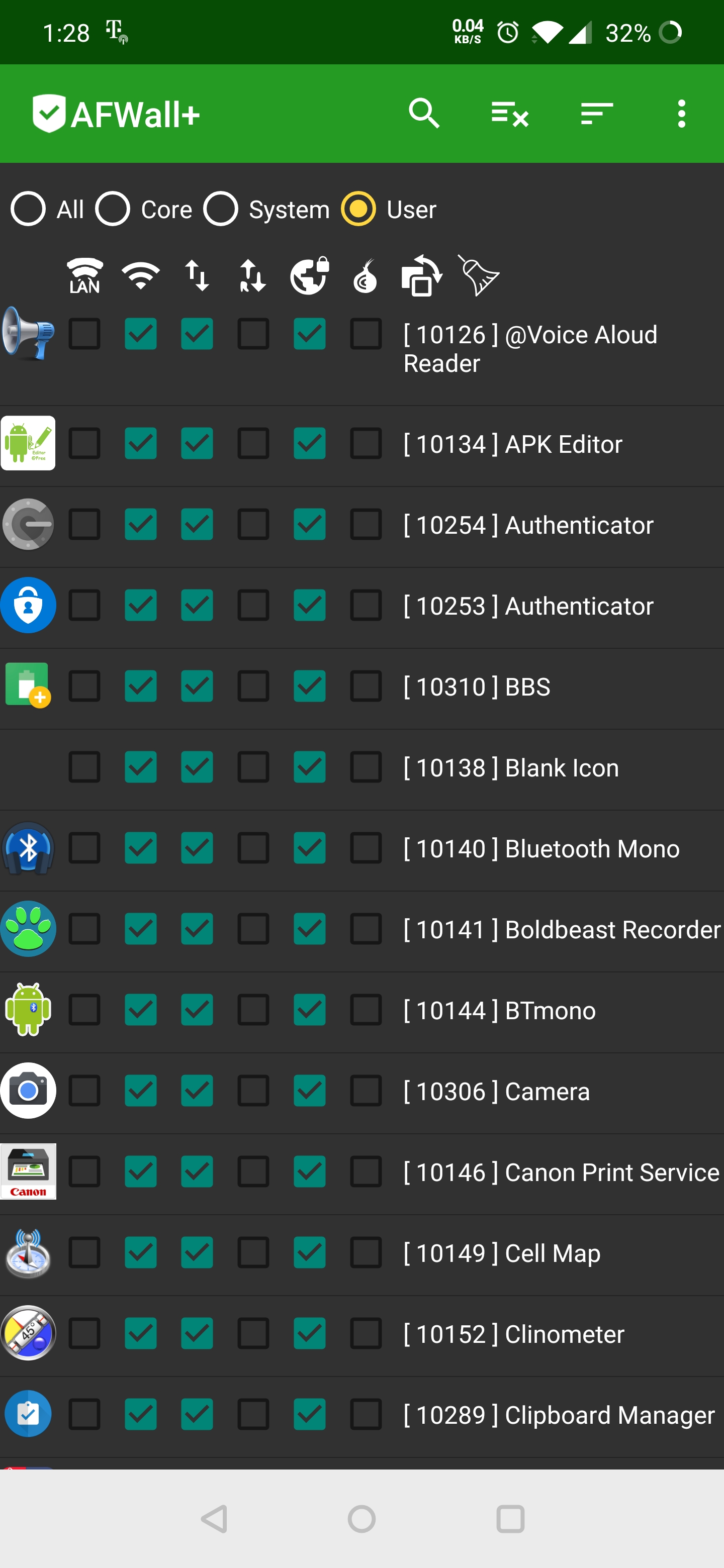
[IMHO] The latest beta (3.3.1 beta 4 I think) primary list interface is way way too expanded. Two lines per entry, a larger app icon... looks like an Apple creation Please keep the original interface list design. Concise & complete [/IMHO]
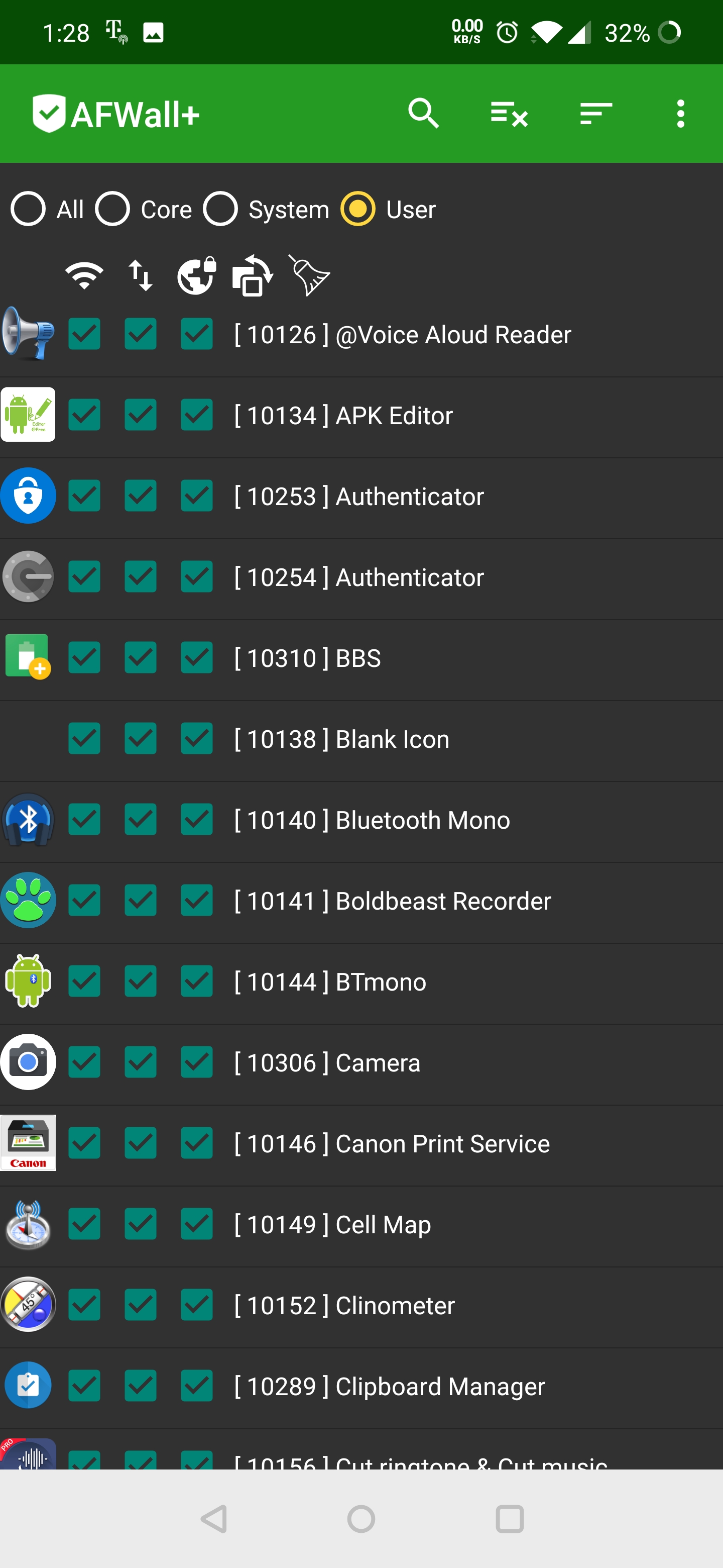
Just to be clear, the attached screenshots show current stable 3 and 6 interface rules connectivity displays. Concise, complete, effective.
It would be nice to have the controls on the left but compared to the more serious things being fixed I could not call this a bug or serious issue. Still, it would be nice if this could be tweaked without drawing focus from other more important things so...
Although the new layout may be logical when there are more controls enabled than can neatly fit on the same row to the left of the app label, it makes the app harder to use when there are only 3 or less controls. Also, IIRC, with 3 controls enabled the new interface is used when supposedly the old interface (which would put 3 controls on the same row to the left) should be used.
[EDIT] I may have misinterpreted statements at XDA about using old interface for < 4 controls as a new feature that is not working when it may actually be a new feature which I've not yet seen and which addresses the topic of this post.
The whole new UI design PR(pull request) was accepted because starting 3.4.0, we have one more control (tether) introduced and the main UI did not have space to show it. I have pushed the changes to apply new UI only when user selects more than 3 controls (wifi/data/lan) + anything else.
Thanks.
Thanks for the kind consideration. While I would prefer and higher number (like 4), it's your choice. And as always -- thank you for your enormous commitment to our great community.
Just updated to latest release and the new UI is more like a patch up, than proper design,
 Surely there is a better fix.
There is so much unused space, half the screen is empty
Surely there is a better fix.
There is so much unused space, half the screen is empty
@ukanth
Is it possible to limit title to two lines, then user must click to see the rest?
As certain oem make ridiculous decisions in using same id for bunch of apps:

This makes the new UI even worse compared to older design
There is so much unused space, half the screen is empty
I can only second this. On my device barely over 1/3 of the horizontal pixels are used (with the app set to not show icons or uid), while every app now takes some three times more space in the vertical direction compared to before. This makes for a very low information density and requires alot more scrolling to locate specific apps.
Any chance of making this behaviour configurable in the UI preferences, so one can choose whether or not using a dedicated line for the controls in the main view suits their device and the configured number of control checkboxes?