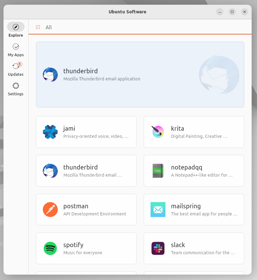
app-center

app-center copied to clipboard
Design discussion: updates page
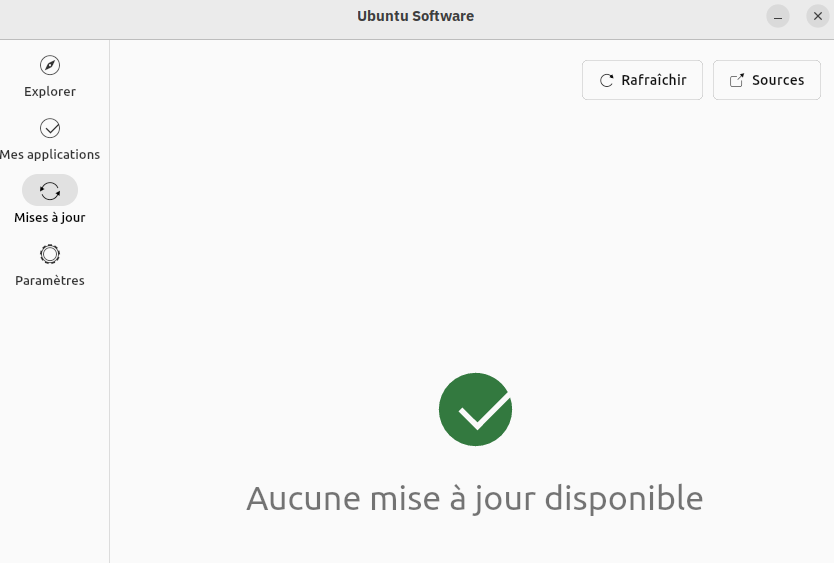
Currently this page shows the updates available for classic packages like debian and rpm. Snaps are not included because they auto-update in the background (TBD)
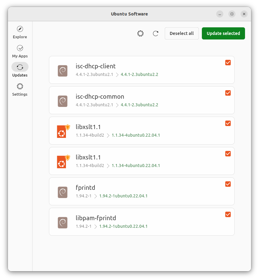
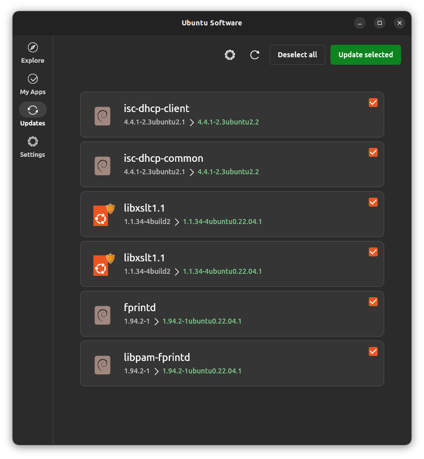
Updates page List View
- updates can be selected globally or indivually
- version change is shown via normal to green color change
(click to enlarge images)
| Light | Dark |
|---|---|
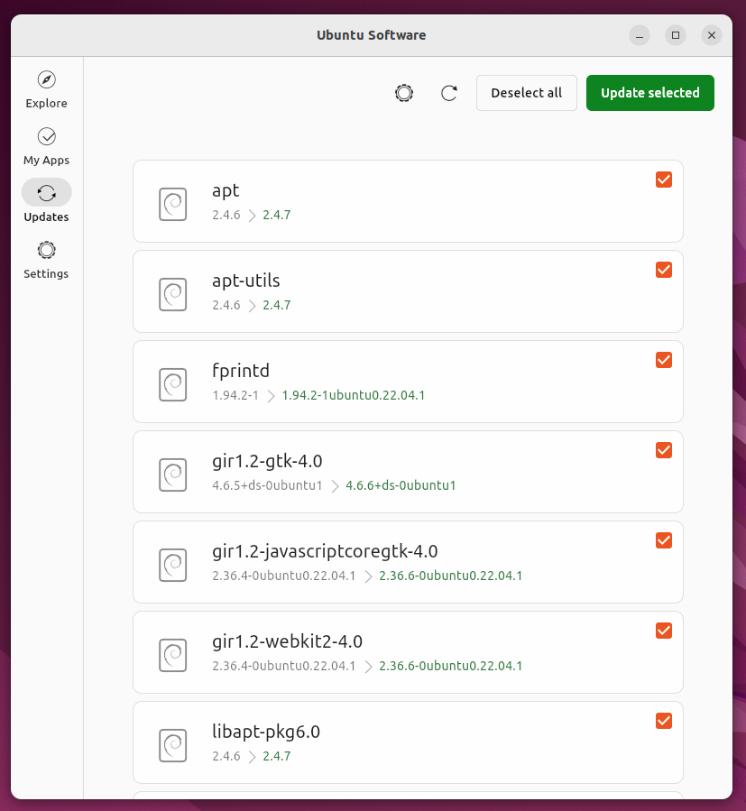 |
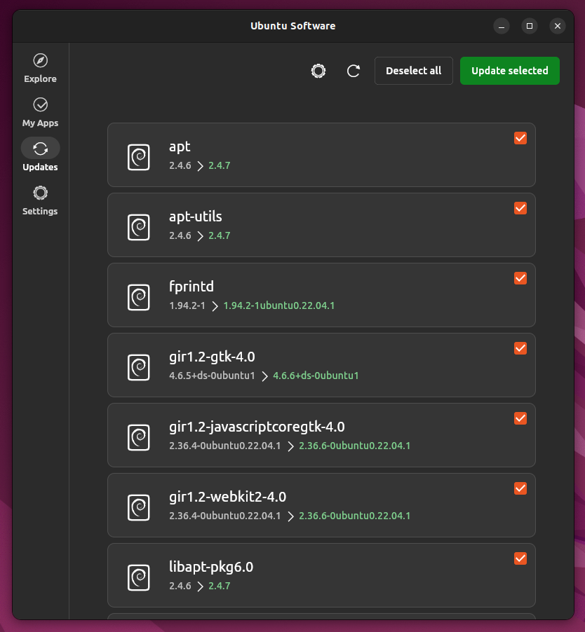 |
Colored Icons as an alternative
| Light | Dark |
|---|---|
 |
 |
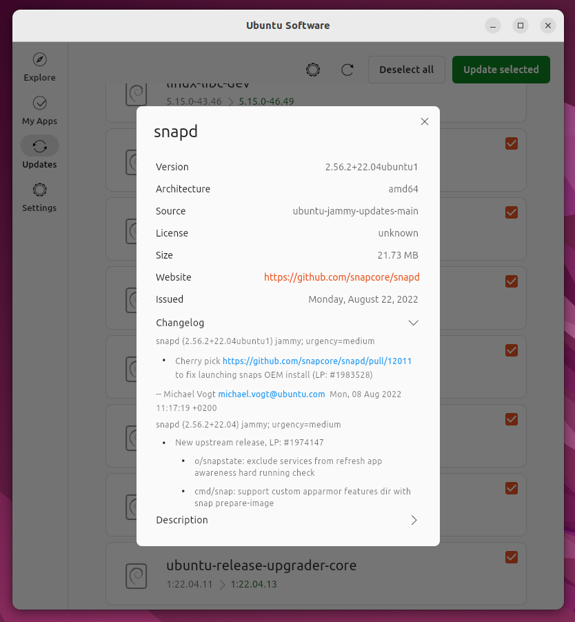
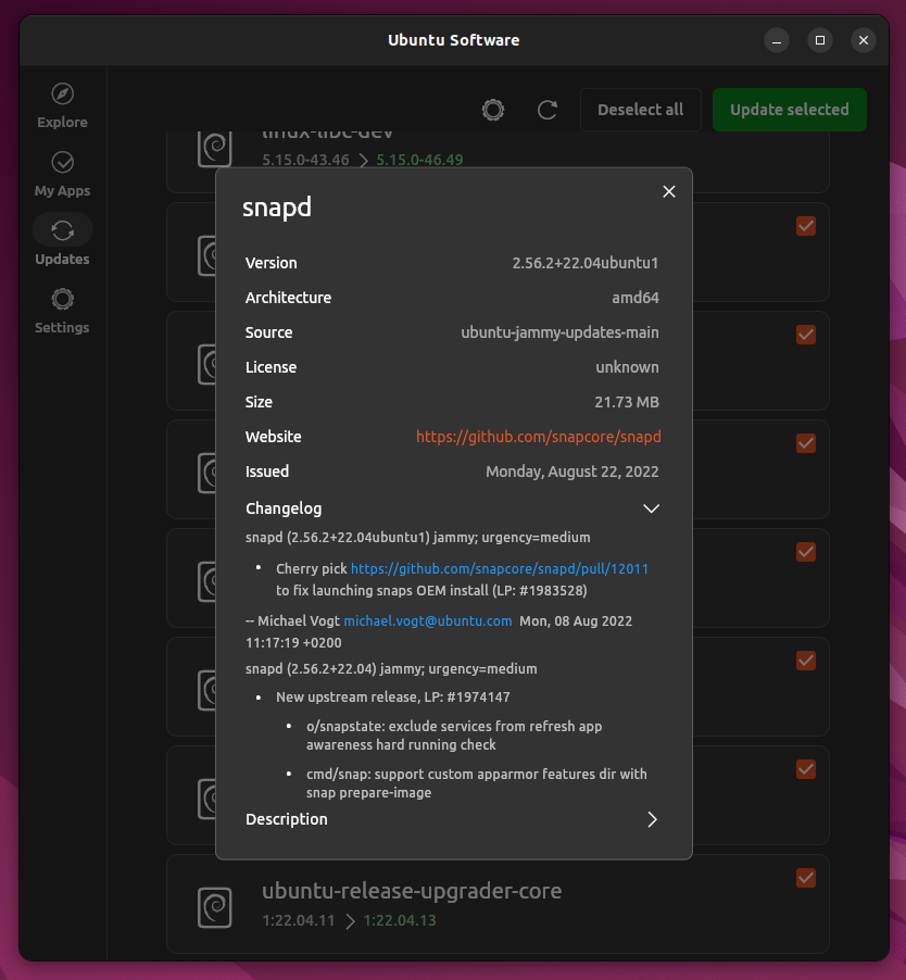
Clicking an update opens this dialog
| Light | Dark |
|---|---|
 |
 |
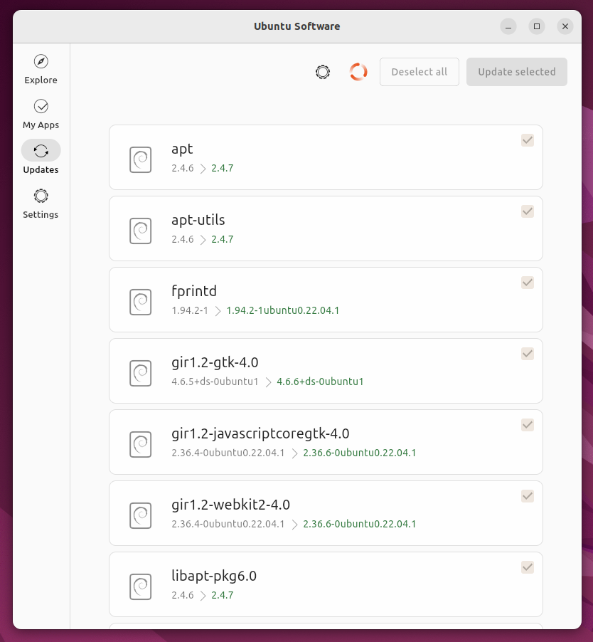
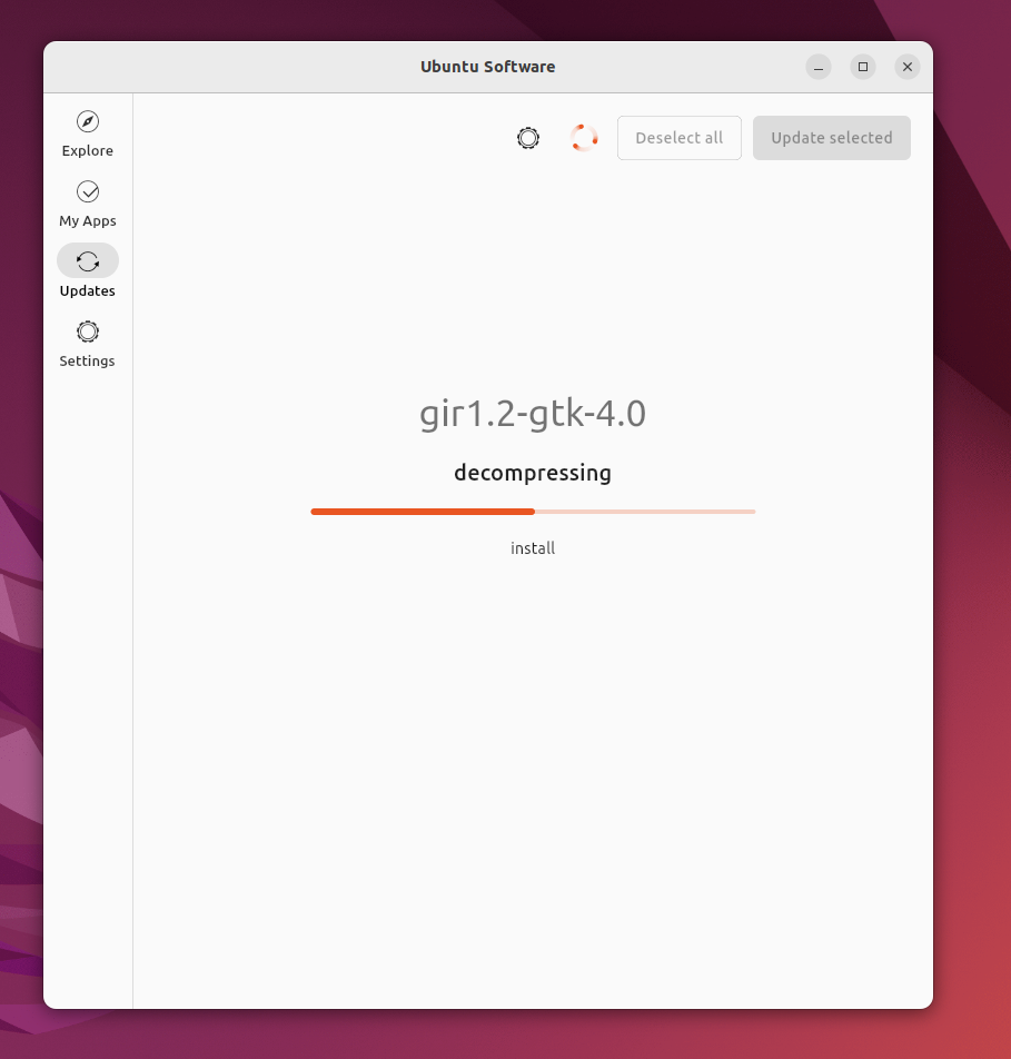
Installing starts and all updates become unselectable
When updating the screen switches to a more simple screen where the process of each step is displayed, this is needed because often the updating process is so fast
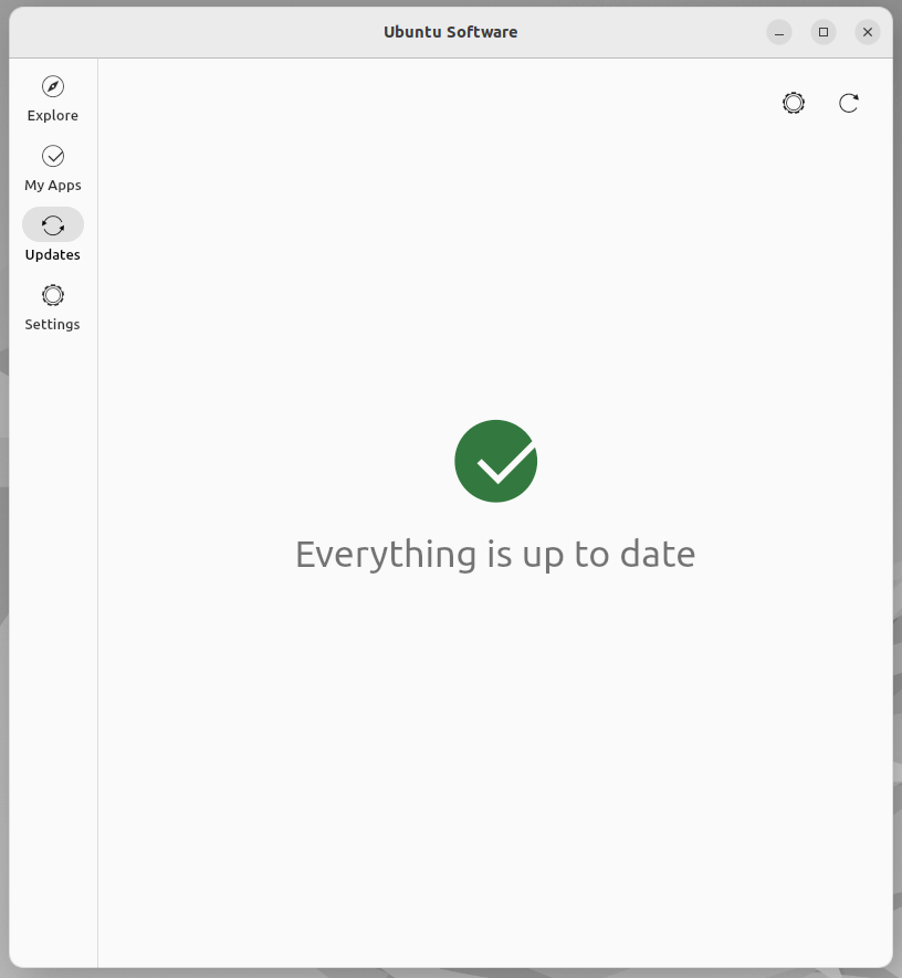
When the update is done or no update is available this splash screen is shown
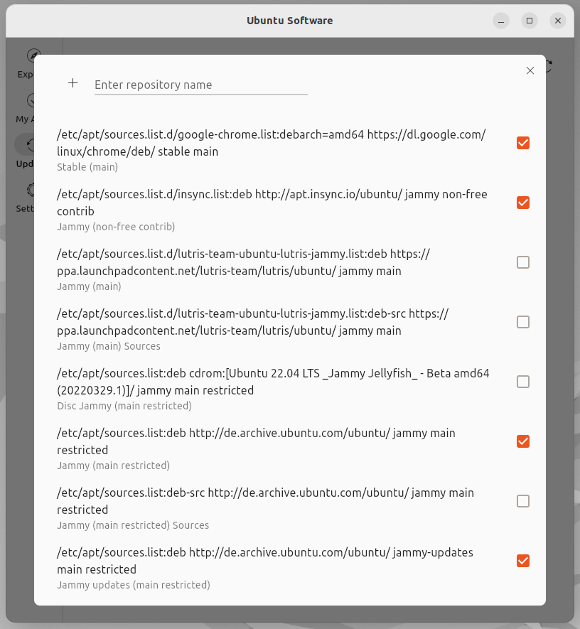
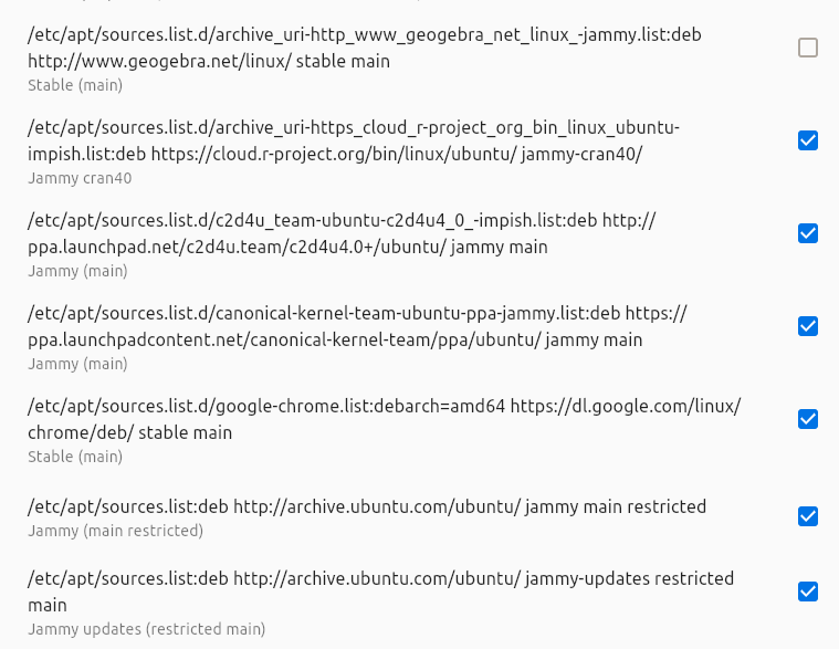
The repositories in place where the software comes from can be managed by clicking the levitating settings wheel button
Update:
Searching for updates as seen from other screens (spinning indicator as an animated icon)
Searching for updates as seen from the update screen (+ animated debian package with liquid inside)
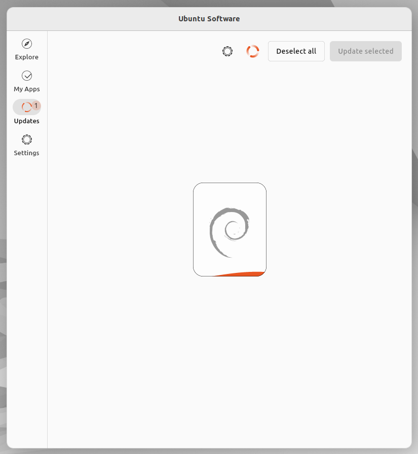
New updates available
Hi!
I find the 'sources' page not that clear:
Is it possible to see the title then the address? Or maybe something not as detailed by default? Just my opinion!
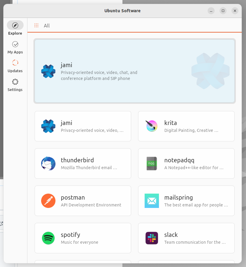
In the 'updates' page, I would have thought to two tabs 'updates' and 'sources' to fit somewhat the design I see in 'my apps'?