Icon vertical alignment in button
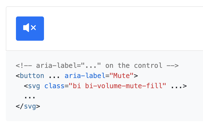
Icons inside buttons appear slightly off, as seen on the documentation page https://icons.getbootstrap.com/#accessibility
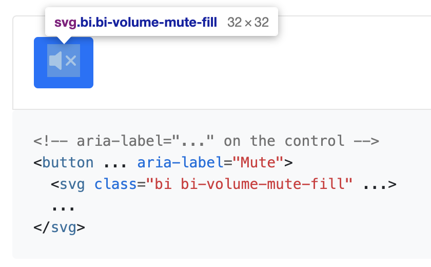
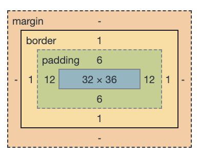
It seems that, even though the icon is 32px in height, the button allocates 36px for the content.
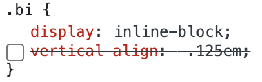
It seems that removing the vertical alignment of the icon would fix the issue:
but I suspect that this will mess up vertical alignment with any text that renders next to the icon.
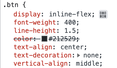
Another fix would be to change the display of the button from inline-block to inline-flex, and have the content center-aligned vertically:
OS: macOS Browser: Chrome, Safari
Any news here, as this bug is still present in bootstrap5?
While you could fix it by using Bootstrap5 flex and adding buttons d-flex justify-content-center align-items-center gap-1 CSS classes, I think this is not the suggested/proper solution or only bad workaround?
MAybe this is the wrong repo though? It#s more about bootstrap itself than the icons? If so, can it maybe be moved?