 twbs
twbs
Thumb is difficult to drag using touch input with custom <input type="range"> controls
When using custom <input type="range"> controls with .custom-range, the thumb is difficult to drag using touch input (mobile and tablet). This occurs on iOS and Android, across browsers.
I recently observed some users interacting with the Bootstrap range sliders in my own project, and almost unanimously they had difficulties with tapping the thumb to drag it. Of course, anywhere in the track can be tapped to 'jump' the thumb to that position, but that doesn't seem to be the primary way users try to interact with it.
Could the hitbox for the thumb be increased in size? Perhaps with the ::before / ::after pseudo elements. It looks like material-ui does something like this, and in my own testing their slider thumb is far easier to drag.
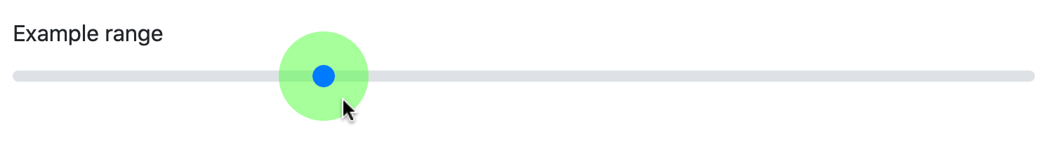
The current effective hitbox is a 1.4rem square (marked in transparent green):

Could this be increased to twice the value of $custom-range-thumb-width — so by default a 2rem diameter circle? (marked in transparent green):

I've done some more research and it seems like ::before / ::after can't be used on <input> elements (see this Stack Overflow answer and this blog post), so that wouldn't work as a solution.
note that material-UI and similar frameworks end up "faking" the sliders with extra spans/divs etc, wihch in the end break them for users of touch+assistive technologies (i've filed issues with some of them about this).
currently, the bootstrap slider simply adds a bit of style/finesse to the native <input type="range">, so the problem is fundamentally one of the browsers not making these controls touch-friendly enough. not sure if there's a clean solution to this at this point, i'm afraid.
though potentially there are some more hacky CSS-based approaches that could be gleaned from https://css-tricks.com/sliding-nightmare-understanding-range-input/
I've found some success with the below code: (which is also on CodePen here)
.custom-range {
  &::-webkit-slider-thumb {
    background-clip: padding-box;
    border: 0.4rem solid rgba(0, 255, 0, 0.5); // translucent green used to aid development, set to 'transparent' in production
    transform: scale(4);
  }
}
It seems promising, but the box-shadow on :focus will need fixing.
unfortunately doesn't work in Firefox though. that's the problem generally, cross-platform support for some of these form styling hacks is not great.
Actually I've got it working in Firefox just fine (see updated CodePen):
.custom-range {
  &::-webkit-slider-thumb {
    background-clip: padding-box;
    border: 0.4rem solid rgba(0, 255, 0, 0.5);
    transform: scale(4);
  }
  &::-moz-range-thumb {
    background-clip: padding-box;
    border: 0.4rem solid rgba(0, 255, 0, 0.5);
    box-sizing: border-box;
    transform: scale(4);
  }
}
I'm not sure why it becomes necessary to explicitly set box-sizing: border-box; for Firefox, but with it it seems to look/work exactly as Safari/Chrome.
It seems unlikely we'll see better browser support for touch controls like this anytime soon, and currently the usability of them is quite poor. I don't think this solution (once the :focus outline if figured out/fixed) is a particularly hacky one.
Yeah, seems to work fine on Firefox. I wonder if autoprefixer supports this.
I think our best bet is to ask for autoprefixer to prefix these properties. In the meantime, we could land a patch with the needed vendor prefixes. PRs welcome.
Finally circled around to this and while I'm sure the increased target area is helpful, it's odd to see a massive focus ring around the thumb. Looks a little broken to me. Not sure how I feel about landing this change as-is. How much of a target area increase do we need here? A smaller border would help, but could still look odd to me.
one approach we could explore perhaps is to somehow do both ... provide an invisible padding/box somehow around the range knob itself (so it is more usable/tappable/grabbable), while also providing a reasonably-sized regular focus indicator
i.e. with some rough tweaking, default state (no forced background)

and focused state (making the border/shadow dimensions a bit smaller to account for the x4 scaling)

Just found this issue and it helped me out massively in fixing an issue with my own range slider. Its a shame it never got implemented for you guys. Hopefully this might help:
You could get around the focus outline issue by resetting everything to default on focus. This wont affect iOS or Android as they don't trigger focus when you tap on elements.
&:focus::-webkit-slider-thumb {
  background-clip: initial;
  border: none;
  transform: none;
}

&:focus::-moz-range-thumb {
  box-sizing: initial;
  background-clip: initial;
  border: none;
  transform: none;
}
I think a better interaction would be for the whole track to receive touch events and change values when dragged. This is similar to the volume slider in iOS Control Center.
https://twitter.com/durreadan01/status/1715926763363328061