Can't tell when post is part of a thread
On Mastodon (in the web version) threads will indicate that they are part of a thread, if they are not the first toot in the thread. On Tusky, there is no indication that it's a self-reply unless you open the toot.
It would be nice to know if a post is a part of a thread without needing to open the post.
-
Tusky Version: 8.1
-
Android Version: 9
-
Android Device: Motorola G7
-
[x] I searched or browsed the repo’s other issues to ensure this is not a duplicate.
Hi Do I misunderstand or you're talking about reply/arrow icon which changes it's look when it's a reply? We have it as well.

Yes, the show thread thing. Why shouldn't we adopt it? It's very confusing to see posts and not realize there's context to them. It only applies to replies to self.
Well, my suggestion is because I don't like the way it looks, and we already have the reply arrow thing that @charlag mentioned as a visual indicator. However, I'm just some person (i.e. not a Tusky maintainer), and it's just my opinion. 😃
Ah, I see that now. I literally never would have realized that the double arrow vs single arrow even existed, let alone that the double arrow means you'd be replying to a reply.
The double arrow is sleek and unobtrusive, and also at the bottom of the post (seen after reading it). Sleekness is nice and all, but even knowing it exists it's only a marginal improvement. I'm not on Tusky to see the most beautiful, sleekest app, but to have a good experience seeing posts on the fediverse.
The thing is, Mastodon has more screen real estate usually so they can afford that. Mastodon did what we do initially. Maybe we can find some better indicator?
Excuse the terrible mockup (I'm on my phone and have very limited picture editing options), but maybe the thread indicator could be the unicode 25B2/25BC symbols up hear the relative timestamp for a toot?

@KWierso thanks for the mockup but I think it's not easy to understand. Basically any iconography wouldn't improve it because we have an icon already and the text repeated for multiple posts will eat one third of screen space in average timeline.
Hi Do I misunderstand or you're talking about reply/arrow icon which changes it's look when it's a reply? We have it as well.
Wow, that's new to me! In fact, I never even noticed that there are different arrows at all. I think the reply arrows should either stand out more (e.g. by colour) or they should be explained in an after-install tutorial.
I also never realized what the different arrows were for, but I would argue that even if I did, they wouldn't be enough. If you're viewing a post directly, threaded replies have a vertical line indicating that. That line should appear on the feed view as well (like it does on Twitter), particularly when a person is replying to themselves, otherwise each post appears to be in isolation (and in reverse order), and it's very confusing.
It looks like #1767 was closed despite being only partially implemented. The request there (and here) was for both an indication of the number of replies that a post has (as part of the thread) and an indication that a post IS a reply (as part of a thread). The former's done, the latter is not.
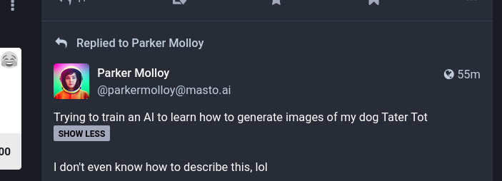
The web interface (non-advanced setting), at least as of 4.0, now has a "Replied to" at the top of posts in the home screen timeline that are part of a thread. That kind of thing seems like it would look fine in Tusky.
I believe the Mastodon API also marks posts as replies, since many clients are able to pull the post they're replying to automatically. As for how to implement, I believe something like the Mastodon 4 visual will be the best. It's minimal yet effective.
I'd also prefer an "is a reply" indicator above the post instead of below like the current double-arrows. It could be a line going upwards from the profile picture (least costly on screen real estate), or that full "Replied to ..." line as from the web interface.
The reason is that usually you scroll downwards, and you read from top to bottom (most languages, at least), and whether there is additional context is something I need to know before I read the actual text of the post, to avoid confusion.
Comparing these two screenshots, Fedilab has multiple thread lines with indentation to help clarify the relationship between comments within a reply thread. I'm unclear if this is germane to the initial request or if I should open a new issue for this.