Use radar chart for date range comparisons
In #461, Terence is adding date range comparisons. We currently show range data with side by side charts like this:
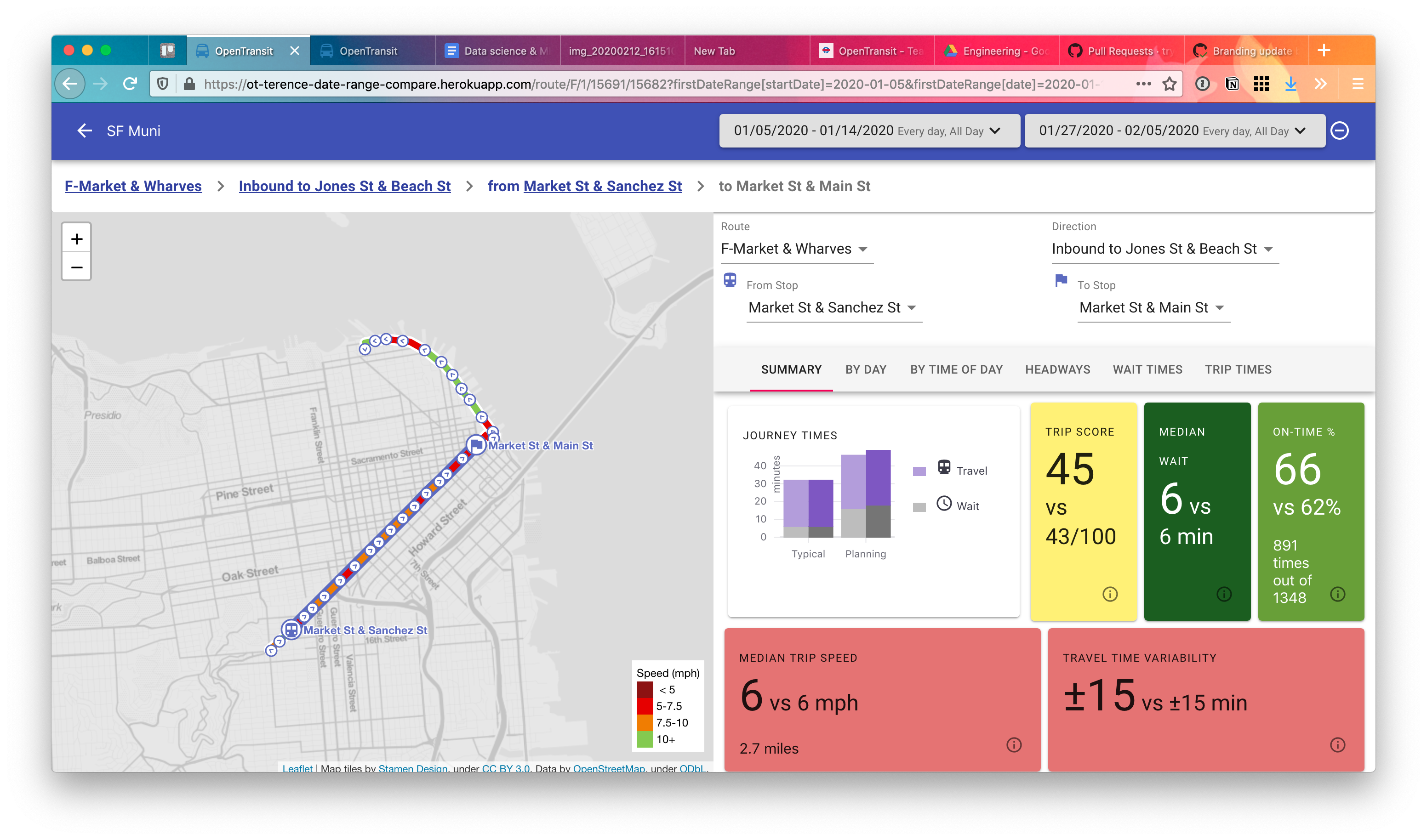
But the UI gets busy and it's hard to see exactly which range is better at a glance.
So in this comment I proposed adding a radar chart like this:

You could imagine using one color "net" for each date range, and the "points" on the edge of the radar chart would be stats like journey times, score, wait, on-time %, etc.
I'm not sure if this would replace the cards we currently have or just augment them. Up to you.
I don't really see how a radar chart would be effective at conveying information about the relative difference of various statistics between two date ranges.
It seems like a more straightforward approach would be to use a table where each row is a statistic, with columns for the first date range, the second date range, and percentage increase/decrease
For example:
| 1/1/2020 | 2/1/2020 | % Change | ||
|---|---|---|---|---|
| Median Service Frequency | 5 min | 8 min | +60% | __________0******____ |
| Median Trip Time | 10 min | 8 min | -20% | ________**0__________ |
(The last column shows an optional horizontal bar to visually represent the % change.)
Another approach would be could be a bar graph with series like Median Service Frequency, Median Trip Time, etc. where each series has two side by side bars for each date range.
Both of these UI approaches would also work for comparing Actual vs Scheduled statistics for a single date range.