t3
 t3 copied to clipboard
Optimize alignment in Parameter window
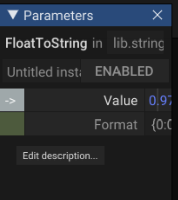
The area of the parameter names should be reduced, in order to not cut off the values. See this example, plenty of space left of the names, but the values are not visible anymore.
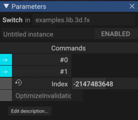
The other way around maybe could also be improved. This is an example for a cut Parameter name, but enough space for the value.
I assume the available space needs to be calculated depending on the max string length of the paramete rnames.
issue is likely only relevant for laptop user
I can see the problem, but there is no solution that would fit for every body. Fix calculating the max would make the implementation much more unreadable.
One possible fix would be a draggable splitter between name and parameter values as is done in UE5.