Improve how the token is shown, after unassigning a token.
Is your feature request related to a problem? Please describe. Currently if you click on a token to unassign the token, the token is still selected (since you clicked on it). The token is un assigned, but it still looks like it's assigned. When you click in some whitespace, this selection is removed.
Describe the solution you'd like Make it more clear when a token is unassigned, when you click on the token.
Describe alternatives you've considered Remove the selected-state, when you unassigned a token.
Additional context https://user-images.githubusercontent.com/109062656/182798037-ce8410e8-3514-499f-9c27-74d4aad41092.mov
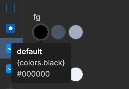
I'd suggest we change the focus style of that TokenButton to something that is clearly distinguishable - we'd still need some indicator of what token is selected right now for keyboard interactions.
Let's use a slight transparent gray for focus, instead of the blue.