texstudio
 texstudio copied to clipboard
Misaligned & Invisible Page Number in Dark Theme
Environment
- TeXstudio: 4.2.2
- Qt: 6.2.3
- OS: WIndows 10
- TeX distribution: miktex
Issue
The page numbering in the "go to" part of the internal PDF viewer has the numbers misaligned.

This is hardly a big deal in the picture above. It also successfully rescales with more page.

However, there is a serious issue when swapping to dark themes. The first two pictures below are for Orion Dark and the other two for Adwatia Dark (txs). The page numbers should be 15 and 298.


Orion Dark has a similar issue with the scaling number at the bottom, but AD doesn't.


I do want to use a Dark Mode, but these issues are a bit annoying...
There is a similar issue with the Find box:


The latter should have a red background and say \congr inside.
It seems like there a quire a lot of issues with the spacing in Orion Dark. I guess I should stick with Adwatia Dark for the time being.
One point of advice from my experiments: Always start txs new after changes affecting the UI like themes, font sizes etc.
I try to reproduce starting with standard theme and 4.2.2 Qt 5.12.2 as well as dev 4.2.3 Qt 6.2.4. Using font MS Shell Dlg 2 in size 8 or Segoe UI 8 respectively (on second system MS Shell... not available):
The internal pdf-viewer shows nearly perfectly (screenshots showing GIMP zooming 8x):
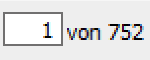
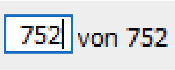
The ruler shows a small offset of 1 pixel (on a Full HD 1920x1080 screen).
What makes me wonder when looking at your screen shot, is the smaller size of the input field when on page 40. My screenshots show a field of constant size. What screen resolution do you use?
Orion dark (tested only with dev 4.2.3):
 Interesting: Have a look at the adjustor for font size, you can only go down, the up button (not visible in the image) is far on the right. In standard config they are both on the right.
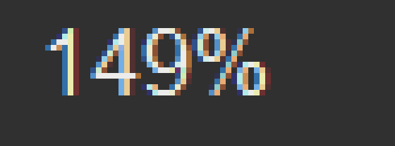
With orion dark I see an offset of 3 pixels and the number field can only show last to digits of the page number (should be 748):
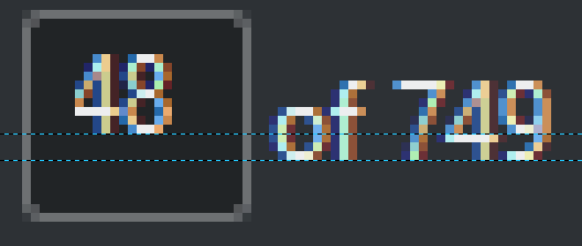
After increasing font size to 16 (Segoe UI) is better (all digits visible now, but offset increased to 4):

A very close look (or a mouse click :-) shows whats going on with the zoom number field:
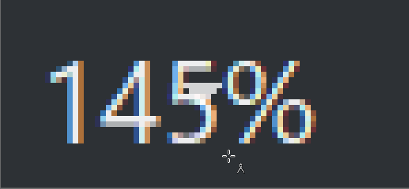 The dropdown list indicater moved in. It should be this way:

Conclusion: Issues of Qt, maybe next version is better.
You may test these settings:

Looks good to me:

 The dropdown list indicator is not present, just click on the zoom number.
Hope this helps a bit.
Thanks for your comment and investigation. As you say, hopefully it will improve in later.
These are my settings.

It's not so bad with Adwatia, but I guess it's not not so well-optimised. It seems to mostly be the sizing which gets messed up.

Unfortunately, I had to downgrade back to v3, from v4. There were just too many things which were hindering me with the new thing.[*] As such, I'll have to wait to see if these things are reverted in later versions—or maybe post my own ticket requesting their reversion! As it stands, the misalignment from Adwatia Dark is pretty minimal and isn't causing me undue issue :)
[*] Off-topic, but I felt I should justify this statement. Mainly, it's the auto-indenting. This is nice sometimes, but other times I like to use my own manual indenting. It just makes some stuff easier to read. In version <=3, if you paste text, it auto-indents it, unless the text is commented out. In v4, it does some hybrid where it auto-indents some stuff and not others.
Did you see the options for "Editor":

Did you see the options for "Editor":
Yes, but unfortunately that was even worse for me 🤦 I like the auto-indentation when typing, but I don't want it when pasting. Naturally, if I paste something in with indents I've made, I want those kept. Anyway, don't want to get this off topic!