 telerik
Need customizing the Expand/collapse & selection columns design & order in the TreeList
- Documentation request
Current behavior
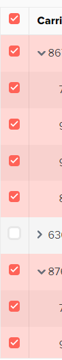
currently I am getting like this
Expected behavior
I want to develop like below added screenshot

Minimal reproduction of the problem with instructions
https://www.telerik.com/kendo-react-ui/treelist/
- Find an example in the documentation that looks similar to your case.
- Open it in Stackblitz by using the OPEN IN STACKBLITZ button.
- Modify the example, so that the issue is reproducible in it. Try to include the minimum possible amount of code.
- Save the example by using the blue Save button at the top.
- Copy the link from the address bar of the browser. -->
What is the motivation or use case for changing the behavior?
Our current requirement is that one.
Browser:
- Chrome (desktop) version 104
kindly provide sample link, please.
See the following example: https://stackblitz.com/edit/react-gx5elf?file=app%2Fmain.tsx.
It is probably not the same as the example you are looking for but it has similar checkboxes, implementation of a custom selection cell and will help you to implement your scenario.
See the following example: https://stackblitz.com/edit/react-gx5elf?file=app%2Fmain.tsx.
It is probably not the same as the example you are looking for but it has similar checkboxes, implementation of a custom selection cell and will help you to implement your scenario.
Really appreciate your fast reply @nstoychev
I referred this already & implemented the same. But there is no way to achieve what I want.