add-richtext-toolbar-button
 add-richtext-toolbar-button copied to clipboard
 technote-space
WordPress plugin to add richtext toolbar button
Add RichText Toolbar Button
Read this in other languages: English, 日本語.
This plugin makes it easy to add RichText toolbar button.
Table of Contents
Details
- Screenshots
- Behavior
- Toolbar
- Sidebar
- Add setting
- Setting list
- Dashboard
- Requirements
- Installation
- Usage
- Add setting
- Use button
- Use
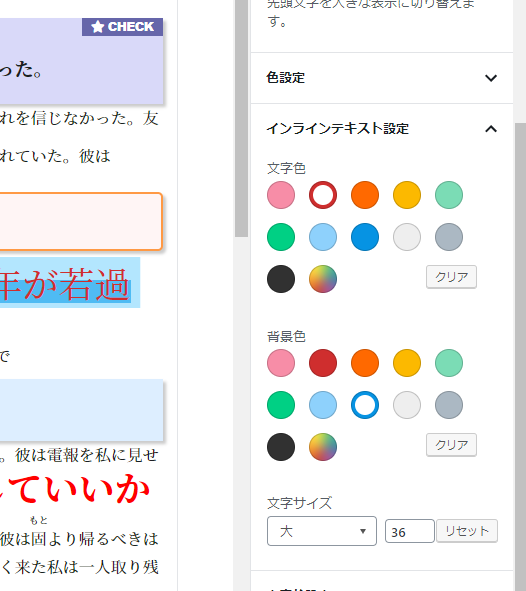
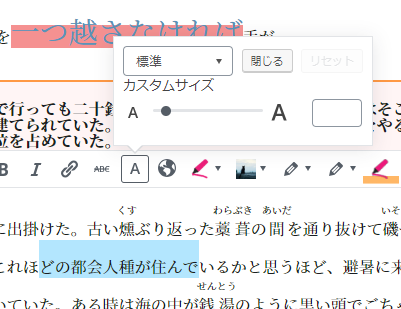
Inline Text Settings
- Setting
- Tag name
- Class name
- Group name
- Icon
- Style
- Validity of toolbar button
- Priority
- Dashboard
- Validity
- Validity of font color button
- Font color button icon
- Validity of background color button
- Background color button icon
- Validity of font size button
- Font size button icon
- Validity of remove formatting button
- Validity of fontawesome
- Default icon
- Default group
- Test phrase
- Dependency
- Author
- Plugin framework
Screenshots
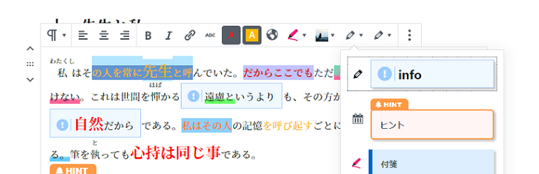
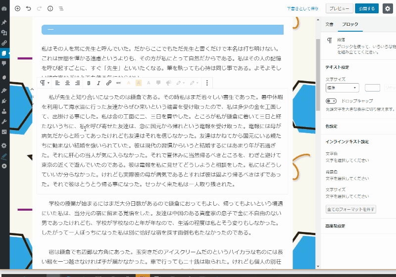
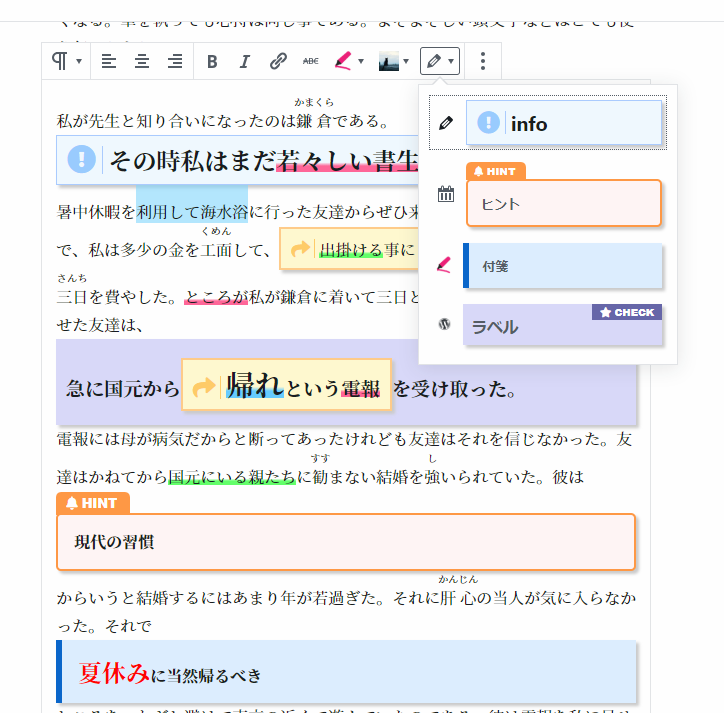
Behavior
Toolbar
Sidebar
Add setting
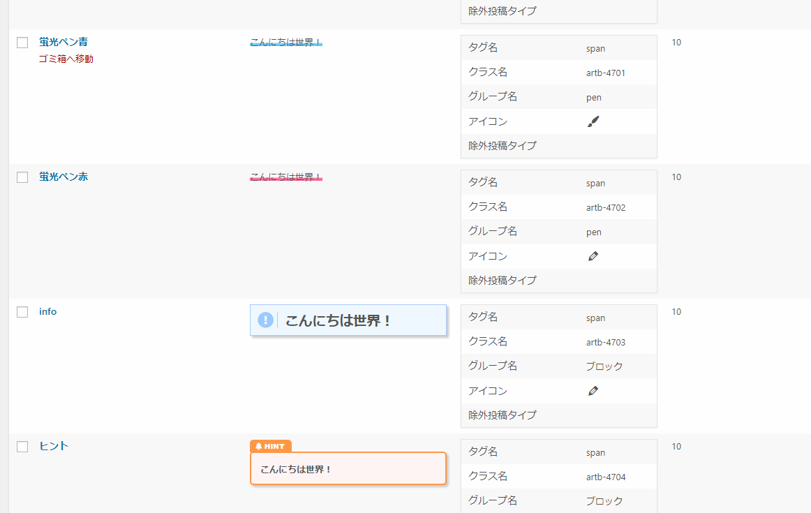
Setting list
Dashboard
Requirements
- >= PHP 5.6
- >= WordPress 5.4
Installation
- Download latest version
release.zip - Install plugin
- Activate plugin
Usage
Add setting
- Go to "All Settings" from left side menu "Add RichText Toolbar Button" of admin page.
- "Add New"
- Input settings like name or styles.
- Press "Publish" button.
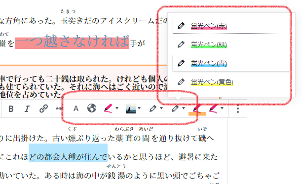
Use button
- Go to editor page.
- Select sentence which you want to add style.
- Apply button.
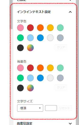
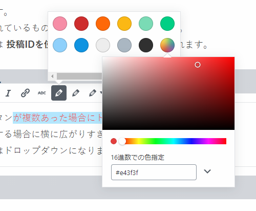
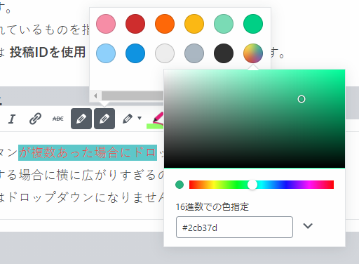
Use Inline Text Settings
- Go to editor page.
- Select sentence which you want to add style.
- Apply color and font size from sidebar on the right.
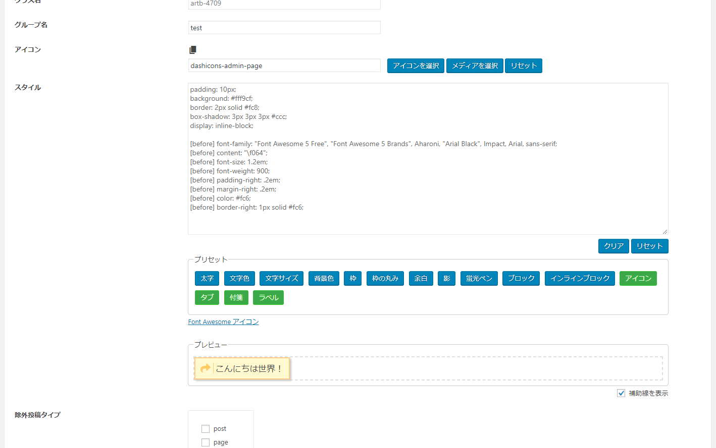
Setting
Tag name
Specify the tag name.
You can use HTML tags like span or cite.
If you do not input anything, span is used.
Class name
Specify the class name.
An error will occur if you specify something that is used by another.
If you do not input anything, Unique name using post ID is used.
Group name
Specify the group name.
If there are multiple buttons with the same group name, they will be gathered by DropDown.
Icon
Specify the icon.
You can use dashicon or URL.
Style
Specify the design to be applied in the following format.
property: value
Pseudo classes like before and after are described by the following rules.
[Pseudo-classes] property: value
ex.
display: block;
padding: 10px;
background: #f0f9ff;
border: 1px solid #acf;
[before] font-family: "Font Awesome 5 Free";
[before] content: "\f06a";
[before] font-size: 1.2em;
[before] font-weight: 900;
[before] padding-right: .2em;
[before] margin-right: .2em;
[before] color: #9cf;
[before] border-right: 1px solid #acf;
Preset
Several design patterns are available.
Validity of toolbar button
Specify whether to display on the toolbar of the Gutenberg editor.
If you move setting to the trash or delete setting, the design itself will be invalid.
This setting is useful when you want to keep the design applied.
Priority
The lower the value, the higher the priority.
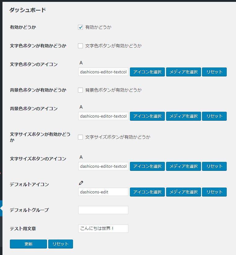
Dashboard
Validity
When this setting is off, all functions are disabled.
Validity of font color button
Specify whether to add a button that can change the text color.
Font color button icon
Specify the icon of font color button
Validity of background color button
Specify whether to add a button that can change the background color.
Background color button icon
Specify the icon of background color button
Validity of font size button
Specify whether to add a button that can change the font size.
Font size button icon
Specify the icon of font size button
Validity of remove formatting button
Specify whether to add a button to remove all formatting in the sidebar.
Validity of fontawesome
Specify whether to load Fontawesome.
Default icon
Specify the default icon.
Default group
Specify the default group.
Test phrase
Specify the test phrase.
Dependency
Author
Plugin framework
Metadata
Owner
 technote-space
Metadata
WordPress plugin to add richtext toolbar button