refactor: various landing page components
✅ Checklist
- [x] I have followed every step in the contributing guide (updated 2022-08-15).
- [x] The PR title follows the convention we established conventional-commit
- [x] I performed a functional test on my final commit
Changelog
Improves the typography on the landing page.
⚠️ No Changeset found
Latest commit: fff9701b0722002d1ee5863635fbbf836bf615ba
Merging this PR will not cause a version bump for any packages. If these changes should not result in a new version, you're good to go. If these changes should result in a version bump, you need to add a changeset.
This PR includes no changesets
When changesets are added to this PR, you'll see the packages that this PR includes changesets for and the associated semver types
Click here to learn what changesets are, and how to add one.
Click here if you're a maintainer who wants to add a changeset to this PR
The latest updates on your projects. Learn more about Vercel for Git ↗︎
| Name | Status | Preview | Updated |
|---|---|---|---|
| create-t3-app | ✅ Ready (Inspect) | Visit Preview | Sep 20, 2022 at 1:35PM (UTC) |
⚡️ Lighthouse report for the changes in this PR:
| Category | Score |
|---|---|
| 🟢 Performance | 100 |
| 🟢 Accessibility | 96 |
| 🟢 Best practices | 93 |
| 🟠 SEO | 79 |
| 🟠 PWA | 54 |
Lighthouse ran on https://create-t3-app-git-coyenn-landing-page-typography-1c4590-t3-oss.vercel.app/

I think the tweets on the left should be made into a slider using https://swiperjs.com/
I think the tweets on the left should be made into a slider using https://swiperjs.com/
that section looks really odd imo, why is the title not on top?
that section looks really odd imo, why is the title not on top?
I know it looks weird currently. I didn't get to finish it yesterday. My idea ist that there will only be one Tweet visible at a time. That Tweet will change very few seconds using an autoplaying slider.
Why is the heading not on top? Because we need a bit more variety. Nearly all the headings are currently on top and it just looks boring.
I'm always open to other solutions/suggestions if you have any!
That sounds like a good idea
Current swiper implementation is kinda wacky. I'm looking into ways of how to solve this.
..And it does not work in deployments...
I think the cards on the community section needs more horizontal padding to stay responsive
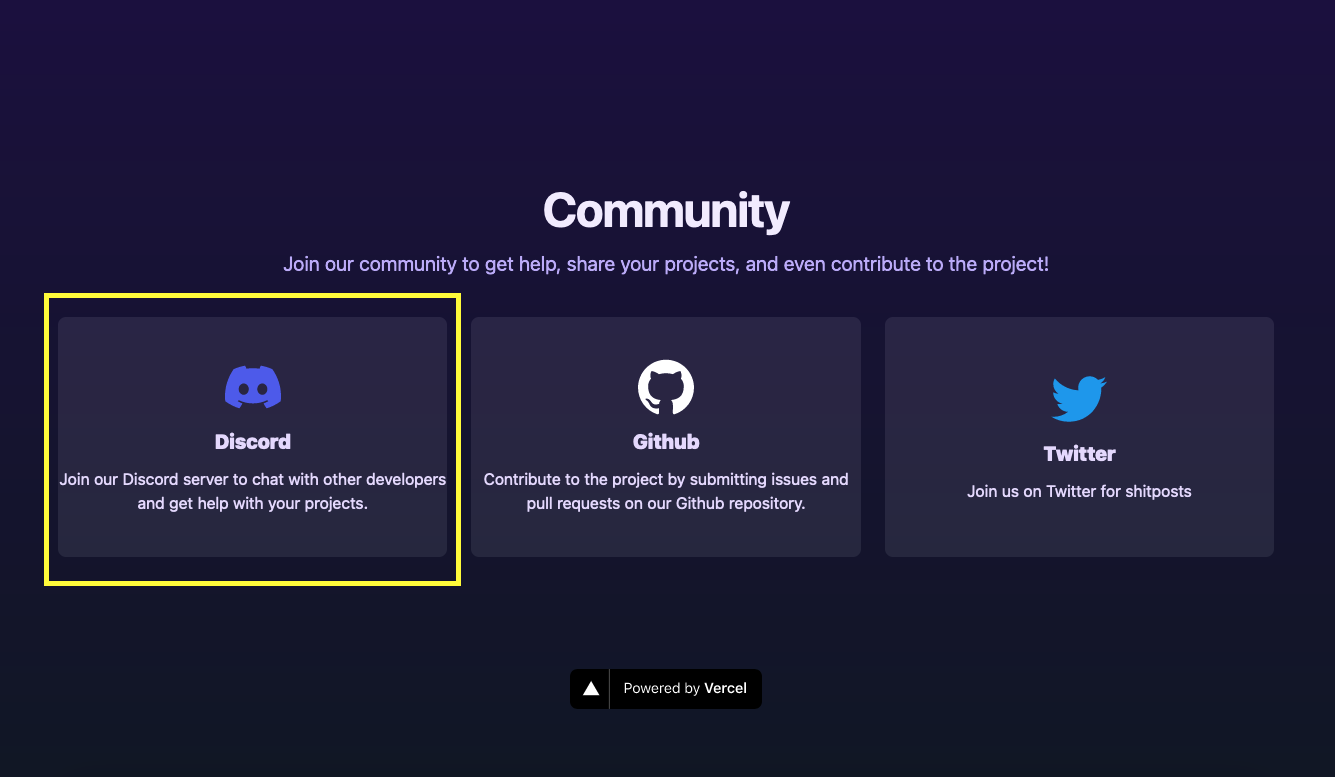
I think the cards on the community section needs more horizontal padding to stay responsive
Thanks for pointing that out!


We might want to merge this soon. I don't want to keep feature branches open for too long.
Another thing I noticed is we might want to consider making the title a bit wider so it fits on 3 rows? The
projecton a single line looks a bit off? Would this fit nicely?The best way to setup an
optionated, fullstack,
typesafe Nextjs project
Sure.
About the buttons: I was planning on creating a button component soon so this kind of fits in with my plan. How about we make them the size of the buttons on https://vercel.com/solutions/nextjs
I'll merge this and start work in a new branch.
Nitpicking, but imo
The best way to setup an opinionated, full-stack, typesafe Next.js project
works better even though the last line is shorter than the others