survey-creator
 survey-creator copied to clipboard
[V2] Creator checkbox UX
Are you requesting a feature, reporting a bug or ask a question?
Bug / bad UX
What is the current behavior?

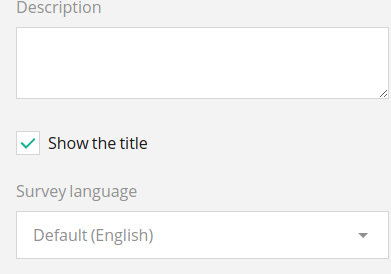
This is not proper UX for a checkbox that enables something. It is unclear what the current state is (obviously in the image the checkbox is not checked, but does that mean it is showing or hiding the title?)
What is the expected behavior?
For booleans a toggle switch is way more intuitive. If a checkbox is used, the text should be affirmative so that it is clear what checking it does:
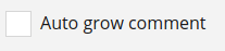 Still this UX is not the best.
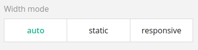
Alternatively, just use the same UX you use for the width mode:
We've discussed this proposal with the chief designer and decided not to change current behavior. Probably we'll return to this question after Creator V2 release.
I think this can be closed; since at least the text in my example has been updated: