 stashapp
[Feature] Studio logo visibility options
There has been discussion in the chat UI channel about visibility issues with studio logos being displayed on the card view. There are situations where the logo is unreadable because the background scene image is the same color as the logo. Plus other scenarios where a logo is not visibly "strong" enough to read against a busy background image.
A temporary CSS fix can add drop shadow to the overlaid studio logo, either with or without an offset. Setting it to black does help visibility on bright colored logos. However, it makes dark logos harder to read.
.scene-studio-overlay .image-thumbnail { filter: drop-shadow(.1em .1em 2px #000); }
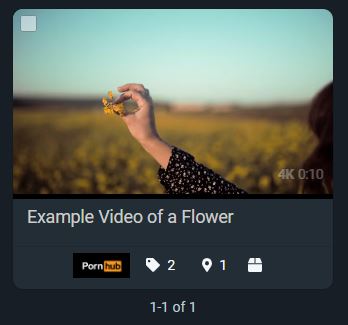
Here is an example of a white logo on a white background. It would be invisible if the drop shadow CSS was not added.

To improve on the visibility of this method, and because there are a wide range of studio logo colors and background scene colors, we'd like to see several options added to each Studio's page, specific to that studio:
- Toggle logo overlay on/off (a few studios add their logo on the scene image itself; having stash add it would be redundant)
- Toggle logo drop shadow on/off
- Set drop shadow color
- Set drop shadow offset
Maybe a different approach should be considered here? I think I'm more in favor of taking this in a less complex direction. I would honestly welcome an option to put a shrunk down version of the logo in the card itself that just expands on mouse hover. This would be FAR more visible than a scene preview background and easier to implement to boot.
Maybe a different approach should be considered here? I think I'm more in favor of taking this in a less complex direction. I would honestly welcome an option to put a shrunk down version of the logo in the card itself that just expands on mouse hover. This would be FAR more visible than a scene preview background and easier to implement to boot.
I thought about that, but the card footer is already the home of so many icons. I don't think it would be feasible to put a logo there. Plus shrinking it down to a cramped area doesn't necessarily improve visibility.
The issue here is that Stash is trying to use a variety of aspect ratio logos. Adding all these studio specific display options for a logo is suboptimal and convoluted.
The solution is rather simple, but probably won't be popular with a lot of people because there is currently no content available, but in the long term it would be the optimal solution. Other projects, such as Kodi do this for scraped art assets^k:
- Do not display these non-standard logos, other than on the studio page.
- Allow for multiple logo uploads to studios (and possibly other core sections of Stash) that are based on strict categories:
| Artwork class | Category | Aspect ratio | Transparency | Notes |
|---|---|---|---|---|
| Studio | Favicon | 1:1 | No | |
| Studio | Banner | 200:37 | No | This is like wordmarks and such |
| Studio | Undefined | null | null | This is for all free form logos, the incumbent logos |
| Studio | Landscape | 16:9 | null | Such as hero images |
| Performer | Headshot | 2:3 | No | |
| Performer | Landscape | 16:9 | No | Such as hero images |
When you have assets with predictable aspect ratios, it is easier for them to fit into defined positions. To this specific scene card mentioned by op, it should be the favicon displayed on scene cards and on the scene/video page. They are much smaller, but still distinct (almost every studio has one and they're super simple to scrape).
We are treating a lot of these images as assets, so they should meet more rigid standards to avoid convoluted hacks to get them to "work".
This related to #2082