stash
 stash copied to clipboard
Published
20 hours ago •
 stashapp
[Feature] [UI] Improve/modernize consistency of formatting in scene detail
trafficstars
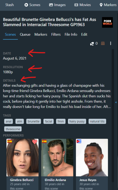
Is your feature request related to a problem? Please describe. The cosmetic formatting of the details lacks consistency: The date section is larger than the other values and is the only value that lacks a heading; the headings that do exist are all above their values, except the resolution which is to the left.
Describe the solution you'd like Streamline the way the details are presented ala Material Design or the Discord settings UI
- Make each section in the details (date, details, performers, tags, etc) a unique flex item with an order property. This will be useful for css customization if the user wants to reorder the sections.
- Give each section a heading and it's value with consistent formatting. (See attached pic, specifically the red arrows)
- The title probably doesn't need to be so big but it should still stand as the largest text
Additional context