 src-d
src-d
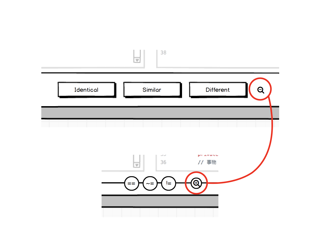
Two-view Annotation Footer Block
I can imagine that after 100 annotation users will feel comfortable with the UI enough for the footer block to become information overload. What I propose is that we have on the footer the ability to toggle between full-view and compressed-view. This compressed view would show the same actionable elements: Previous, Identical, Similar and Different, Finish and Next but with Icons instead of text descriptive actionable elements. It would maintain usability and further increase the height of the code block for increase readability of itself.
I can not see how replacing the text with icons would increase the code panel height. Are you maybe proposing any other change like collapsing the header and/or making the footer something transparent?
A screenshot might help to understand the change
A screenshot might help to understand the change
💯 and it might also allow us to quickly validate it with real users
@bzz @dpordomingo Here's a wireframe on this UI behaviour. Imagine also with Collapsible Header, we'll get almost 100% vertical height for code display :)
https://balsamiq.cloud/sdjen2c/p6ijjl5

Thanks @dpordomingo for starting the feedback loop :)
Does it contain the FilePair previous paginator?
Yes, and I would guess that it will be our first element that has a plural visual representation.
What's this new button?
It's the toggler in its "expand" status.
@vmarkovtsev Would you please be so kind to share your thoughts on this? (i'm not forgetting Fitts's Law)
@ricardobaeta LGTM.
I have a suggestion to meld the second header into the first one:

Thus we occupy all the possible vertical space.
Hi @vmarkovtsev, thank you so much for joining on board :) Actually this meld crossed my mind, but having in mind that we're going to have a Collapsible Header https://github.com/src-d/code-annotation/issues/54 this meld is not so efficient as collapsing the header and just show the breadcrumbs and the progress bar. We have more vertical space, going in this direction.