 src-d
src-d
UX feedback
I got the chance to play with the staged application and I have some feedback to give mostly on the UI/UX of the application.
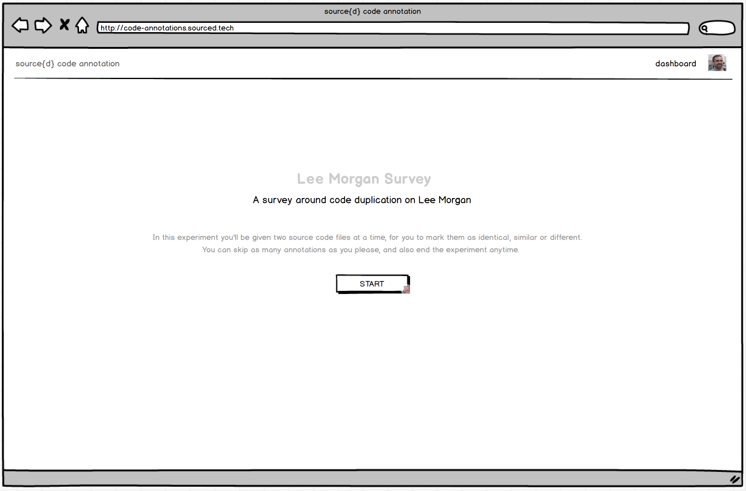
Landing page
This should be more explicit about what the application does. The phrase source{d} code annotation brings together state-of-art insights from machine learning and user experience, for source code annotation., while buzzword compliant, is vague and doesn't really tell me what this is about.
Similarly, Welcome! We're glad you made it this far. is a weird thing to say for a landing page.
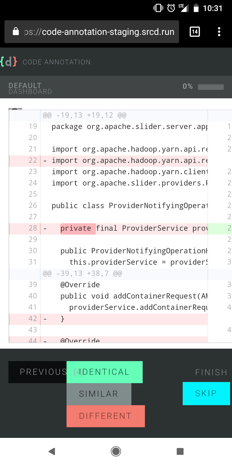
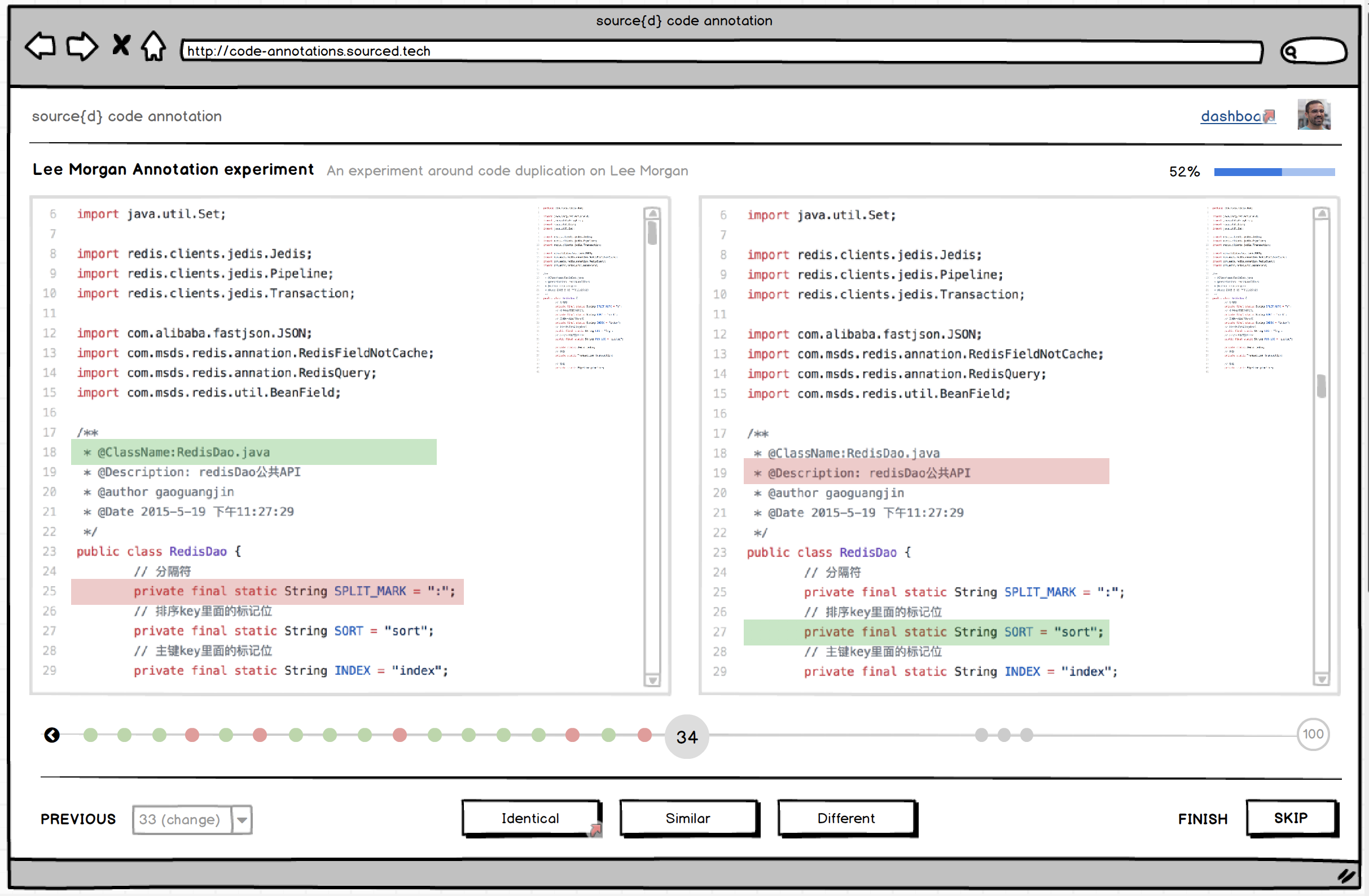
Annotation page
Maybe we could show a quick dialog the first time the user logs in to show what the interaction is supposed to be like?
You are now logged in, congrats!
Now it's time to start annotating these pairs of files by telling us whether they are:
- identical,
- similar, or
- different
Also, how similar is "similar"? Maybe it'd be nice to show a couple of examples? Now I'm thinking this could be quickly made as a screencast 😄
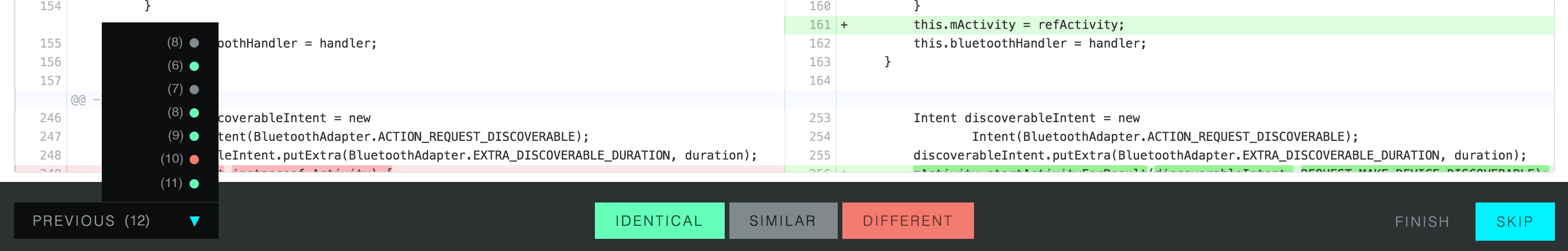
The previous menu is not a previous menu, is actually a navigation menu that allows me to go forward. Do we even need this? I expected previous to simply go to the previous comparison.
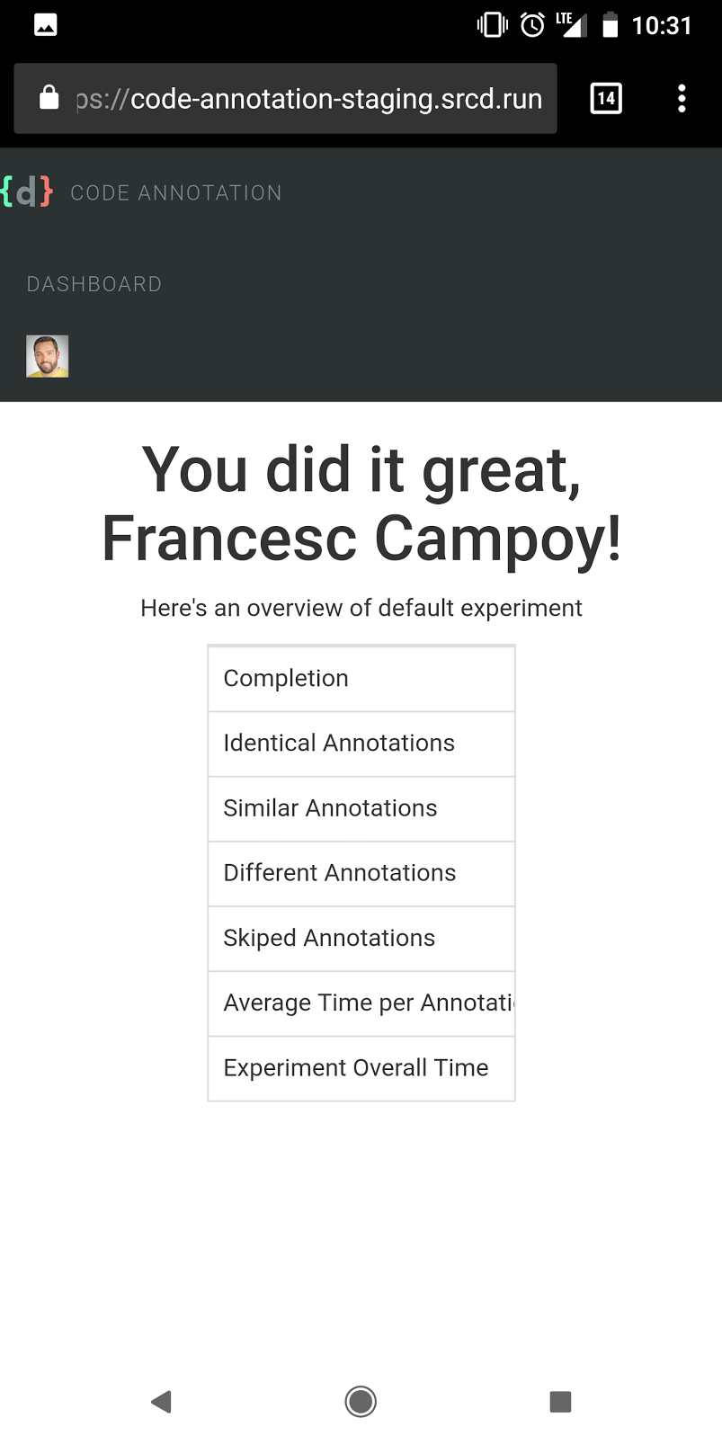
Results page
At this point, I would explain explain a bit more of the project. Maybe add a link to source{d}? Maybe a link to our slack community in case people have questions.
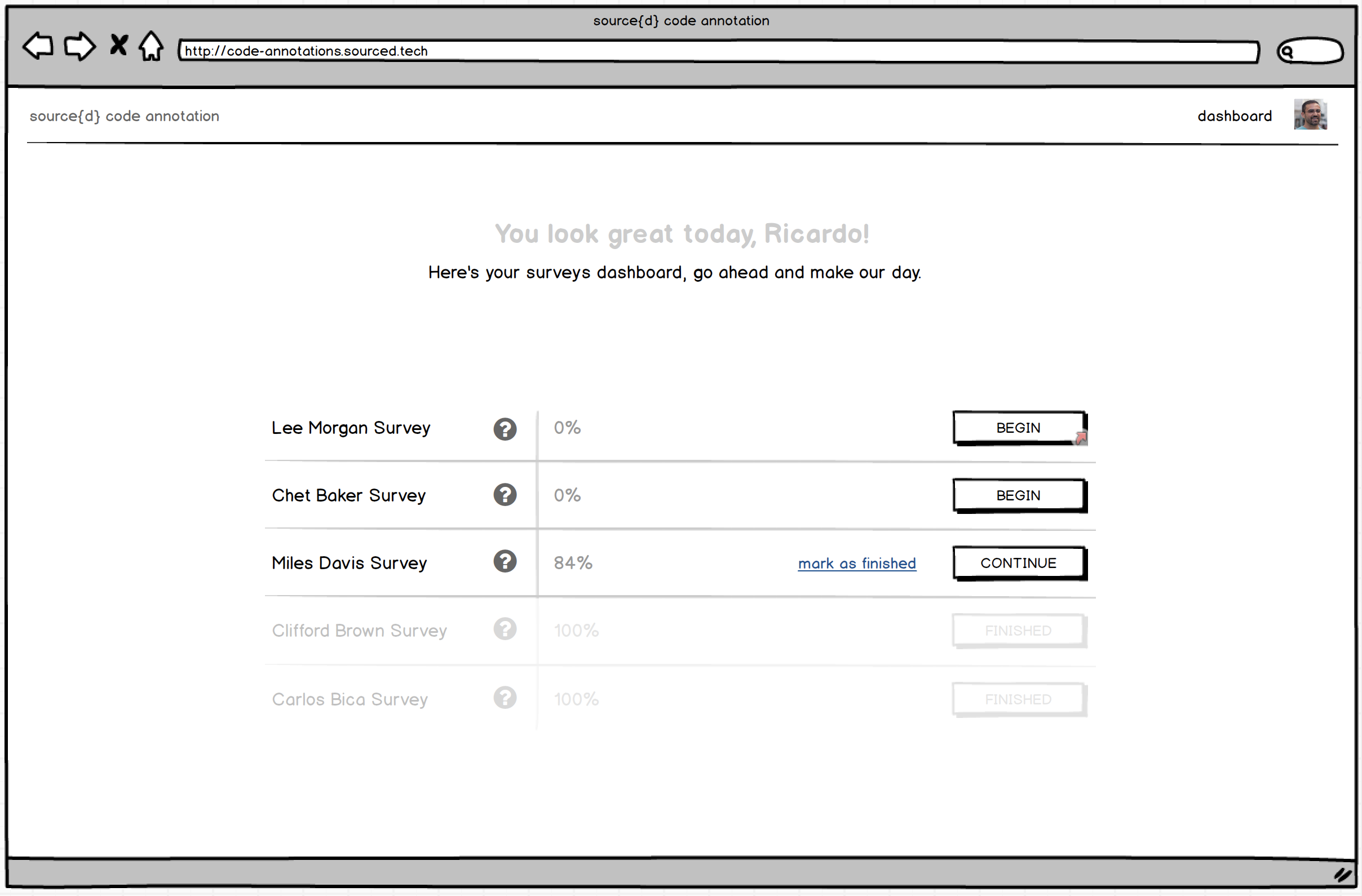
I clicked on the dashboard link at this point and took me back to the annotations page. Is that intended? It was not expected. Why do we have two links code annotation and dashboard pointing to the same point?
Other UX
It's sometimes hard to read the code side to side when it's not on full screen. It'd be cool to have some kind of key shortcuts for the idential, similar, different, skip options
Mobile UX
The landing page image doesn't scale correctly
The whole comparison page seems broken (screenshot in details)
Same for the results page (screenshot in details)
General feedback
We're really not far from having a great experience, but the devil is in the details. If we want people to use this annotation tool efficiently we're going to improve the UX.
Thank you very much for such a detailed writeup!
Just want to quickly put things into perspective, to make sure we are all on the same page here:
If we want people to use this annotation tool efficiently we're going to improve the UX.
You are totally right. But for now, at this stage of a project, there has been a consensus that it is only an internal tool for source{d} ML team. This makes nice-to-have things like i.e mobile version, keyboard shortcuts, etc to be out of scope right now.
on
Also, how similar is "similar"? Maybe it'd be nice to show a couple of examples?
AFAIK it lacks this by design, as one of the requirements of the research project is to research the definition on similarity, and so any description would bias the users. But @vmarkovtsev would explain that part better.
AFAIK, there are no immediate plans on improving, it beyond the state when it's "usable" for immediate research, needed for the file-level similarity in Apollo project.
Having said that, there is always a possibility that it's going to be changed i.e with the next research, and at some point it would be worth pushing it to the further audience (which BTW I belive is interesting direction) and then spend more time improving it.
Meanwhile, I'm sure @ricardobaeta would be happy to solicit the low-hanging fruits like i.e if somebody suggests a better text, instead of
source{d} code annotation brings together state-of-art insights from machine learning and user experience, for source code annotation
etc, into the wireframe.
Hope this helps!
Great to know this is meant to be an internal tool, actually
Looking forward to Ricardo's reply then
Hi @campoy! Sorry for the hiatus on getting back to you.
I got the chance to play with the staged application and I have some feedback to give mostly on the UI/UX of the application.
Thank you deeply for such a thoughtful and sharp analysis Francesc! I really appreciate the time you put into it. Please be so kind to find my comments bellow.
Landing page This should be more explicit about what the application does.
The story we’re telling here - what is source{d) code annotation - uses two mediums to accomplish it as such: effective and actionable copy, and a self-explanatory animated image. These two complementary mediums are the building blocks of the message we want to transmit on the Landing.
The first - effective and actionable copy - will be established by the composition of three basilar elements: value proposition, proposition synthesis, and a link to start using the product. Needless to say that, we must take into account content strategy/content modelling here, both product’s value proposition and its synthesis will bear all cross-channel communication. The medium is the massage :) More on this, we have @marnovo, he has a way with words :)
The second - self-explanatory animated image - is an element that will capture the heart of the experience, and expose its meaning in an engaging fashion, besides acting as a feedforward artifact, impelling people to start engaging with the product.
The first medium, as it is now, represents the initial exploratory work and does not properly convey on what source{d} code annotation lies upon. And it should. Good UX is good Copy, and the value proposition and its synthesis undoubtedly need to be aligned with the product’s nature, and surely with our own personality, voice and tone. Please take a look at our Brand Persona and its Visual Lexicon in our Product Google Drive if you fancy it.
The phrase source{d} code annotation brings together state-of-art insights from machine learning and user experience, for source code annotation., while buzzword compliant, is vague and doesn't really tell me what this is about.
This proposition synthesis is a placeholder, curiously enough, taken from https://prodi.gy/ :)
Similarly, Welcome! We're glad you made it this far. is a weird thing to say for a landing page.
This value proposition is a placeholder as well, with intent nonetheless, but it falls short, a lot.
Annotation page Maybe we could show a quick dialog the first time the user logs in to show what the interaction is supposed to be like?
The underlying foundation of experience design it’s marked out by the unequivocal layer of collaboration. The user experience is, therefore, as effective as the effectiveness of this layer. One of the goals of this layer is to maximize a great first-run experience. Jared Spool coined one relevant cornerstone for this to happen as the The Magic Escalator of Acquired Knowledge.
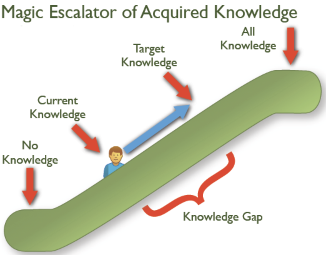
The user’s knowledge gap it’s established on the journey from current knowledge to target knowledge. Our vision is to narrow this gap early on. The rationale for the second medium in the Landing it’s to enlighten people all about the elements of this collaboration. We’re going to flesh out all there is to know about the experience, taking the user from current knowledge - what is source{d} code annotation? - to our intended target knowledge - sequentially annotate pairs of files as identical, similar or different, using a funky animated svg illustration.
You are now logged in, congrats! Now it's time to start annotating these pairs of files by telling us whether they are:
- identical,
- similar, or
- different
The Landing funky animated svg illustration will eliminate the knowledge gap that would be behind the need to drop in place an onboarding artifact on the annotation page UI.
Also, how similar is "similar"? Maybe it'd be nice to show a couple of examples?
The animated illustration funkiness will explain clearly what actionable elements define the collaboration, and most importantly, what’s the outcome of the action upon each one. Try to represent in your mind what would be the visual translation of something like this:
fmt.Printf("Hello World!”) ~~~ fmt.Printf("Hello World!”) == Identical
fmt.Printf("Hello World!”) ~~~ fmt.Printf("Hello Mars!”) == Similar
fmt.Printf("Hello World!”) ~~~ fmt.Printf(“One, two, buckle my shoe!”) == Different
Now I'm thinking this could be quickly made as a screencast 😄
I strongly believe that the animated illustration will eliminate the need for such an artifact.
As a side note, needless to say that along the qualitative data we’re going to get from the Community, there are tools that can help us to start gathering some metrics to validate our assumptions early on, like temper.io that we can get for 12$/month.
The previous menu is not a previous menu, is actually a navigation menu that allows me to go forward. Do we even need this? I expected previous to simply go to the previous comparison.
The rationale for this actionable element is to allow people to review previous annotations - it shouldn’t allow you to move forward - and reconsider any annotation given. Initially we had on the UI an history bar:
The previous menu element would convey the assumption of people’s need to get an overall picture of the survey. The coloured dots would represent the annotation given by people through the survey. They would get the chance to review a skipped annotation per example. Ideally, the current “previous menu” element will be something along these lines:
Results page At this point, I would explain explain a bit more of the project. Maybe add a link to source{d}?
The project, and particularly each survey, it’s introduced to people before they start annotating. It was as well prototyped.
Although, what I think you’re mentioning it’s about giving people context on what source{d}’s code annotation means to us and what we want to get from it. I would say that we can add this UI building block to the Results UI, shaped with a nice short copy and a link to a “soon to be created” blog post about it. Food for thought would be suggesting an “About” link right besides the “Dashboard” link on the header :)
Maybe a link to our slack community in case people have questions.
Spot on. I would even go a little further. Let’s ideate this Community UI building block as engaging and consequent as possible:
- Copy (Why do we have and want to foster our Community)
- Copy (Let’s be smart on Community numbers. We have 305 Members and +7k Messages. You’ll now better :))
- “Join our Community” Form (aka sourced.tech landing, with link for registered people)
I clicked on the dashboard link at this point and took me back to the annotations page. Is that intended? It was not expected. Why do we have two links code annotation and dashboard pointing to the same point?
The “logo link” takes you to the Landing. The dashboard link takes people to source{d} code annotation “home”. It’s the UI where people have a helicopter view of their surveys. The idea is to make this UI as informational and actionable as possible. Not only people can see ongoing and/or finished surveys, they can see as well surveys that they can proactively enrol on. The ideation for this Dashboard looks something like this.
Other UX It's sometimes hard to read the code side to side when it's not on full screen.
There are several foreseen low-hanging fruits that could put this experience on steroids:
- Collapsible Top Bar as you enter Annotation UI, would slide down on top canvas :hover
- Monokai code theme. I tend to believe that the majority of people read and write code on black backgrounds
- Toggler for minimal Bottom Action Bar. I would say that power users - or everybody - will just need a very tight bottom bar with cherished icons for each actionable element.
It'd be cool to have some kind of key shortcuts for the idential, similar, different, skip options
- We should pay attention to keyboard navigation. A set of proper keyboard short-cuts will be deeply appreciated by many people I believe. And for this, yes, a pretty funny notification as a reminder once in a while.
Mobile UX The landing page image doesn't scale correctly The whole comparison page seems broken (screenshot in details) Same for the results page (screenshot in details)
The straightforward thinking for any given web application would be to jump on the responsive bandwagon for the sake of sake. Nonetheless, there’s a misusage of the term in my opinion, mainly because “responsive design” is not something you do first, or after, as a sole discipline. Design, for the web, by itself, encompasses the craft of an artifact that is available for all users and it is device agnostic. Point made, the experience provided by a digital artifact on desktop should have an equivalent outcome on mobile - in principle.
In our case, what is of the essence to analyse is the nature and environment of the experience, and @bzz and I articulated on it since day one. The cross-device experience equivalency must be achieved in a way that it doesn’t defeat people’s expectations. At the heart of this product’s experience is the ability to read, compare and annotate two files of source code with the less effort and friction as possible. Having this in mind, and for a quick insight on the key takeaways of annotating source code on mobile please take a look at Nielsen Norman Group Reading Content on Mobile Devices. With all this context in mind, the cross-device usage of this product - as it was meant to be initially shipped - was reasonably excluded.
However, we all have big expectations for this product, and the nature of the experience will for sure be affected by the upcoming diversity of the annotation’s character. This diversity will build up a different interaction environment. The surveys can consist on considerable smaller source code files, and even the comparison can be summed up to a binary annotation. The paradigms that rule the product’s experience as it is now have no equivalent outcome on mobile, but I strongly foresee the evolution of a product for all users and device agnostic - annotation wise.
General feedback We're really not far from having a great experience, but the devil is in the details.
I’m on your side. Although we’ve started designing the product with the mantra “the experience above all” and acknowledging the entire user journey, like @bzz commented we shifted to focus only on the Annotation UI, assuming a specific use-case for a specific target user, on an internal usage environment. Giving birth to what we have now was the result of experimental methodologies and processes, and to some extent, strategy as well. I’m profoundly happy for what we ended up shipping, and even more satisfied for what we’ve learned in the making. And that’s the kind of projects I nourish, the ones where everyone learns the most. We’re now collecting feedback from the ML team on what we shipped. This will be a huge payback on the effort we all made, and the reasoned guidance for us to move forward. We’re not far as your say, but crafting an unique experience it’s a swim we still have to swallow :)
If we want people to use this annotation tool efficiently we're going to improve the UX.
Design is a team sport. My vision is that as soon as we decide to proceed with the project, people who represent the target audience should be brought onboard. Like the old lad Nielsen says, testing with five users is enough to cover 80% of the things we need to tackle. I’m sure you can quickly come up with five exquisite fellows willing to be part of this journey when the call is made. Moreover, community-driven design is an ongoing endeavour and a responsibility upon our shoulders. We should not scope the work there is to be done only to user experience, but rather on developer relations, product management, product design, web applications development, machine learning engineering, and not to say the whole company :) If we do this efficiently, we’ll have a efficiently tool :)
Hey @ricardobaeta,
Thanks for the great response! I'm glad to see that we basically agree on what needs to be done. I didn't mean my feedback to be considered as a "needs to be fixed now" issue, it was more of a wish list, and I see our wishes are quite similar.
Looking forward to seeing those improvements.