Hack
 Hack copied to clipboard
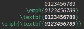
Bold italic zero not as heavy as other characters
Thanks for your work on this great font, as well as the alt-hack character variants.
While using it, I noticed that the bold italic zero doesn't appear as heavy as the other bold italic characters, or as the bold upright zero. This screenshot shows what I mean:

The first line is DejaVu Sans Mono, for the sake of comparison, and the second line is Hack. Both are in bold. When I toggle from non-italic to italic, it appears that the outline of the zero becomes thinner.
Perhaps this was a design decision, but it stuck out to me, and so I wanted to get your thoughts on it.
Thanks for reporting this. I did notice this when I worked on the alternate zeroes. I don't recall making changes to the width of those strokes though it is entirely possible that I made them narrower in order to use the oval fill in the glyph when I originally modified the Bitstream Vera Mono set. Once you get to small sizes with a handful of pixels to distinguish these separate shapes it becomes difficult to display more than a completely filled angled oval in this case. This is a problem with the bold as well.
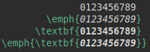
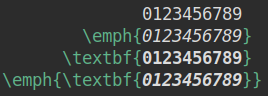
Can I ask you to examine this at sizes between 8-14 (our target size range) in a body of source code and post images to see if it is a 'problem'? From a pure type design standpoint there is not consistency and it is noticeable at large sizes. I agree with that. Let's see if it is an undesirable difference at the sizes that we are using for our design targets so that we can decide if we need to address it. My guess is that it becomes significantly less apparent at size and may improve the appearance of the current design. In fact the change here may be that we need to do the same with the bold...
You're right, the difference is much less noticeable at smaller sizes, so perhaps no change is necessary. Here are some screenshots:
- Hack, size 10

- Hack, size 13
- DejaVu Sans Mono, size 10
- DejaVu Sans Mono, size 13
Thanks for posting them. I think that is the issue. If we slant the bold with the oval fill, it is going to be a solid shape.
No worries, I'm happy to help. Let me know if there's anything else I can do.
The text in my GIF above was just in LibreOffice Writer, but I recorded the GIF using Peek screen recorder.
I am going to put this on for v3.002 work. Will tinker with these designs in the bold sets to see if we can find something for both bold and bold italic that is consistent and renders the fill better. Thanks again for noticing and taking the time to mention this issue.
I think that this was originally an issue due to the fact that the fill shape would not render well in the bold weight of the glyphs. I am considering a different fill shape for the bold and bold italic variants. They are too "black" as is. In the bold, the very thin oval shape renders as line which is not intended. You don't see bold and bold italic much in source which is why it hasn't been a priority but agree that it is a problem. Will experiment a bit and open an new PR for it so that you and others can review some design changes.
This was bumped to v3.003 work as 3.002 was a bugfix patch. Getting started on this.
Pushing back to v3.004 work. We have prioritized work on the build toolchain to reach the v3.003 release target. I will get back to this.
@burodepeper do you have any thoughts about this David? I am really struggling with what to do here. I am considering reversion back to the Bitstream Vera SM upstream designs for the bold and bold italics (i.e., regular + italic have oval fill, bold + bold italic have circle fill). There is just not enough space to render the oval fill with the bold variants unless we consider changing the shape of the outer circular portion of the glyph altogether.
@chrissimpkins I've run into this as well when I was redrawing them. What could work for bold(+italic) is a hybrid between circle and oval. Still an oval, but circle enough so it can touch the sides without causing too much bleed. That means some careful redrawing, so, perhaps reverting is the more pragmatic approach for now?