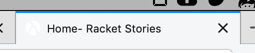
The page title icon is very hard to see
In the Firefox tab bar, the white icon for Racket Stories is very hard to see because it has no contrast with the light grey tab bar color:
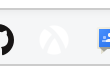
This also makes it hard to bookmark the site, since the icon has the same problem in the bookmarks bar:
Den ons. 2. okt. 2019 kl. 22.08 skrev Jack Firth [email protected]:
In the Firefox tab bar, the white icon for Racket Stories is very hard to see because it has no contrast with the light grey tab bar color:
[image: Screen Shot 2019-10-02 at 1 06 41 PM] https://user-images.githubusercontent.com/8175575/66077835-a3ff4400-e515-11e9-9f6c-17d971b10cb4.png
This also makes it hard to bookmark the site, since the icon has the same problem in the bookmarks bar:
[image: Screen Shot 2019-10-02 at 1 06 55 PM] https://user-images.githubusercontent.com/8175575/66077855-b37e8d00-e515-11e9-909b-063d1bca4e73.png
Thanks for this report. I hadn't tried Racket Stories in Firefox (only in Chrome). When Firefox uses the dark theme it looks okay. It does look horrible with a light gray background.
Do you think changing the background from transparent to solid would work without breaking the other browsers? Or is an outline the way to go?
FWIW I submitted a logo with transparent background to this web-site which generated the various icons.
/Jens Axel
I don't know. I have noticed however that GitHub has two different icons with reversed colors:
Maybe there's a way to tell browsers that one icon is for light themes and one is for dark?
Den tor. 3. okt. 2019 kl. 00.29 skrev Jack Firth [email protected]:
I don't know. I have noticed however that GitHub has two different icons with reversed colors:
[image: Screen Shot 2019-10-02 at 3 28 33 PM] https://user-images.githubusercontent.com/8175575/66086576-51c81e00-e529-11e9-89c2-bc34bfc80815.png
[image: Screen Shot 2019-10-02 at 3 28 37 PM] https://user-images.githubusercontent.com/8175575/66086578-54c30e80-e529-11e9-8e81-581c18f732c4.png
Just saw this in Chrome: [image: image.png] so Github has the same problem, but with dark themes.
https://user-images.githubusercontent.com/8175575/66086578-54c30e80-e529-11e9-8e81-581c18f732c4.png
Maybe there's a way to tell browsers that one icon is for light themes and one is for dark?
This is probably needed.
/Jens Axel
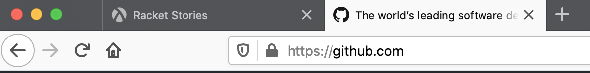
Hi. I changed the favicon color to gray which ought to work with both light and dark themes. Can you check that the favicon looks ok in Firefox (remember to clear the cache).
It looks better when the tab is active. Here's a screenshot of the tab icon, with an (inactive) GitHub tab next to it for comparison:

The icon also shows up pretty well on the bookmarks bar:

However, when the tab is inactive the icon is still pretty hard to see:

I am seeing this
The tab color is slightly different. This is Firefox version 71.0 macOS.